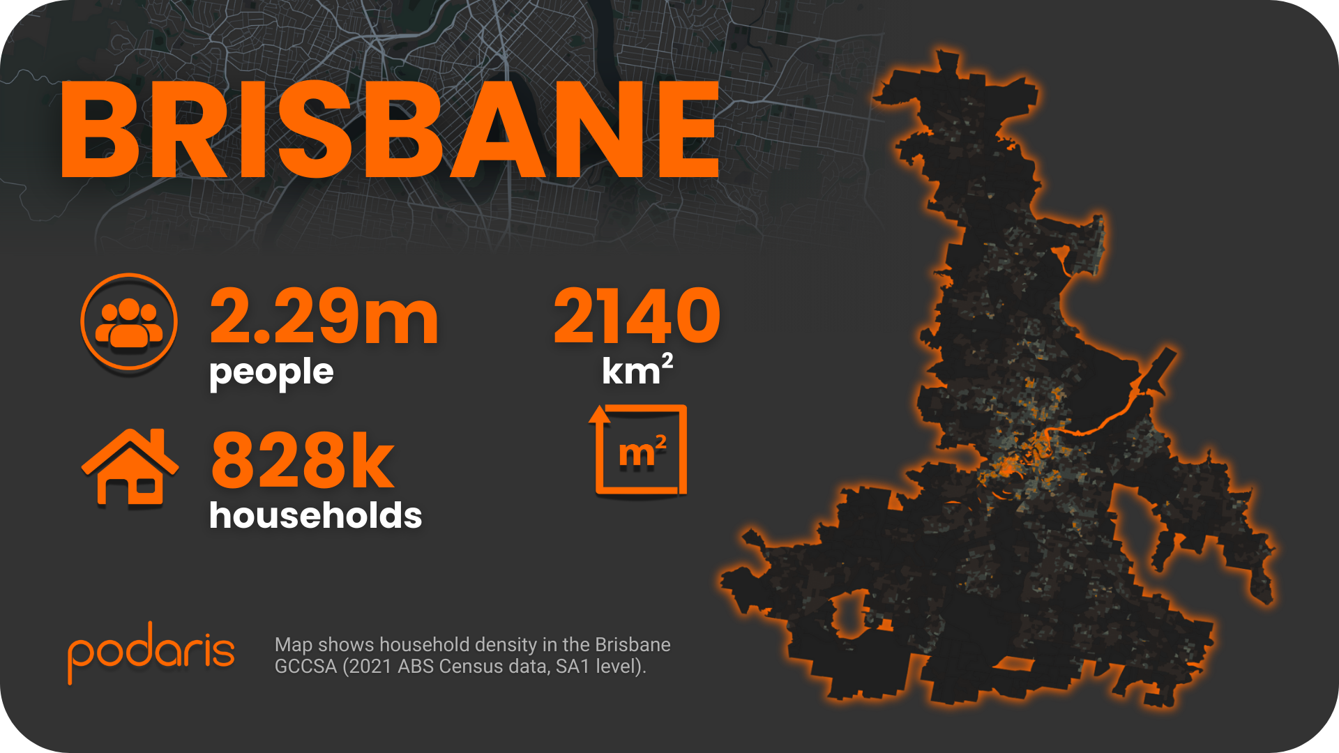
Brisbane is big. Really big. At 2,140 sq. km, it's nearly 50% larger than Perth and substantially bigger than Adelaide, yet somehow manages to be Australia's third-largest city rather than its first. That geographical sprawl, combined with 2.29 million people and the Brisbane River carving the whole thing in two, makes it perhaps the most interesting test case in our Australian Transport Scorecard series.
The question isn't whether Brisbane has public transport (it does: bus, rail, ferry). The question is whether you can effectively serve a population this dispersed without either going broke or giving up entirely. Let's see what the data says.
Building the network
We started with Brisbane's GTFS feed, which we imported into Podaris:Plan. The workflow is straightforward enough that we've probably described it five times already in this series, but for completeness:
- Filter by agency boundaries or service dates
- Clean and optimise routes
- Merge bus, rail and ferry into one connected system
- Export for analysis without touching a separate GIS tool
We layered in 2021 ABS population and household data at the SA1 level. This gives us the demographic foundation to answer the important question: who actually benefits from this network?
Stop catchments: The coverage test
First, we looked at how many households can reasonably walk to public transport. Using isochrone analysis in Podaris:Insight, we calculated:
- 59% of households within 400m (roughly five minutes’ walk)
- 78% within 800m
- 83% within 1.2km
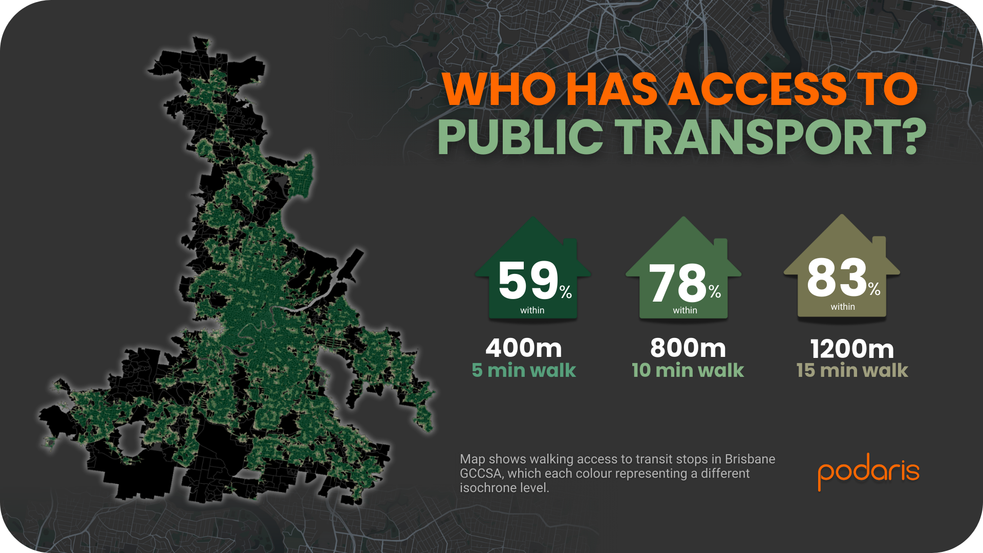
That 59% figure is lower than every other mainland capital we've analysed: Adelaide manages 68%, Perth 64%, even Canberra hits 64%. This is what 2,140 sq. km of suburbs looks like in practice. When your city boundary extends this far, maintaining stop coverage gets exponentially harder. Every additional percentage point represents thousands more stops to service, staff, and maintain.
That said, 83% of households within a 15-minute walk isn't terrible. But proximity to a stop tells you nothing about whether the bus that arrives will actually be useful.
PTAL: What service level are they getting?
To understand service frequency, we ran a PTAL analysis using the Transport for London methodology, looking at the morning peak (06:30 to 09:00). PTAL doesn't just measure “can you walk to a stop?” It asks “what's waiting for you when you get there?” Scores run from 1a (you probably shouldn't have bothered walking) to 6b (excellent).
Brisbane's distribution:
- 9.5% with no accessible public transport
- 38% in PTAL 1a
- 25.4% in PTAL 1b
- 20% in PTAL 2
- 4.9% in PTAL 3
- 1.3% in PTAL 4
- 0.3% in PTAL 5
- 0.4% in PTAL 6a
- 0.3% in PTAL 6b
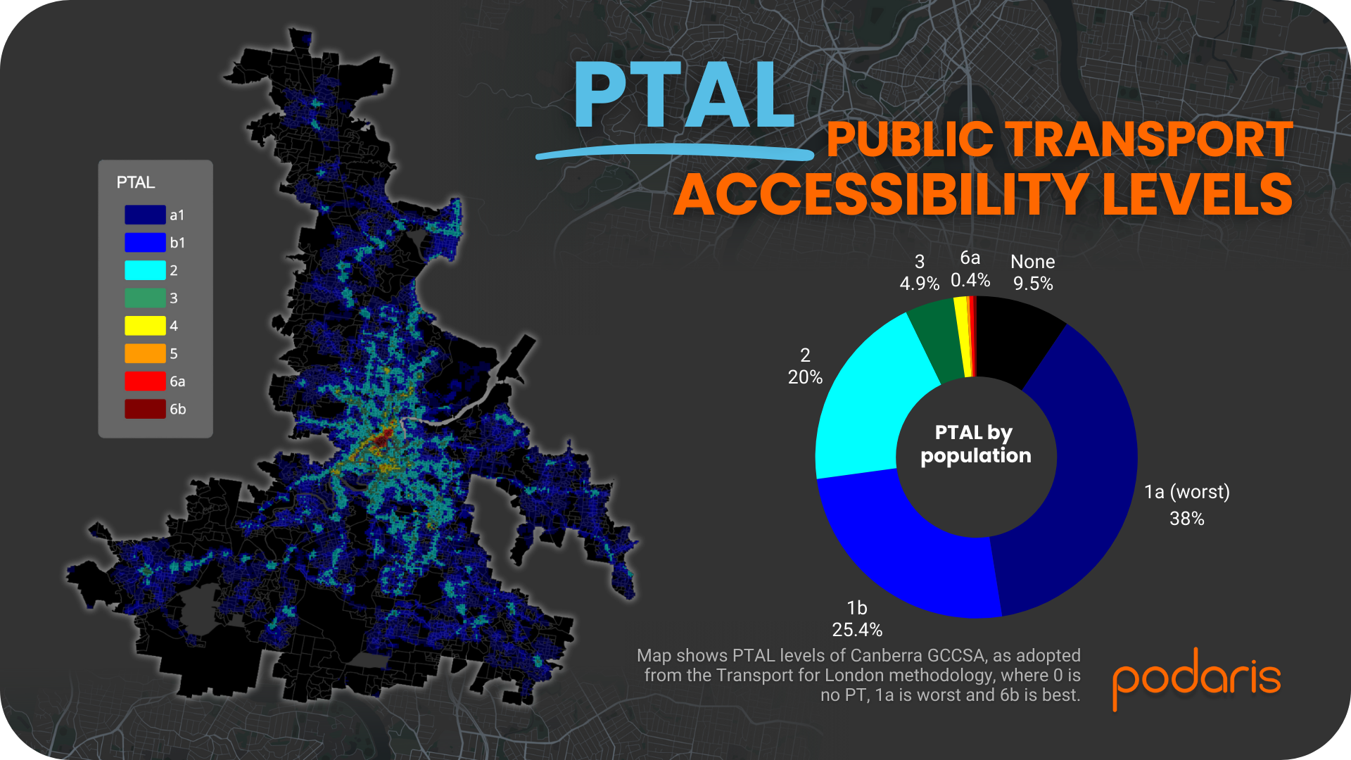
Nearly half of Brisbane residents (47.5%) have either no public transport access or the worst level available. That's substantially higher than Adelaide (18.6%) or Perth (30.1%).
The culprit is geography. A route that runs every 10 minutes in inner Brisbane might be every 30 minutes in the middle suburbs and hourly at the edges. PTAL punishes low frequency severely, and when you're trying to serve 2,140 sq. km, maintaining high frequencies everywhere becomes implausible.
But here's the interesting bit: Brisbane also has the highest percentage of residents in PTAL 3 or above (7.2%) compared to Adelaide's 3.9% and Perth's 4.6%. These higher-scoring areas cluster around inner Brisbane and major corridors. So Brisbane clearly knows how to deliver good public transport. It's just concentrated in specific places rather than spread thinly everywhere.
What this tells us
A few things stand out that are relevant beyond Brisbane specifically.
Size compounds problems non-linearly
Brisbane isn't just “a bit bigger” than Adelaide. At 2,140 sq. km versus Adelaide's 1,827 sq. km, you might expect proportionally worse results. But transport networks don't scale linearly. A suburb 5km further out isn't just 5km away, it's often an entirely different service tier with different operational economics. The gaps compound.
High coverage can mask poor service
83% of households within 1.2km of a stop sounds impressive until you realise what's actually showing up at those stops. Many areas have “access” to public transport in the same way that a monthly bus technically counts as access. It's there, but good luck planning your life around it.
Concentration beats dilution
The PTAL 3+ areas prove that Brisbane can deliver quality service when it focuses resources. These corridors didn't happen by accident. They're the result of deliberately concentrating frequency along specific routes rather than trying to serve everywhere equally poorly. This suggests a template: identify where similar corridor improvements might work and stop pretending you can run metro frequencies to outer suburbs on a bus budget.
Multi-modal analysis matters more at scale
Brisbane has bus, rail, and ferry all playing distinct roles. A location might have a mediocre PTAL score but excellent connectivity if it's near a rail interchange or ferry terminal. PTAL captures frequency but not connectivity. For this, tools like Podaris’ connectivity analysis become more useful, measuring not just “how often does something arrive” but “where can I actually get to from here?”
What next?
Brisbane demonstrates a problem that many sprawling cities face: you can't afford to serve everywhere well, so where do you invest? The data suggests some answers.
Double down on corridors that already work. Brisbane's high-PTAL areas exist because resources were concentrated. Finding similar opportunities in underserved areas might be more cost-effective than marginal improvements everywhere.
Accept that different areas need different solutions. Trying to run conventional bus routes everywhere at high frequency isn't realistic. But demand-responsive services, better feeder routes connecting to quality trunk services, or hub-and-spoke models might deliver better outcomes than the current approach of spreading service thinly.
Model scenarios quickly to test what works. With Podaris, you can build and analyse these alternatives in hours rather than weeks. Whether you're testing a new BRT corridor, redesigning feeder services, or seeing how a ferry extension changes accessibility across the river, the platform handles the complexity so you can focus on the planning.
Next in our Australian Transport Scorecard: Sydney and Melbourne, where we'll see what happens when you add genuine density to the mix. If Brisbane shows the challenge of scale, these cities show the challenge of scale plus volume.
Learn more at podaris.com