Kicking off our Australian Transport Scorecard series, we’re heading to the Top End. Darwin, while Australia’s smallest capital city by population, provides an excellent example of how Podaris can be used to rapidly understand and analyse public transport networks of all sizes.
Why Darwin?
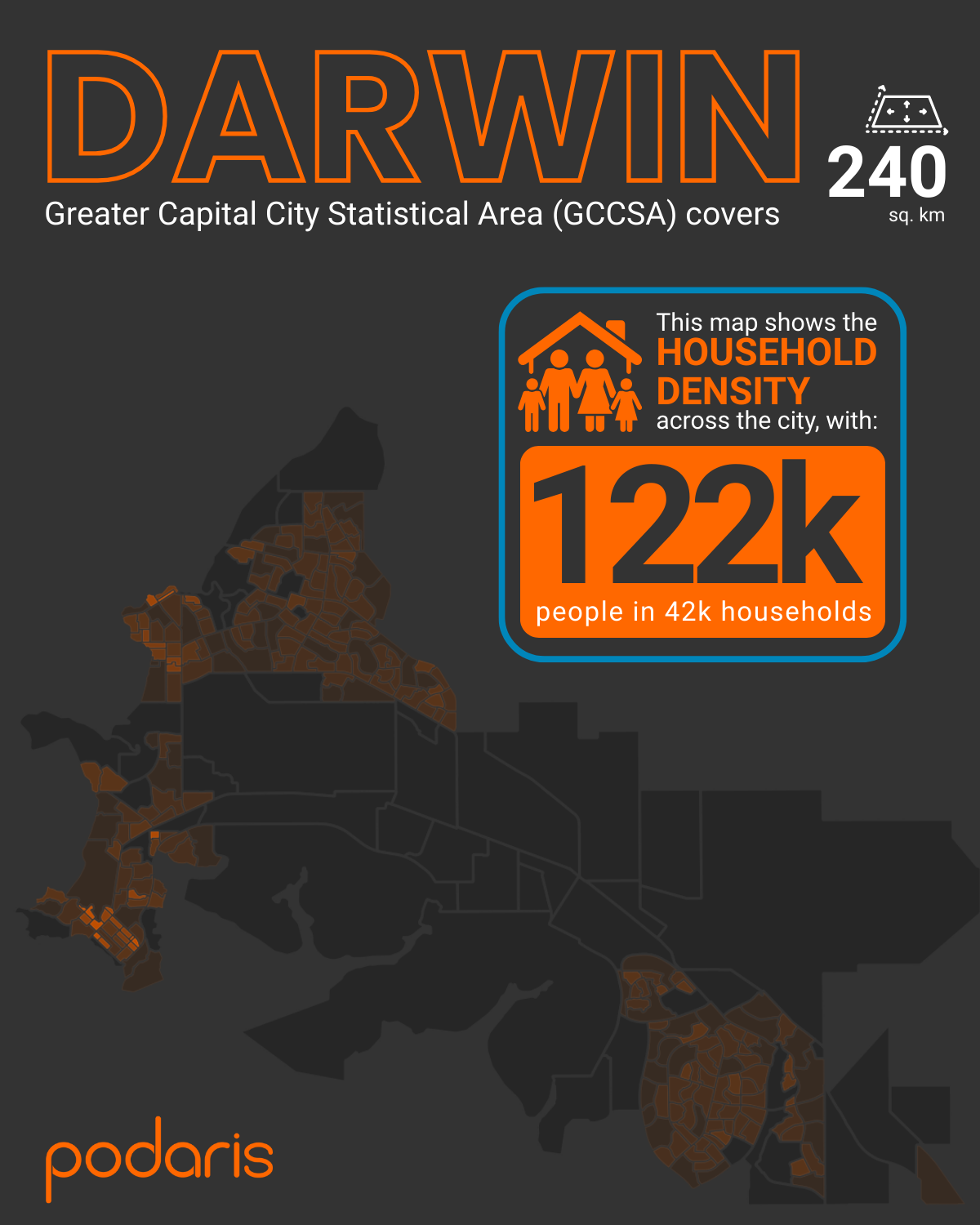
The Darwin Greater Capital City Statistical Area covers around 240 sq. km, home to 122,000 people and 42,000 households. With a majority-bus public transport system and a dispersed urban footprint, it’s a useful case for exploring accessibility and coverage in a compact but growing city.
Step 1: Building the network
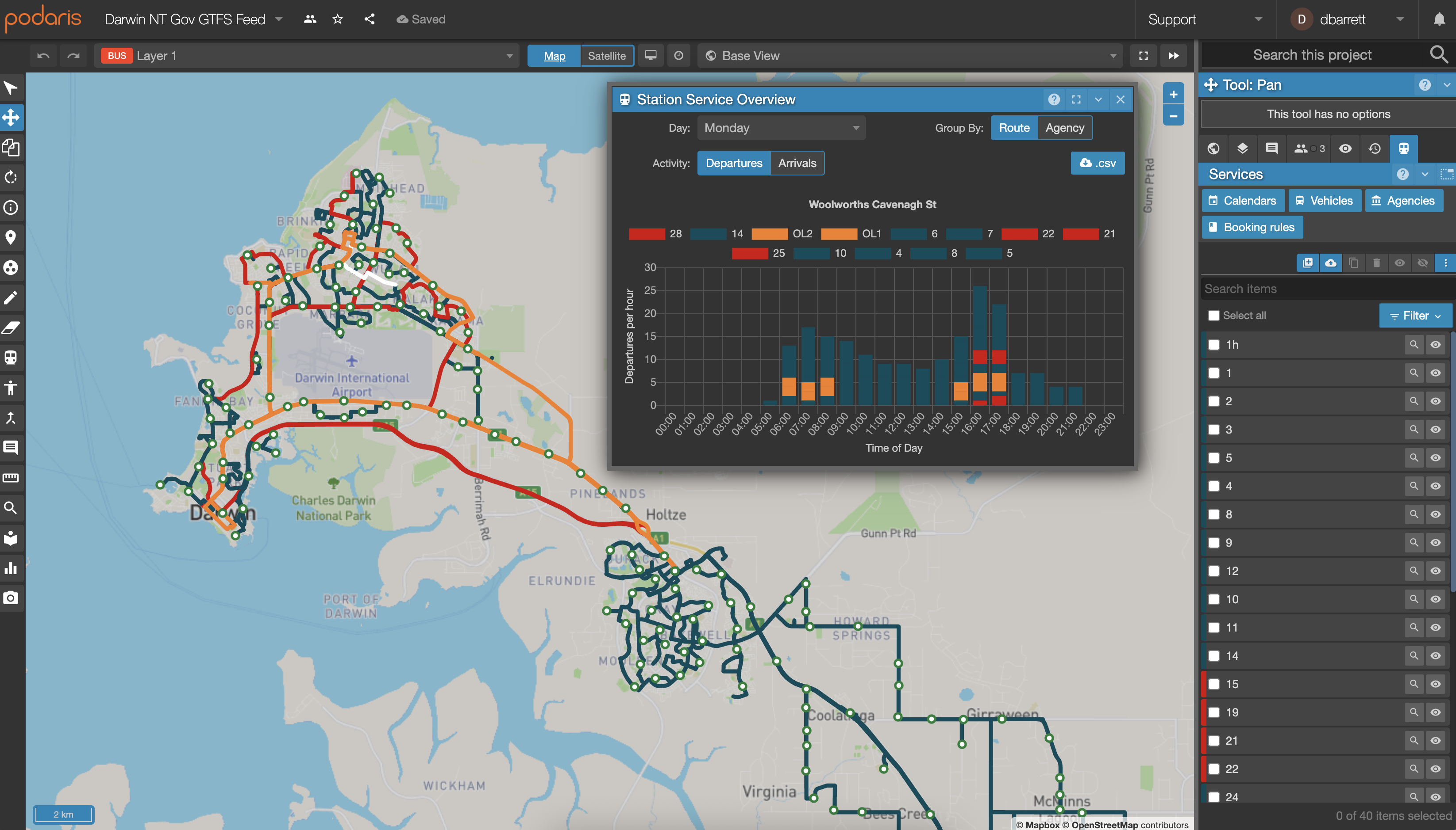
Using Podaris:Plan, we imported the GTFS feed for Darwin’s bus network. GTFS (General Transit Feed Specification) data provides schedules and routes in a standardised format, which Podaris can process and visualise in seconds.
Alongside the network, we overlaid ABS 2021 household and population data at SA1 level, giving us a demographic lens on top of the transport system. Podaris also functions as a WebGIS tool, allowing for custom vector and raster datasets - meaning that planners can incorporate project-specific data as needed.
Step 2: Analysing accessibility
Once the network was in place, we turned to Podaris:Insight, an interactive toolbox for measuring connectivity and generating accessibility analysis. For Darwin, we focused on two key measures:
Stop catchments
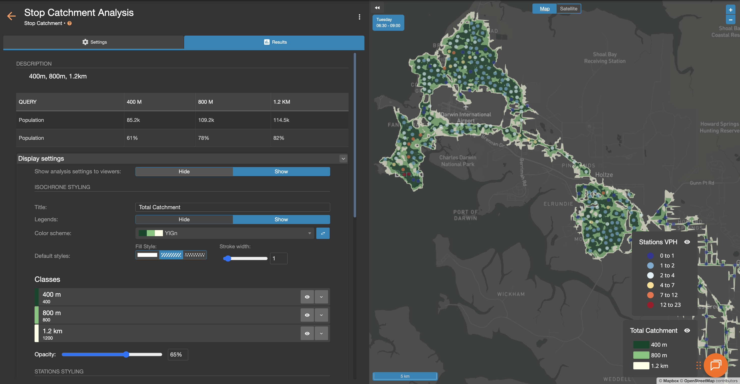
Isochrone maps showed how far people can travel within a set walking distance of bus stops.
The findings:
- 61% of households are within 400m (a five-minute walk) of a stop
- 78% of households within 800m
- 82% of households within 1.2km
This provides a quick picture of where the bus network reaches most effectively—and where gaps remain.
Public Transport Accessibility Levels (PTAL)
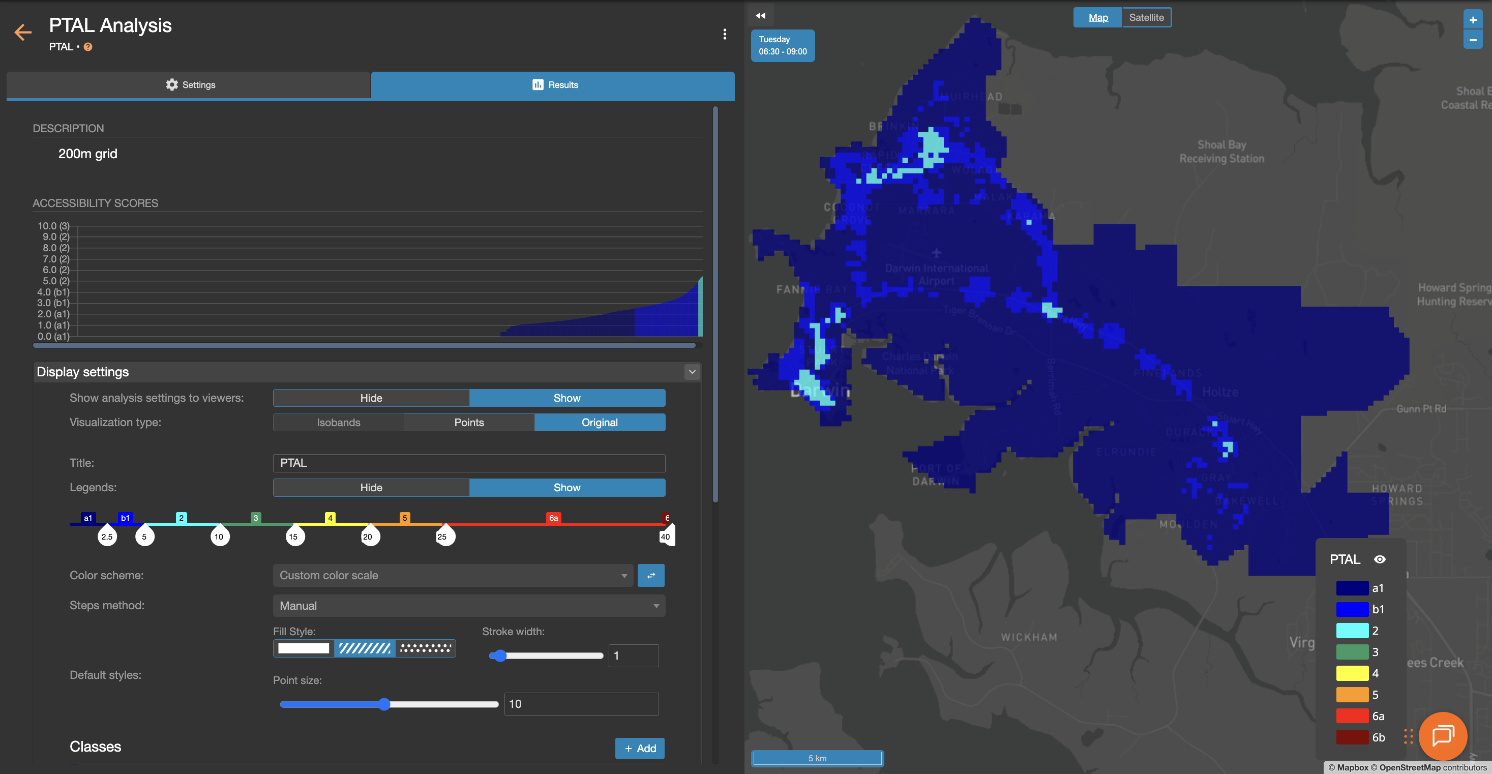
Using the Transport for London methodology, PTAL scores give a location-based measure of service density and frequency. Darwin’s results:
- 65% of the population falls into the lowest accessibility band (PTAL 1a)
- 24.5% in PTAL 1b
- Just 6.6% in PTAL 2
- No areas reached PTAL 3 or higher
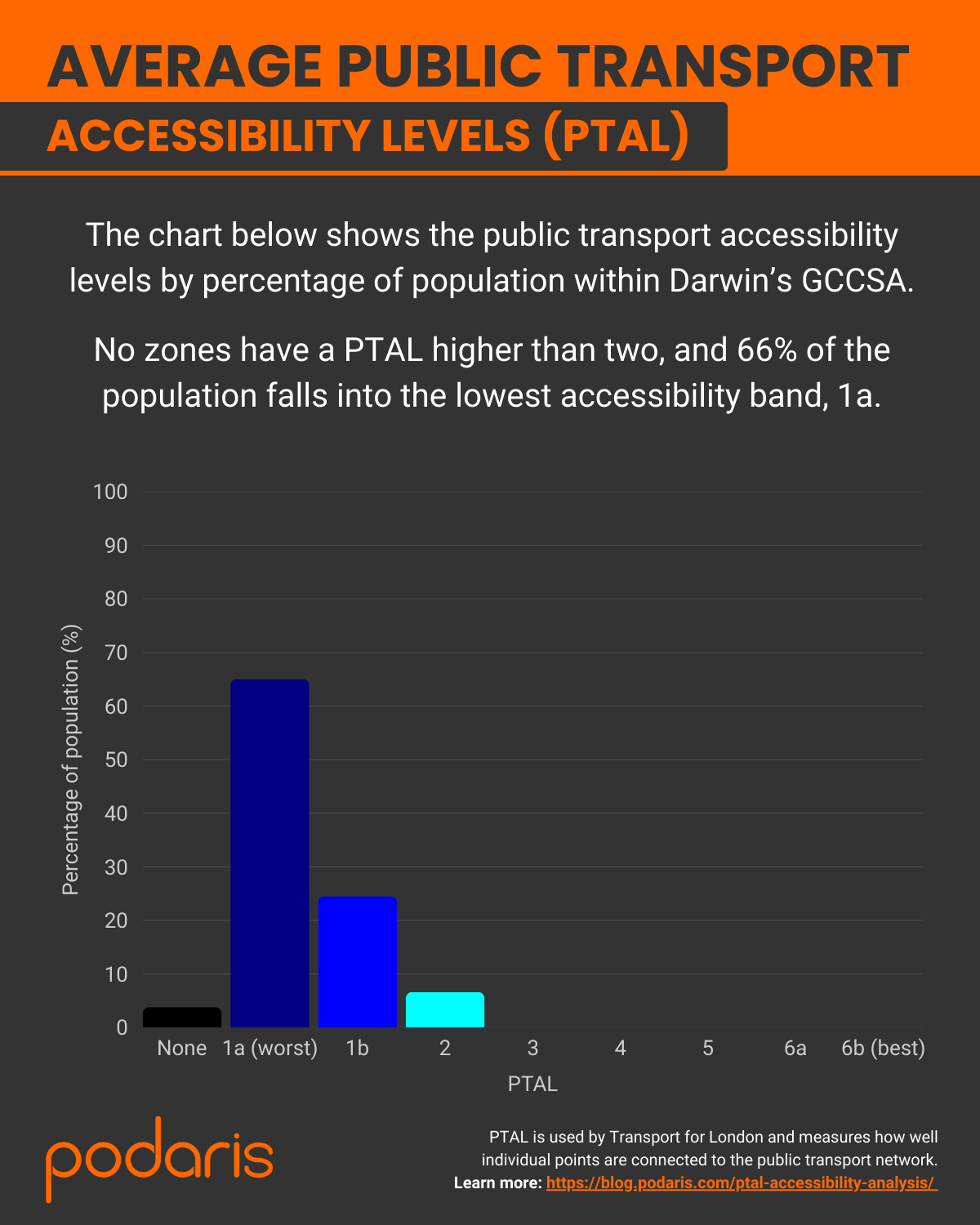
In other words: most of Darwin has some access to buses, but the service levels remain sparse compared to larger cities.
What we learned
This case study highlights how Podaris can:
- Combine real-world networks and demographic data in minutes
- Reveal accessibility patterns through stop catchments and PTAL analysis
- Provide clear, visual outputs that help stakeholders quickly understand strengths and weaknesses in a city’s transport system
While PTAL has its limits, it doesn’t measure where services go, or whether they connect to jobs, hospitals, or activity centres; it’s still a powerful first step for benchmarking service provision.
Final thoughts
Darwin may be small, but it’s a perfect illustration of how Podaris accelerates transport analysis. What once required weeks of GIS work can now be achieved in hours, opening the door to faster, more informed decision-making.
Over the coming weeks, we’ll continue this series with other Australian capitals, building a national snapshot of public transport accessibility.
If you’re working on a project in Darwin (or any Australian city), reach out; we already have the GTFS and ABS datasets ready to go in Podaris.
Learn more at podaris.com