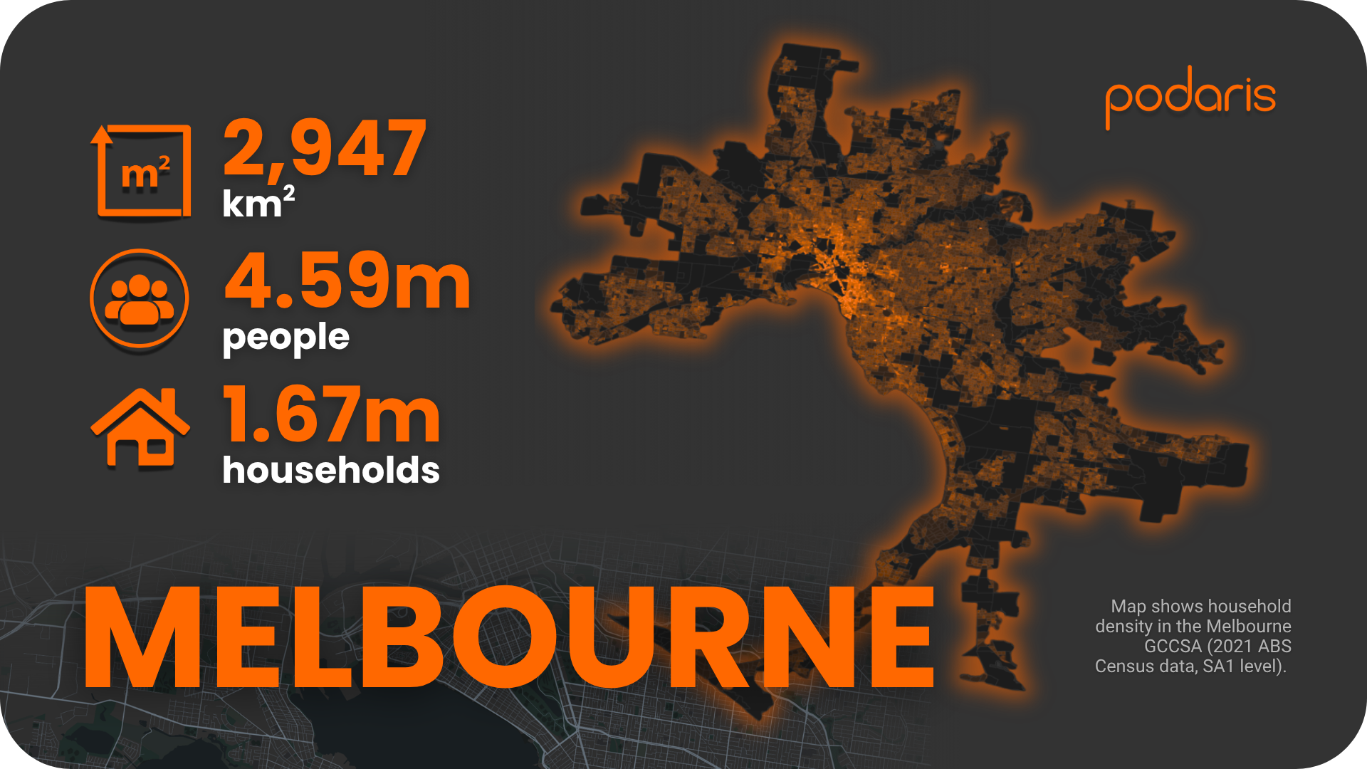
Melbourne presents a different challenge to Brisbane. Where Brisbane struggles with sheer scale, Melbourne grapples with scale and complexity. It's Australia's second-largest city by population (4.58 million), but its 2,950 sq km metropolitan area makes it significantly denser than its northern counterpart. Add to this Australia's largest tram network, an extensive rail system, and a vast bus network serving rapidly expanding outer suburbs, and you have a genuinely multi-modal transport ecosystem.
The question is: does this complexity translate into better accessibility for Melburnians?
Building the network
Using Podaris:Plan, we imported Melbourne's complete GTFS feeds covering buses, trams, and trains. The platform handled the multi-modal complexity seamlessly, allowing us to construct a cleaned, analysable network model.
We then overlaid ABS 2021 household and population data at the SA1 level. This demographic integration lets us evaluate accessibility not just spatially, but in terms of who actually benefits from the network.
Stop catchments: How far do people need to walk?
Our isochrone analysis in Podaris:Insight reveals Melbourne's walking accessibility to public transport stops:
- 66% of households within 400m (roughly 5 minutes’ walk)
- 83% within 800m (about 10 minutes)
- 87% within 1.2km (around 15 minutes)
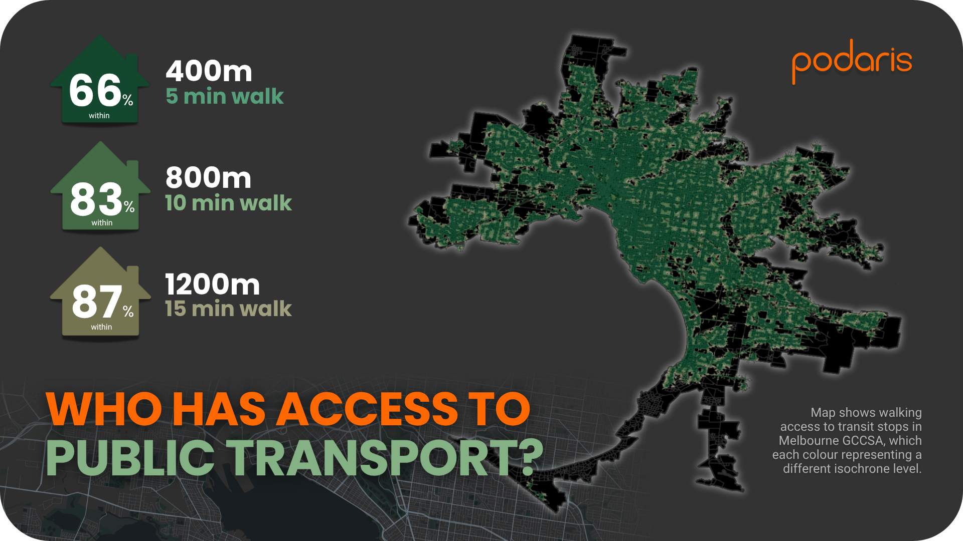
These figures are solid, particularly compared with car-dependent Australian cities. The inner suburbs benefit from Melbourne's tram grid, where stops are frequent and coverage is dense. However, the gap between 83% and 87% tells an important story: those final households are significantly further from any service, typically in new growth corridors where development has outpaced public transport provision.
PTAL: What level of service do they get?
Having a nearby stop matters little if services are infrequent. Using London's PTAL methodology for the morning peak period (06:30–09:00), we calculated service intensity across Melbourne's residential areas:
- 26.4% in PTAL 1a (poorest service)
- 30.8% in PTAL 1b
- 22.1% in PTAL 2
- 8.2% in PTAL 3
- 5.3% combined in PTAL 4–6 (best service)
- 6.7% with no network access
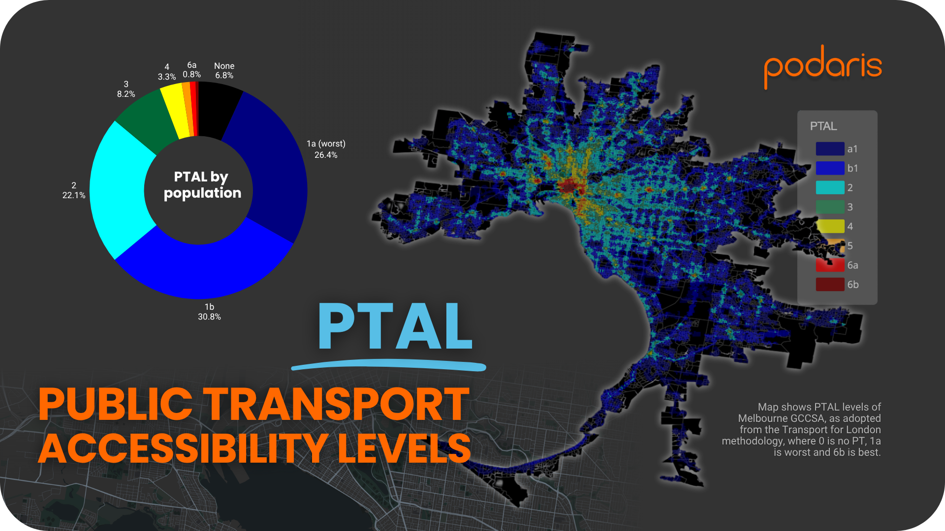
This distribution is revealing. More than half of Melbourne's households (57.2%) sit in the two lowest PTAL bands, indicating infrequent service. However, compared with cities like Darwin or Canberra, where virtually everyone falls into PTAL 1a–1b, Melbourne shows meaningful representation in the mid and upper bands.
That 5.3% in PTAL 4–6 represents genuine walk-up-and-go service, concentrated in the CBD and along major tram and rail corridors. It's a small percentage, but in absolute terms it means roughly 280,000 households with excellent public transport access.
What this reveals about Melbourne
Three key themes emerge from the data:
Trams and trains drive the best outcomes
Melbourne's high-performing areas cluster along established tram routes and railway lines. These corridors, particularly in the inner north and inner east, demonstrate the value of high-capacity, high-frequency infrastructure. Where these modes overlap, accessibility peaks.
Growth at the edges outpaces transport investment
The outer suburbs tell a different story. New estates in growth corridors like Wyndham, Casey, and Whittlesea show lower PTAL scores and longer walking distances to stops. These areas are car-dependent not by choice but by necessity, as transport provision struggles to keep pace with population growth.
A more balanced distribution than most Australian cities
Melbourne's PTAL spread differentiates it from smaller capitals. While over half of households still experience poor service levels, the presence of a meaningful mid-tier demonstrates that the network supports varied transport needs better than most Australian cities. It's not world-class, but it's a step above the purely car-oriented planning that dominates much of the country.
It's worth noting PTAL's limitations: it measures service intensity, not destination connectivity. A household might have excellent PTAL access but still face poor connections to employment centres, hospitals, or education. Future posts will explore these destination-based metrics.
Melbourne's accessibility in context
Melbourne illustrates the challenge of managing a large, multi-modal network at scale. The inner areas benefit from over a century of tram infrastructure and extensive rail investment, creating genuinely transit-rich neighbourhoods. Meanwhile, the outer suburbs, where much of Melbourne's growth is concentrated, remain significantly underserved.
The data shows both the power of integrated transport infrastructure and the difficulty of extending it to fast-growing areas. For planners, the question isn't whether Melbourne's network works (clearly it does in parts), but how to extend that success to the households currently languishing in PTAL 1a and 1b.
With Podaris, planners can integrate GTFS data, demographic layers, and accessibility analysis to turn this complexity into actionable insights. Understanding where gaps exist is the first step towards closing them.
Next in the series: Sydney - Australia's largest city and most intricate transport network. Can its scale deliver better accessibility outcomes than Melbourne?
Learn more at podaris.com