
Perth breaks new ground in our series, it's our first city with ferries as part of the public transport mix. Spanning 1,750 sq. km with 2.04 million people, Perth's challenge isn't just multi-modal integration - it's serving a sprawling metropolitan area where distance matters as much as frequency.
Unlike the compact cities we've analysed so far, Perth tests a different question: can multi-modal networks deliver strong accessibility across low-density geographies? With buses feeding suburban rail lines and ferries connecting communities across the Swan River, Perth's transport strategy is all about smart integration at scale.
Building the network
Using Podaris:Plan, we imported Perth's complete GTFS feeds: bus, rail, and ferry services across Western Australia. The workflow is straightforward:
- Filter by geography, agency, and time
- Optimise datasets for planning or analysis
- Merge multiple operators into one connected model
Even with large, complex feeds covering regional services, Podaris processed everything in minutes. We layered in ABS 2021 household and population data to understand how the network serves where people actually live.
What the data reveals
Stop catchments: Strong coverage across distance
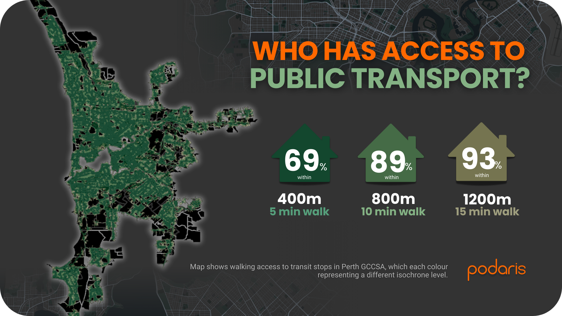
Nearly seven in ten households live within a five-minute walk of public transport. Stretch that to ten minutes, and you've captured 89% of Perth's households. For a city of this geographic scale, that's impressive, and it shows the value of having rail for longer trips and ferries for cross-river connections.
Isochrone maps showed how many households fall within walking distance of the nearest public transport service:
- 69% of households are within 400m (five minutes) of a stop or station
- 89% within 800m
- 93% within 1.2km
Public Transport Accessibility Levels (PTAL)
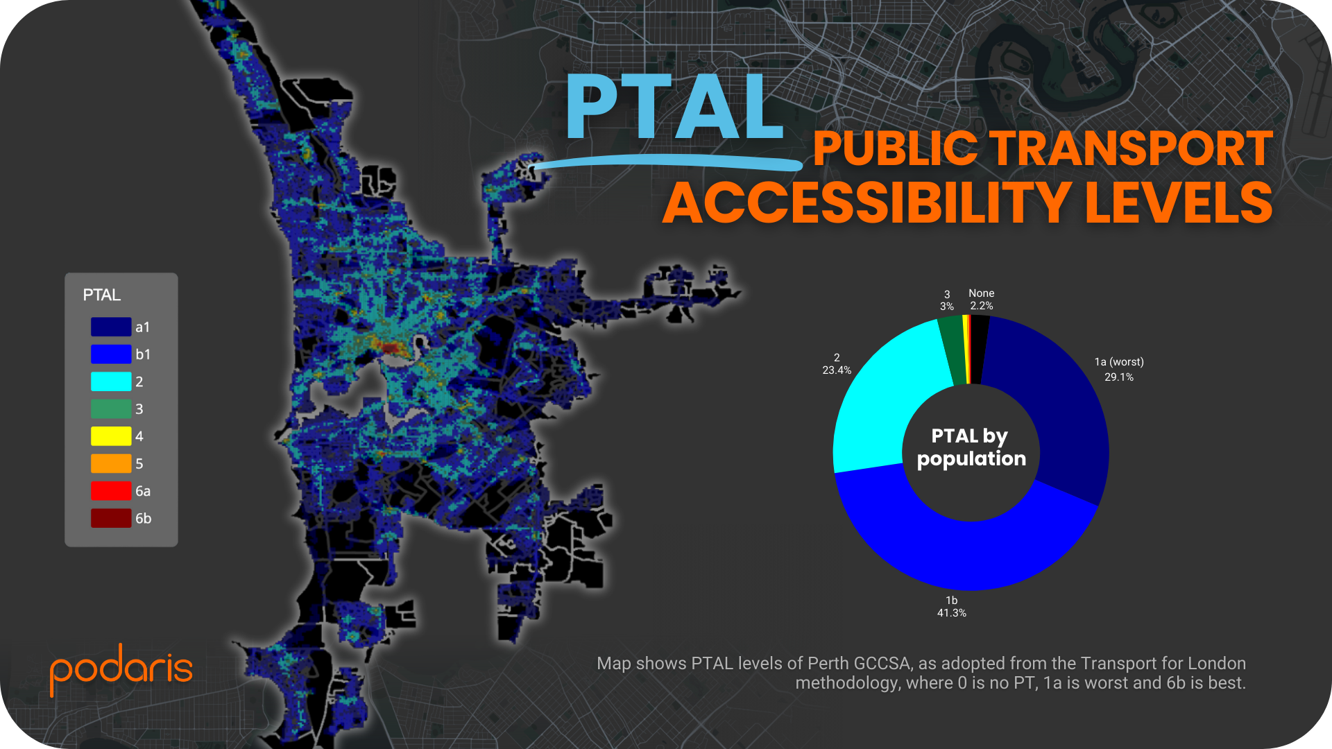
Running average PTAL analysis for the morning peak (06:30–09:00) revealed how accessible the city is by public transport:
- 29% of residents in PTAL 1a - the lowest accessibility band
- 41% in PTAL 1b, with reasonable service frequency
- 23% reaching PTAL 2, and small shares climbing to PTAL 6b
What does this mean? Perth's network reaches most of the city, but service intensity is lower than Adelaide's. This isn't surprising for a sprawling geography, but it points to where targeted frequency improvements could deliver outsized benefits.
The opportunity: That 29% in PTAL 1a represents areas where modest increases in service frequency could unlock significantly better accessibility. In a low-density city, even one additional bus per hour can shift households from PTAL 1a to 1b, making public transport a viable choice for everyday trips.
What we learned
Perth demonstrates something critical: accessibility isn't just about coverage, it's about making services useful. While PTAL doesn’t measure where services go (jobs, hospitals, activity centres), it provides a clear lens for understanding how much transport access exists across the metropolitan region.
Podaris lets you test this quickly:
- What if we doubled frequency on key suburban corridors?
- How many more households reach PTAL 2 or higher?
- Where would new ferry services have the biggest impact?
From GTFS import to demographic analysis to stakeholder - ready maps—all achievable in under an hour, not weeks.
Final thoughts
Perth proves that water transport, sprawling geographies, and complex datasets are all within reach using Podaris. The same platform that handled Darwin's bus-only network scales seamlessly to Perth's multi-modal, metropolitan-wide system.
As we move east to Australia's largest cities, the networks only get bigger; but the workflow stays fast, collaborative, and ready to share with stakeholders.
How does Perth's accessibility compare to your city? We'd love to hear from transport professionals working on similar challenges—drop a comment or reach out.
Learn more at podaris.com
Curious about running this analysis for your own network? The same Podaris:Insight tools that powered this scorecard are available to transport planners worldwide: from rapid stop catchment mapping to detailed PTAL analysis.