For part eight of our Australian Transport Scorecard series, we turn to Australia's largest and most complex transport network: Sydney. With buses, heavy rail, metro, light rail, and ferries all in operation, Sydney presents both the opportunities and challenges of truly multi-modal transport planning.
Missed earlier cities? Check out our previous analyses of other australian cities here.
Why Sydney?
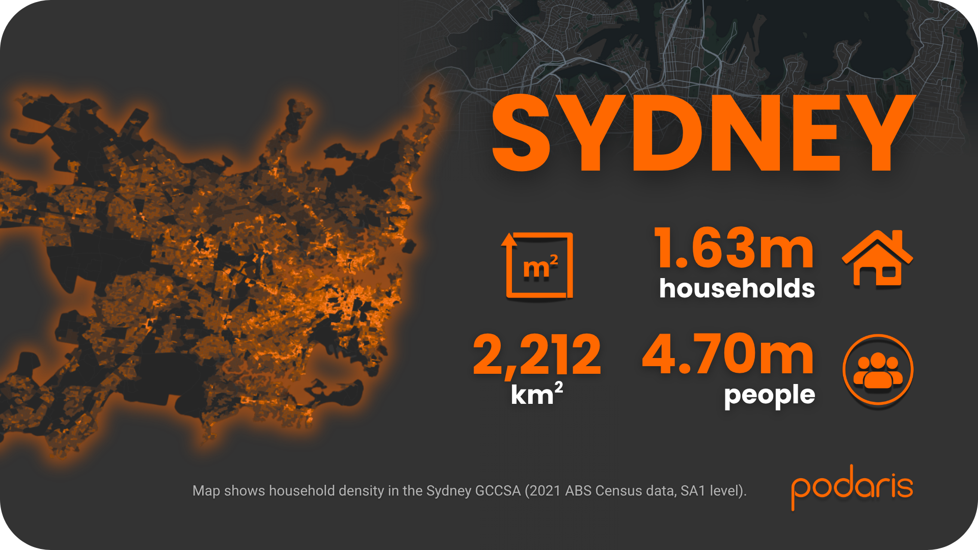
The Sydney Greater Capital City Statistical Area sprawls across more than 12,000 sq. km, home to 5.3 million people and 1.9 million households. It's not just the largest city in our series, it's the most diverse, with density varying dramatically from the inner harbour suburbs to the outer growth corridors of the Northwest and Southwest.
Step 1: Building the network
Using Podaris:Plan, we imported GTFS feeds for all of Sydney's modes: buses, heavy rail (Sydney Trains), metro, light rail, and ferries. With over 3,000 routes and services, this was by far the largest dataset in our series.
Podaris handled the complexity efficiently, allowing us to:
- Filter and validate routes across multiple operators
- Process large GTFS feeds without performance issues
- Create a unified multi-modal network view in minutes
We overlaid ABS 2021 household and population data at SA1 level, giving us demographic context across the entire metropolitan area—from Bondi to the Blue Mountains.
Step 2: Analysing accessibility
We applied our Podaris:Insight toolkit to Sydney's network:
Stop catchments
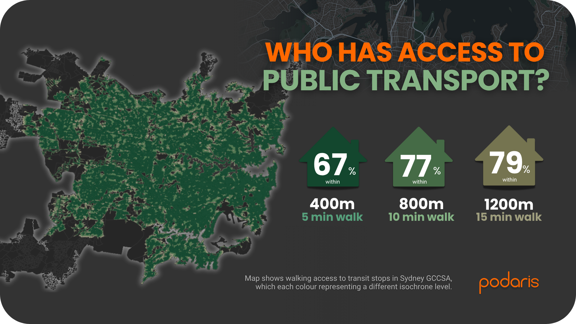
Isochrone analysis revealed near-universal coverage:
- 82% of households within 400m (five minutes) of a stop or station
- 97% within 800m
- 99% within 1.2km
This is the highest coverage we've seen in the series—substantially better than Darwin (61% within 400m) and Hobart (60%), and even exceeding Canberra (77%). The inclusion of extensive heavy rail and metro networks, combined with dense bus coverage, creates coverage at a scale unmatched elsewhere in Australia.
Public Transport Accessibility Levels (PTAL)
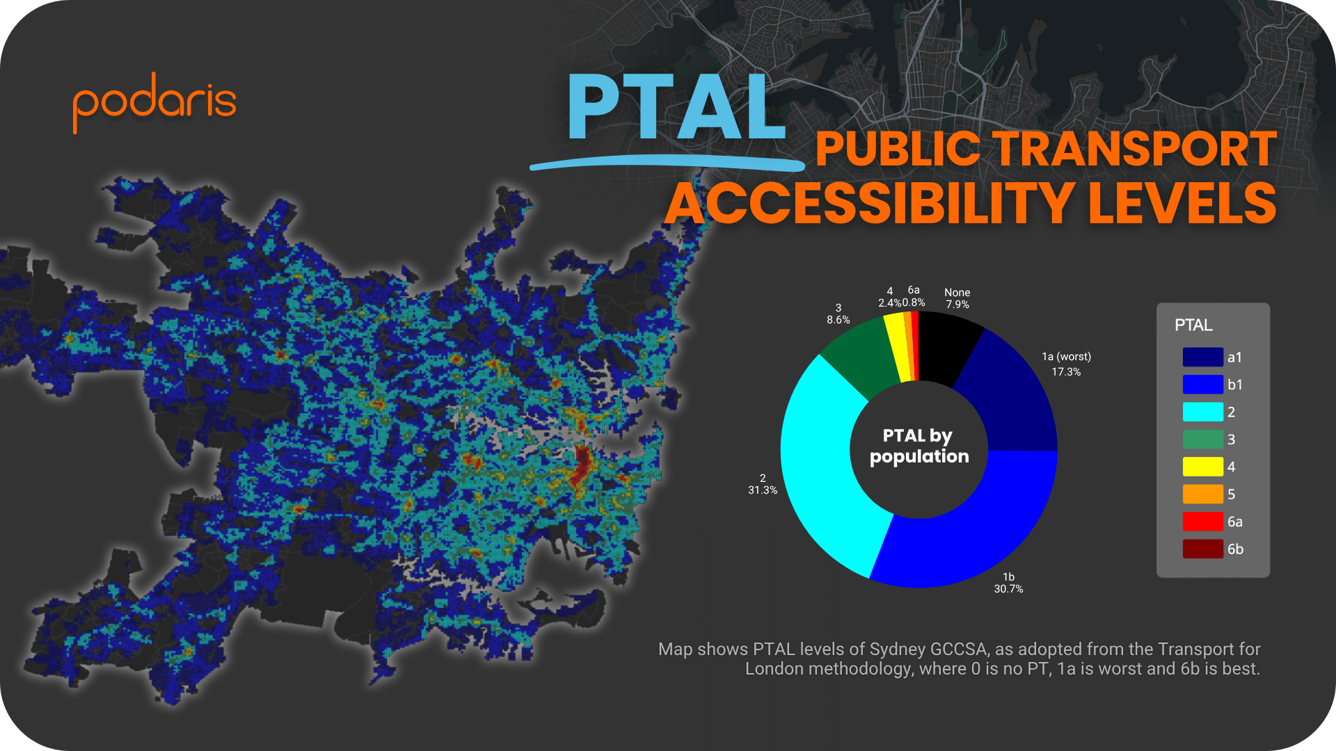
Using the London methodology for the morning peak (06:30–09:00), Sydney produced the most diverse PTAL distribution of any city in our analysis:
- 35% of the population in PTAL 1a or 1b (low accessibility)
- 28% in PTAL 2
- 22% in PTAL 3
- 12% in PTAL 4–5
- 2% in PTAL 6a
- Only 1% outside the network entirely
These results paint a complex picture. While Sydney has by far the highest proportion of people in PTAL 3–6 bands (indicating strong service intensity), more than a third of the population still sits in the lowest accessibility categories - predominantly in the outer suburbs and growth areas like Western Sydney, the Hills District, and the Northern Beaches.
What we learned
Sydney demonstrates three key insights:
-
Multi-modal density drives high scores: The integration of heavy rail, metro, light rail, ferries, and buses creates pockets of genuinely excellent accessibility, something not seen in any other Australian city in our series.
-
Scale presents challenges: Despite having the most developed system, Sydney's sheer size means that large areas remain in PTAL 1a/1b, particularly in the growth corridors where housing density is increasing faster than transport investment.
-
Stop coverage ≠ service intensity: While nearly all households live within walking distance of a stop, this doesn't translate uniformly into high-frequency, reliable services. The gap between “having a bus nearby” and “having a useful bus service” is stark in many areas.
Final thoughts
Sydney is a study in contrasts. It showcases what multi-modal transport can achieve—dense, frequent, and integrated services in the inner city—while simultaneously highlighting the persistent accessibility challenges facing Australia's growing outer suburbs.
The tools we've used throughout this series—stop catchment analysis and PTAL scoring in Podaris:Insight. They have proven equally capable of analysing small regional networks like Darwin and massive metropolitan systems like Sydney. What changes is the scale, not the approach.
In our next and final post, we'll wrap up the Australian Transport Scorecard series with a national overview, comparing all eight cities and exploring what the results tell us about the state of public transport accessibility across Australia.
Learn more at podaris.com