For part two of our Australian Transport Scorecard series, we’ve headed south to Tasmania. Hobart, with its compact footprint and growing population, provides a fascinating case for testing how Podaris can highlight the strengths and gaps in a city’s transport network.
Missed part one? Checkout out Darwin's analysis
Introducing Hobart
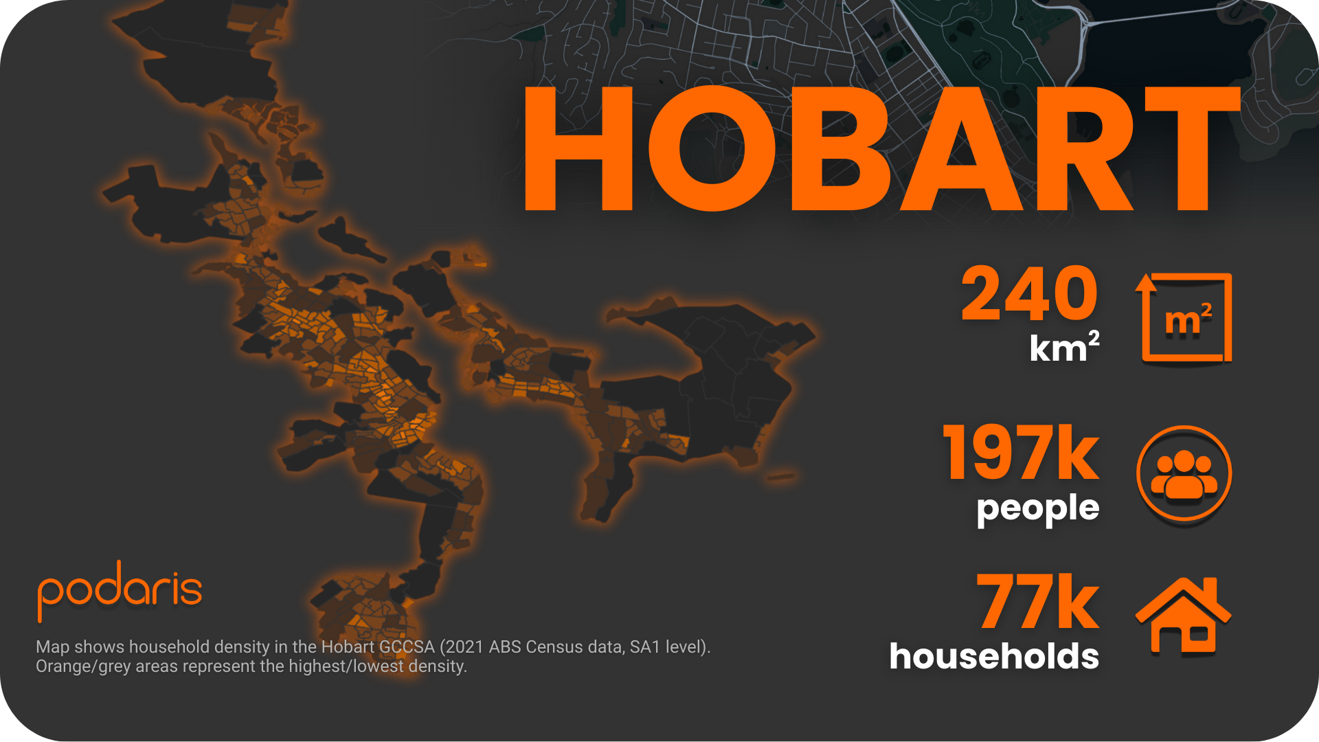
The Hobart Greater Capital City Statistical Area covers around 240 sq. km, home to 197,000 people and 77,000 households. Like Darwin, Hobart relies on a majority bus public transport system (there is a ferry across the Derwent), but the urban geography is more complex—bounded by water and mountains, which can shape service coverage and accessibility.
Step 1: Building the network
Using Podaris:Plan, we imported Hobart’s GTFS feed - which also includes data for other cities and towns in Tasmania. GTFS (General Transit Feed Specification) data is the foundation of most modern transit analysis, and Podaris makes it simple to ingest, process, and visualise this data in minutes.
Podaris’ GTFS tools allow us to:
- Filter by agency, geography, or date ranges
- Optimise data for different analysis scenarios
- Control how each GTFS element is represented
- Handle large feeds quickly with efficient processing
On top of the transport network, we layered ABS 2021 household and population data at SA1 level, giving us a demographic view of who is served by the network. As always with Podaris, custom datasets can also be brought in to tailor analysis for specific projects.
Step 2: Analysing accessibility
With the network built, we moved into Podaris:Insight. For Hobart, we focused on three tools:
Corridor frequency
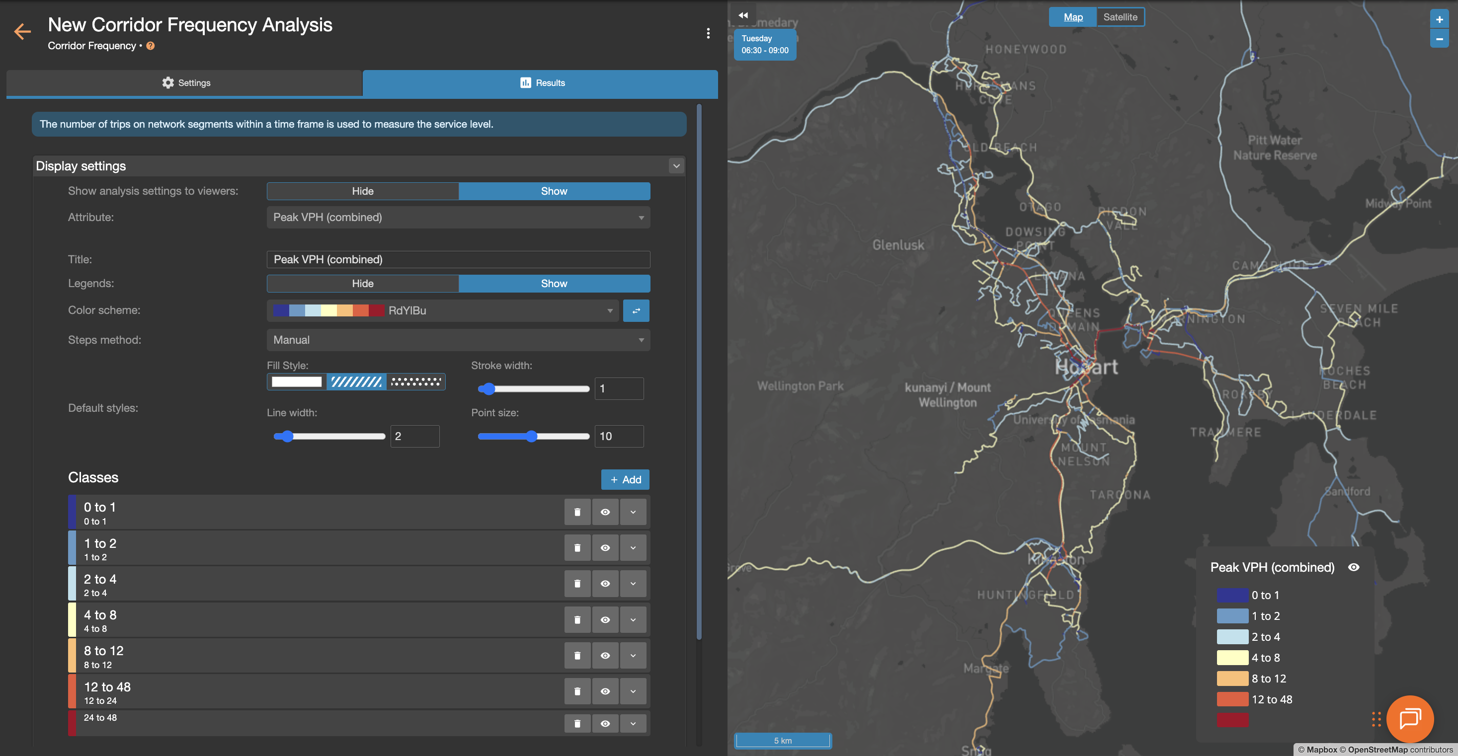
Before diving into accessibility, we ran a corridor frequency check to validate the GTFS import. This quickly showed where Hobart’s highest service volumes sit during peak the morning peak —an important sense-check before deeper analysis.
Stop catchments
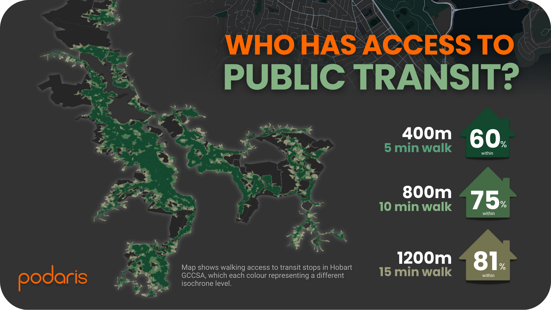
Next, we used stop catchment isochrones to map households within walking distance of bus stops and ferry terminals. The results:
- 60% of households within 400m (five minutes) of a stop
- 75% within 800m
- 81% within 1.2km.
This highlights both the reach of Hobart’s network and the areas where coverage thins out.
Public Transport Accessibility Levels (PTAL)
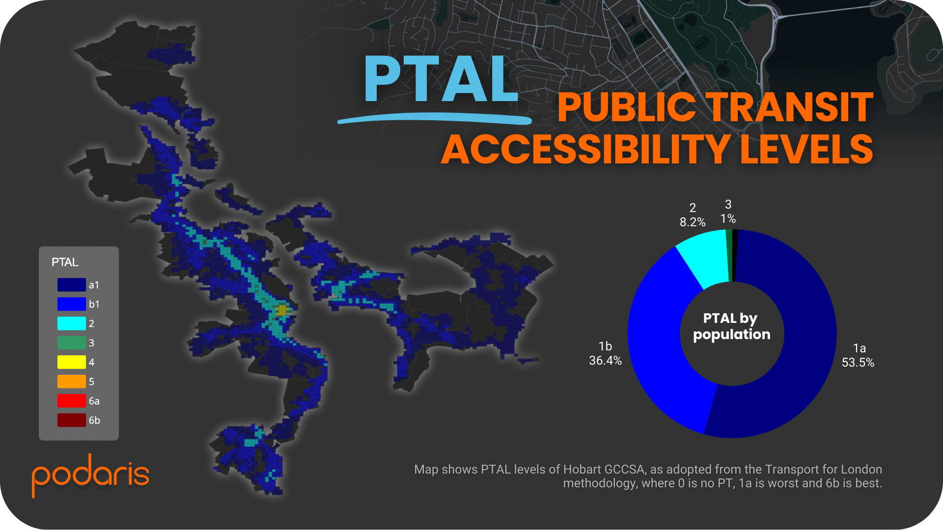
Finally, we ran a PTAL analysis using the London methodology, set to the morning peak (06:30–09:00). PTAL combines service frequency, speed, and reliability into a location-based score from 1a (poor) to 6b (excellent). Hobart’s results show:
- 53.5% of the population in PTAL 1a (lowest accessibility)
- 36.4% in PTAL 1b
- 8.2% in PTAL 2
- Just 1% in PTAL 3
- No areas reached PTAL 4 or above.
Compared with Darwin, Hobart has slightly higher scores at the margin, but the overall picture is similar: a city with broad coverage but limited service intensity.
What we learned
The Hobart case demonstrates several ways Podaris can support planners:
- Corridor validation makes it easy to check GTFS accuracy before analysis
- Catchment analysis quickly reveals coverage gaps relative to households
- PTAL scoring benchmarks accessibility levels across the city
As with Darwin, the limits of PTAL are worth noting: it doesn’t capture where services connect (e.g. jobs, hospitals, universities), and it can create sharp boundaries where stop cut-offs occur. That said, it remains a valuable tool for rapid, citywide benchmarking.
Final thoughts
In Hobart, Podaris once again showed its ability to combine network data and demographics into clear, actionable insights. What traditionally required complex GIS workflows can now be done collaboratively, in real-time, and shared easily with technical and non-technical stakeholders alike.
As part of this series, we’ll continue to build a picture of public transport accessibility across Australia’s capitals. Each city tells a different story—but the speed, flexibility, and clarity of Podaris remains constant.
Learn more at podaris.com