For decades, planners have sought better ways to measure how connected people are - not just to transport, but to opportunity. Whether we’re thinking about jobs, schools, healthcare, or the local shops, connectivity shapes daily life. It’s what determines whether a 20-minute neighbourhood is feasible, or whether a new housing site truly supports sustainable travel.
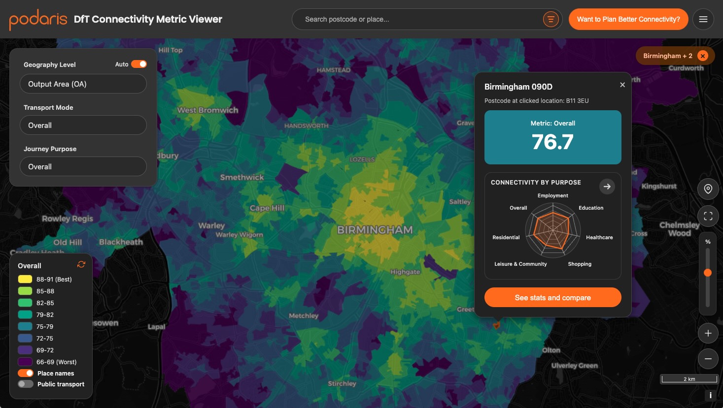
At the end of 2025, the Department for Transport (DfT) launched its first national Transport Connectivity Metric, a data-driven attempt to measure “how easily people can get where they want to go” across England and Wales. It’s ambitious, intricate, and packed with potential. But like all models, to know when to apply, you need to know how it works.
At Podaris, we’ve spent the last few months diving deep into the metric: visualising it, reconstructing it, and testing its assumptions inside our platform. Here’s a look at how it works, and where it fits into the ecosystem of accessibility metrics.
What Is the DfT Transport Connectivity Metric?
The DfT defines connectivity as “someone’s ability to get where they want to go.” It’s not about who does travel, it’s about who could.
Instead of focusing on transport supply (like station proximity), the metric estimates the total value of destinations that can be reached within a 60-minute window, across four travel modes (walking, cycling, public transport, and driving) and six purposes (employment, education, healthcare, shopping, leisure/community, and social visits).
These are combined into overall “connectivity scores,” scaled so that the best-connected area in England and Wales equals 100, and everything else sits relative to that.
In other words:
If you can reach more valuable destinations faster, you’re more connected.
How It Works (Under the Hood)
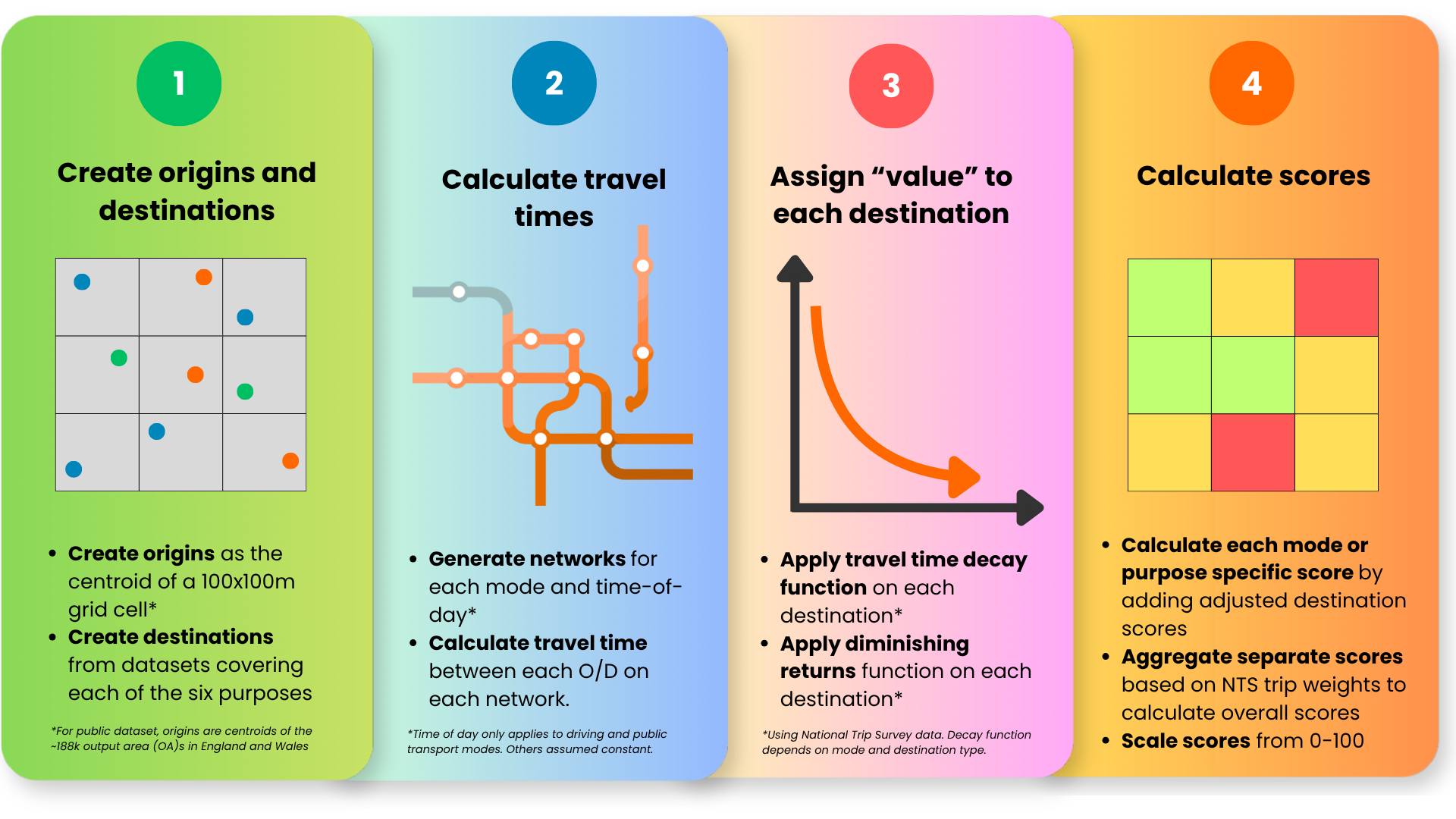
The DfT metric works by estimating how many valuable opportunities you can reach from any given 100×100m grid cell, and how quickly you can reach them. Although the underlying model has many calculations, the core process can be broken into a few steps:
1. Define origins and destinations
- Every 100m grid cell acts as an origin point.
- Destinations come from various datasets (NHS, DfE, OS, ONS, OSM), covering:
- Education
- Healthcare
- Shopping
- Leisure & community
- Employment
- Residential locations
Each destination belongs to one of six broad travel purposes.
2. Calculate travel times
- Separate networks are used for walking, cycling, public transport, and driving.
- These include real-world paths, roads, and timetabled services.
- Travel times vary by time of day, and the journey time is calculated for each time point as follows:
- Driving: AM peak, midday, PM peak, night
- Public transport: every 10 minutes from 6am–10pm
- Walking/cycling: assumed consistent across the day
The model only counts destinations reachable within 60 minutes.
3. Assign a “value” to each destination
Each destination starts with a simple value of 1, and its contribution to the final score is shaped by two steps:
-
Apply a time penalty:
A sigmoid “willingness to travel” curve reduces value as travel time increases. Typical multipliers are: ~0.9 at 5 minutes, ~0.2 at 45 minutes, and of course, 0 beyond 60 minutes. This curve is fitted to National Travel Survey (NTS) data, and varies by purpose, mode, and (for motorised modes) time of day. -
Apply diminishing returns:
The model prevents the 50th supermarket from being as valuable as the first. This creates an “adjusted” score for every destination based on its value.- Employment and residential access use a logarithmic function so that, for example, going from 400-800 jobs adds the same amount of value as going from 200-400 jobs.
- Service destinations (schools, GPs, shops, leisure, etc.) use custom scaling factors based on destination type. For example, the methodology applies different diminishing returns curves for primary schools versus hospitals, reflecting that access to the nearest primary school matters more than access to many.
4. Calculate scores, combine scores, and scale to 0-100
All adjusted values of a given destination type × mode are summed to produce a score (e.g., cycling to healthcare).
- If a mode has multiple time slices (e.g., public transport’s 96 intervals), scores are combined using NTS trip-time weights.
- For each origin, this produces 24 scores in total: 4 modes × 6 purposes.
Then, the scores are combined to create overall scores:
- Mode-specific scores (e.g., overall walking connectivity) combine the six purposes using purpose-specific trip-share weights from the NTS.
- Purpose-specific scores (e.g., overall healthcare connectivity) combine the four modes using mode-share weights for that purpose.
- The final overall connectivity score averages sustainable modes using national mode shares: 52% public transport, 40% walking, 8% cycling (driving is excluded).
Finally, each score layer is independently scaled from 0–100, where:
- 100 = the most connected place in England or Wales, and
- All other places are relative to that benchmark.
The full methodology is available on GOV.UK.
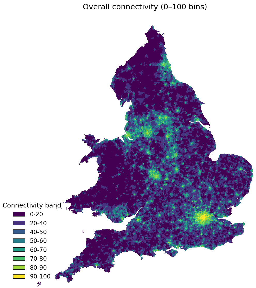
What the Maps Show
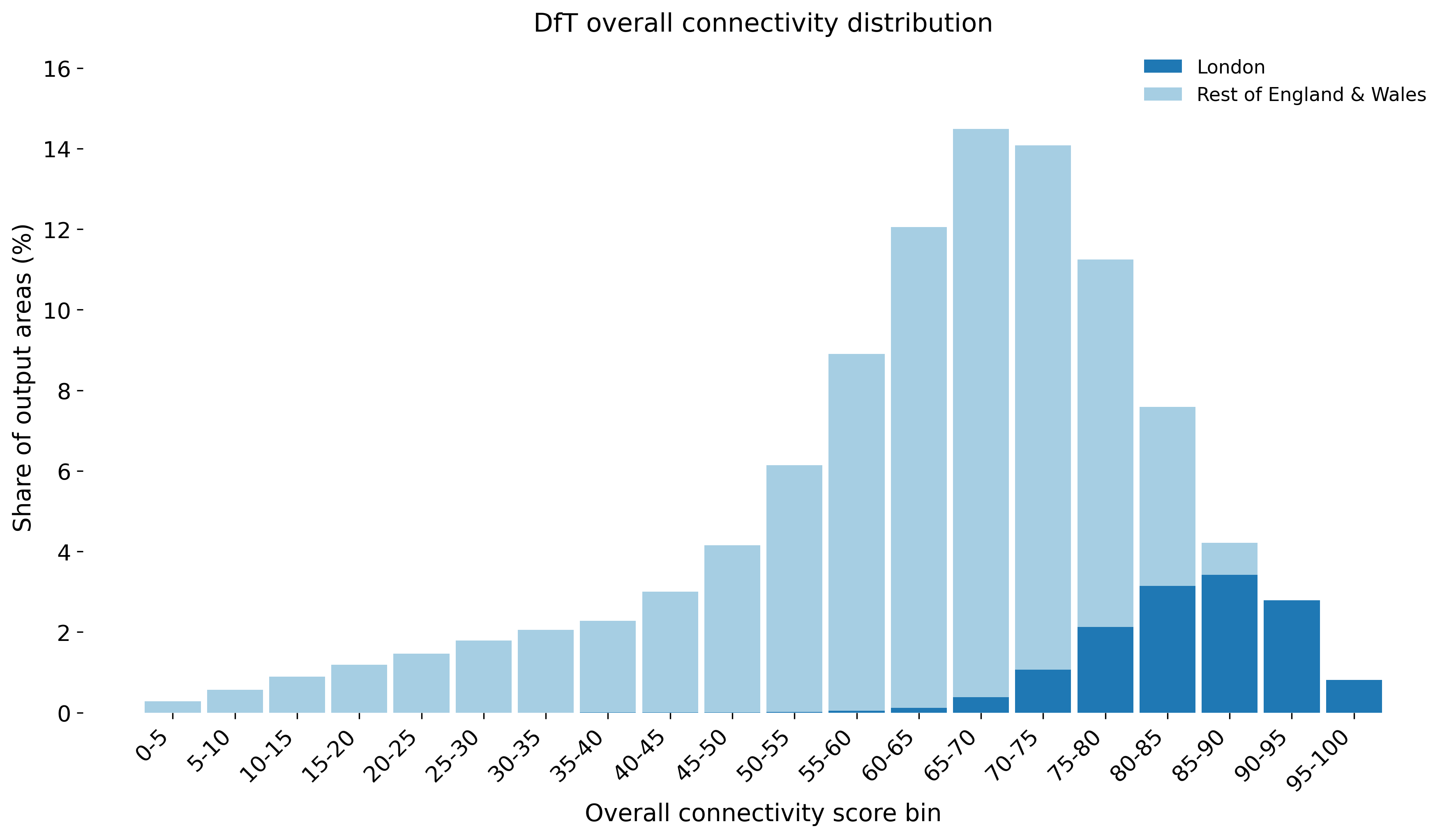
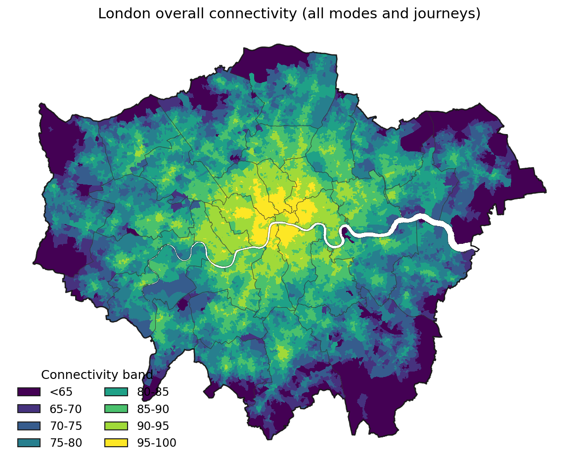
At the national scale, the patterns are intuitive: major cities score highest, while rural and coastal areas drop off sharply (see image at top). London particularly scores head and shoulders above everywhere else. In fact, every single output area in England and Wales that scores over 90 is in London.
London Case Study
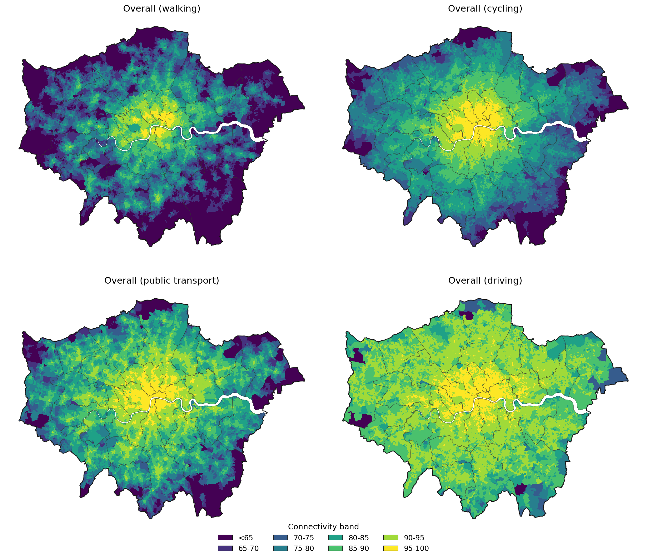
Breaking down the results by mode reveals some clear trends:
- Walking: Extremely high connectivity in the core of central London, but it drops off within a few kilometres.
- Public transport: Strong corridors along Underground, Overground, and rail routes, but patchier between them.
- Cycling: A bit more even — still higher in inner London but extending further.
- Driving: Surprisingly high everywhere, reflecting uncongested travel times assumed by the model (though arguably less realistic for inner zones). In fact, the DfT itself calls driving “the great equaliser”: it flattens differences by connecting even rural origins to distant destinations, albeit in ways that depend on congestion and road hierarchy.
And by purpose:
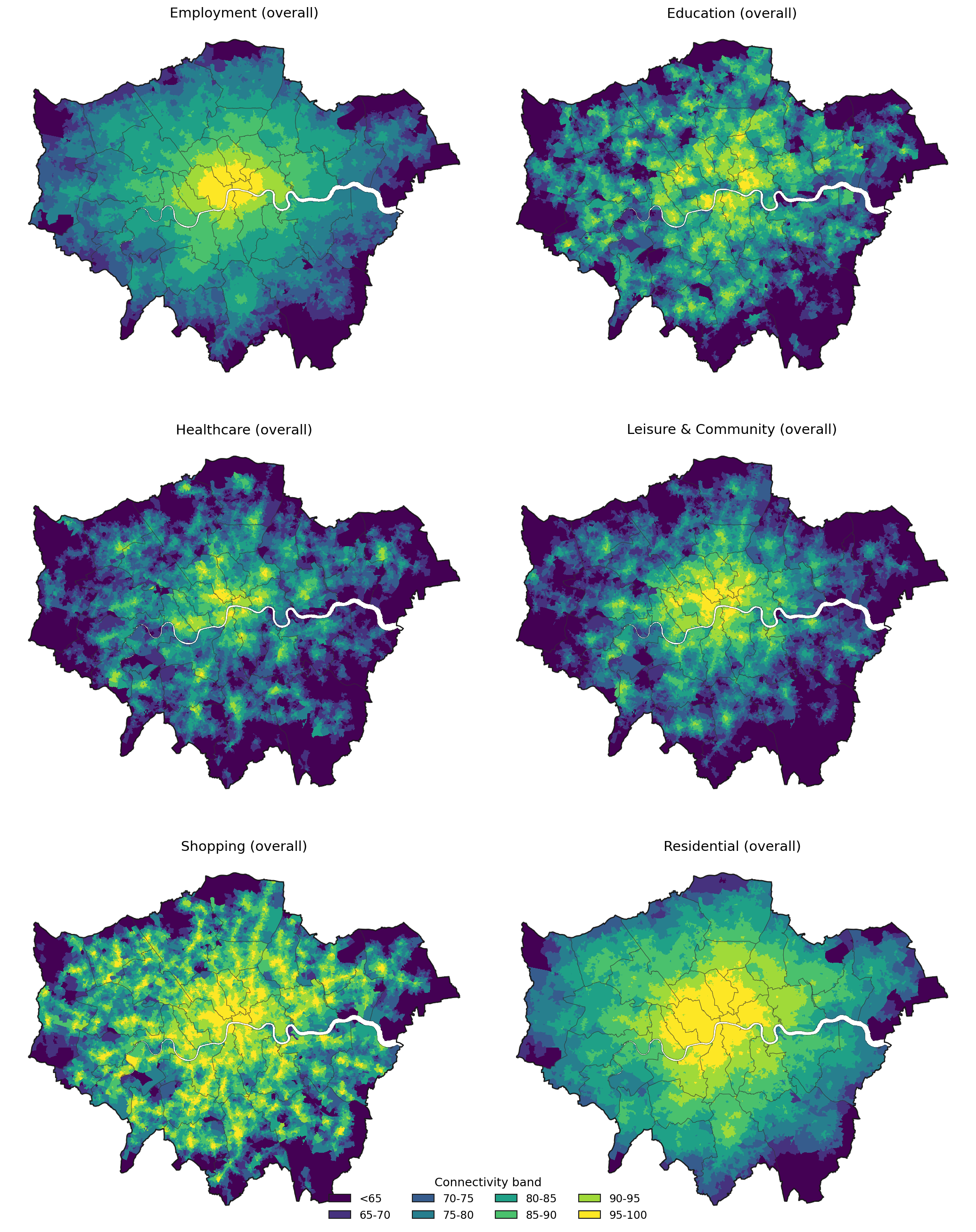
- Employment and residential access decline gradually from the centre outward, which makes sense because jobs and homes are widespread.
- Healthcare and education form sharp clusters around hospitals and schools.
- Leisure, shopping, and community access closely mirror population density and retail hubs.
Together, these maps tell a story of a city that’s well-connected by almost any measure, yet differently so depending on how you move, and what you’re moving for.
Strengths of the Metric
For planners, the DfT metric represents a significant step forward: a standardised, multi-modal measure of accessibility for England and Wales. While journey time statistics have existed for years, this is the first attempt to combine multiple modes and purposes into a single national framework.
Strengths include:
- Multi-modal and multi-purpose: Combines four transport modes and six destination types.
- Consistent methodology: Enables cross-regional comparison (e.g. London vs. Leeds).
- Scalable: Available at Output Area and even 100m grid resolution for local analyses.
Limitations and Questions
As with any model, the choices made in its construction – what to include, what to simplify, what to leave out – fundamentally shape its utility. The DfT metric makes several assumptions that deserve scrutiny:
Limitations include:
- England and Wales only. Scotland and Northern Ireland are not included, limiting “UK-wide” comparisons.
- Closed source. The Connectivity Tool, many of the datasets, and key parameters are not open or accessible to allow for reproduction by consultants, researchers, or the public.
- Simplified assumptions. No accounting for cost, comfort, safety, or post-COVID travel behaviour.
- Limited customisation. Users can’t easily tweak parameters (e.g. time limits, purposes, or local network data.)
- Temporal aggregation By averaging across time slices, the metric may mask peak-hour constraints or off-peak service gaps that matter greatly to real users.”
In short, it’s a great benchmark, but how it should be used to support planning remains up in the air.
How It Compares to PTAL
If you’re used to London’s Public Transport Access Level (PTAL), the DfT metric might feel both familiar and alien. PTAL rates locations 0–6b based purely on public transport frequency and distance – a wonderfully simple indicator of potential mobility.
By contrast, the DfT metric measures real opportunity: how many valuable destinations you can reach within an hour.
That nuance is powerful but also slippery. As we showed in our PTAL vs Connectivity post, the two measures can tell very different stories:
- PTAL loves stations. A site near East Croydon scores 6b — the highest possible — even if most trips are long-distance.
- DfT loves destinations. The same site scores closer to mid-range, since most nearby jobs, schools, and shops are still a journey away.
- Planning implications: A “high PTAL” site might not actually have good local connectivity; conversely, an area with modest PTAL but dense local amenities could score high in the DfT model.
Used together, these metrics can help planners distinguish between access to transport and access through transport, a subtle but crucial difference.
While novel for England, the DfT's Connectivity Metric has many similarities with other multi-modal connectivity metric's such as NREL's Mobility Energy Productivity metric. Similarly, cumulative opportunity measures (counting all destinations within X minutes) offer simplicity at the cost of ignoring diminishing returns.
Each approach has trade-offs. The DfT metric's strength lies in its comprehensive scope; its weakness in the assumptions baked into that scope.
Why It Matters
The DfT’s work is a major step toward more evidence-based accessibility planning. For years, data has been fragmented between different tools: PTAL for London, Journey Time Statistics for the regions, and countless bespoke local models. The connectivity metric offers a chance to unite them, but it's also not neccessarily fully attuned to local needs.
In the end, openness and flexibility will determine its real impact. A model that can’t be interrogated or adapted risks becoming just another static map, which is essentially just a beautifully coloured black box.
That’s where transparent, interactive platforms like Podaris can make a difference: by bringing transparency, reproducibility, and collaboration to data that was previously locked away.
Making Connectivity Metrics Work for You
At Podaris, we've built tools that complement and extend accessibility analysis, including a full implementation of the DfT methodology. This allows planners to:
- Change the time thresholds (e.g. 90 vs 60 minutes);
- Adjust mode weights or destination categories;
- Plug in your own local data for jobs, healthcare, or education;
- Compare baseline vs. scenario connectivity for new developments;
- Export interactive maps and accessibility curves.
This reproduction complements our public visualiser, where anyone can explore the official DfT data interactively. Or, book a demo to see how you can run your own scenario-based connectivity models anywhere in the world.
Whether you're exploring the national picture or planning specific interventions, understanding connectivity requires both standardised metrics and the flexibility to adapt them to local contexts.