When the Department for Transport released its national Transport Connectivity Metric at the end of 2025, it also released an official tool to explore the results. But there's a catch: you can't download the underlying 100 metre data.
That's the limitation we've heard about most. Planners, consultants, academics, and analysts want to do more than look at a connectivity score on a map. They want to pull it into QGIS, join it to their own datasets, drop it into a report, or feed it into a model. When you can view the data but not export it, none of that is possible.
So we added it to our free connectivity visualiser, available to anyone. This post walks through exactly how.
Ways to get the data out
There are a few ways to export from the visualiser, depending on what you need:
- A full data export. The complete connectivity dataset for an area you define, delivered as a GeoJSON you can open in any GIS. This is the one most people are here for.
- A public API. Point lookups and programmatic exports, for anyone who'd rather script it.
- A quick summary CSV. Headline comparison statistics for whatever you've selected, downloaded instantly in your browser.
We'll take them in that order.
The full data export
This is what people have been asking for: the actual per-area connectivity data, boundaries and all.
Step 1: Choose your area
Click the Export button on the map to open the export menu. You have three ways to define what to download:
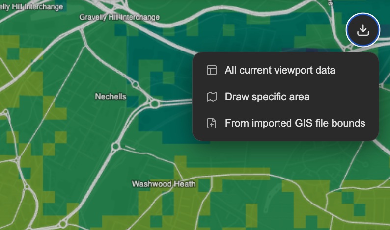
- All current viewport data. Exports everything currently in view. Pan and zoom to frame the area you want, and it grabs the bounding box.
- Draw specific area. Draw a polygon directly on the map to capture an exact catchment, corridor, or study boundary.
- From imported GIS file bounds. Drag in a GeoJSON of your study area (for example, a scheme boundary or a set of wards) and export to match its extent.
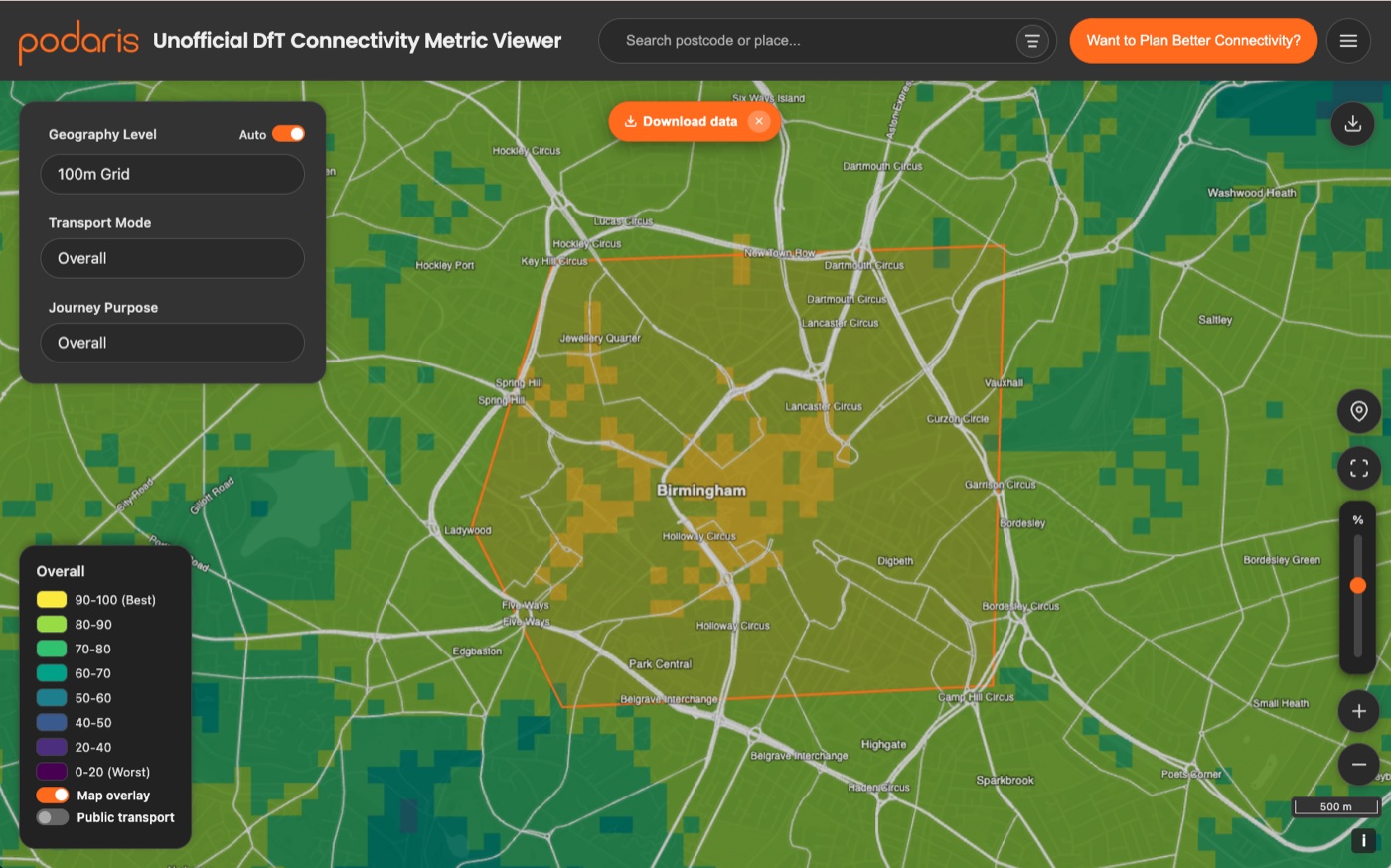
Step 2: Pick your geography level
The export uses whichever geography you're currently viewing, so switch to the resolution you need before exporting:
| Level | What you get |
|---|---|
| 100m grid | The finest resolution: every 100×100m cell |
| Output Area (OA) | The most detailed census geography |
| LSOA | Lower-layer Super Output Areas |
| Local Authority (LAD) | One row per district |
| Region | One row per region |
Larger, finer-grained areas take longer to process, so there are sensible limits. 100m grid downloads are fine for local authority districts, but if you want data for a larger area, you may need to download in chunks or choose a coarser resolution.
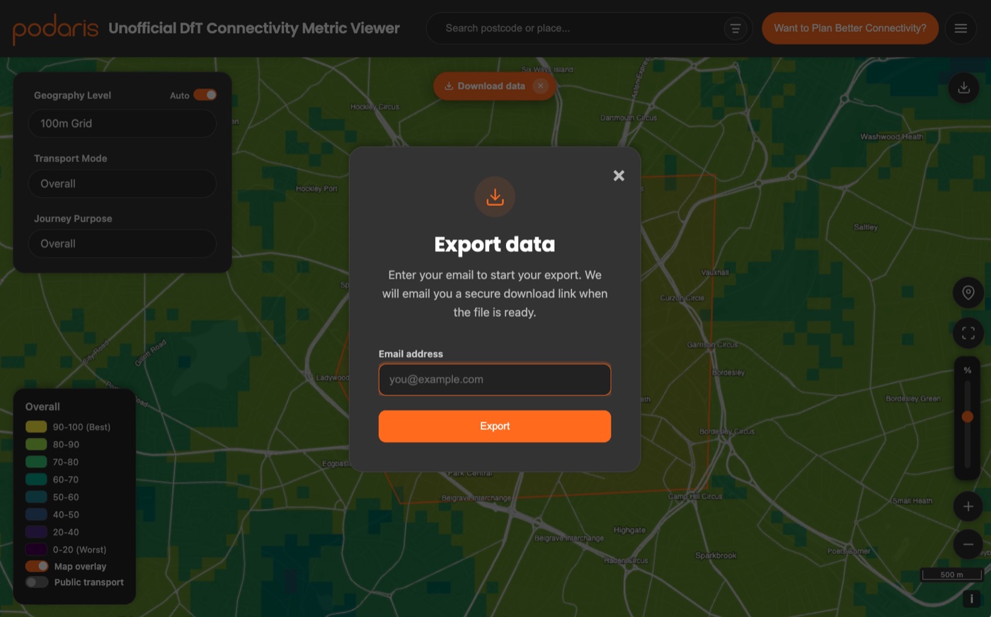
Step 3: Enter your email, get a secure link
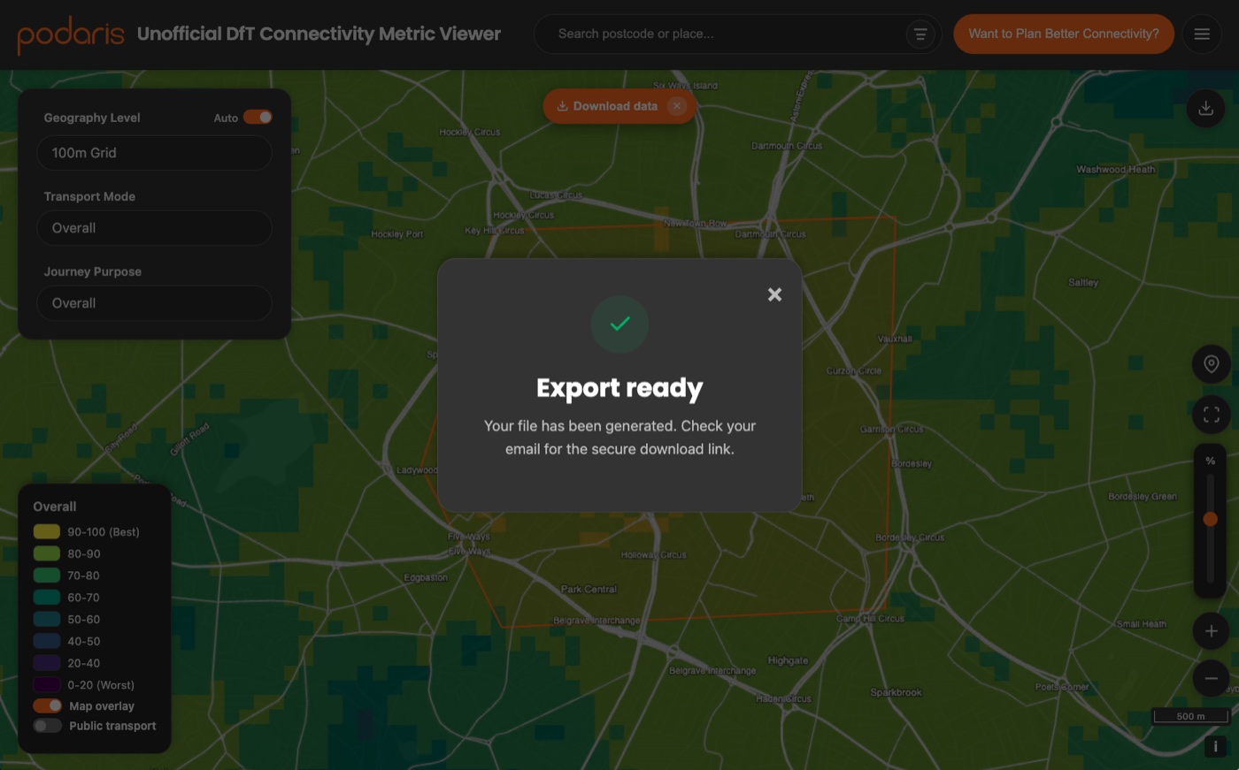
Because a full export can involve millions of rows, it runs as a background job rather than freezing your browser. Enter your email, and we'll generate the file and email you a secure download link when it's ready, usually within a minute or two.
What's in the file
You get a GeoJSON FeatureCollection: one feature per area, with the boundary polygon (or the 100m cell) as the geometry, and the connectivity scores attached as properties. Open it directly in QGIS, ArcGIS, or anything that reads GeoJSON, with no joining required.
Each feature carries the full breakdown described in our methodology post: the 4 modes (walking, cycling, public transport, driving) across the 6 purposes (employment, education, healthcare, shopping, leisure & community, residential), plus the overall scores: properties like Healthcare (cycling), Employment (walking), and Overall.
Every feature also carries level and level_code, plus the geography codes that make sense at the level you exported, so you can join it to your own data. A 100m grid or OA export nests all the way up (oa, lsoa, lad, rgn); a local authority export carries just lad and rgn; a region export carries rgn. Codes that would always be empty at a given level are left out.
The developer API
If you'd rather script it, the same data is available through a public API. Request a key (emailed to you), then you can do point lookups or kick off exports programmatically. The API contract (PDF) has the endpoints, the export area limits, and the output schema.
# 1. Request an API key — it's emailed to you
curl -X POST https://labs.podaris.com/api/connectivity-metric-extractor/access/request-key \
  -H "Content-Type: application/json" \
  -d '{"email":"you@example.com"}'

# 2. Look up connectivity at a single point
curl "https://labs.podaris.com/api/connectivity-metric-extractor/v1/connectivity?lat=51.5074&lon=-0.1278&level=lsoa&include_metrics=true" \
  -H "Authorization: Bearer dft_live_..."

# 3. Kick off an export (GeoJSON or CSV) for a bounding box or polygon
curl -X POST https://labs.podaris.com/api/connectivity-metric-extractor/v1/export \
  -H "Authorization: Bearer dft_live_..." \
  -H "Content-Type: application/json" \
  -d '{"level":"lsoa","format":"geojson","geometry":{"type":"bbox","bbox":[-0.51,51.28,0.33,51.69]}}'
Exports return a job ID you can poll, and a download endpoint once the job is done. It's the same engine that powers the in-browser export, so you get identical data: CSV or GeoJSON, at any of the five geography levels.
The quick summary CSV
Finally, if all you want is the numbers behind the panel (how an area compares to its region, its local authority, and the national picture), there's a faster route that skips the export flow entirely.
Open the “See stats & compare” panel, select an area (a local authority, a region, a drawn area, or the whole country), and click the download button in the panel header.
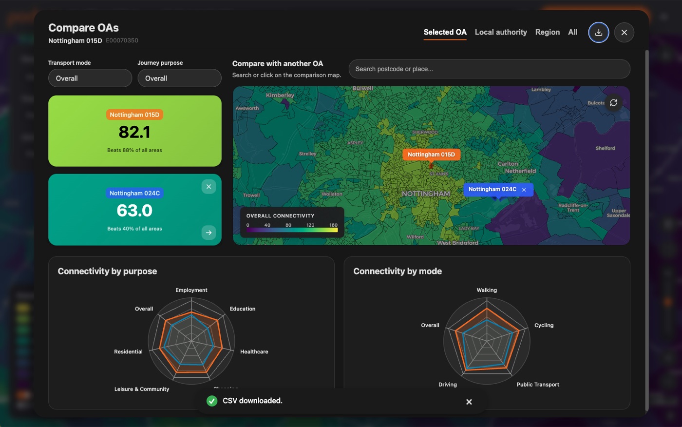
You'll get a CSV straight away, with the comparison sections exactly as shown in the panel. It's ideal for dropping a quick benchmark into a spreadsheet or a slide, and it never leaves your browser.
A complement to the DfT's work
Releasing the Connectivity Metric, along with a free tool anyone can use to explore it, was a real step forward for evidence-based planning in England and Wales. We wanted to build on it.
A metric like this is most useful when the people who do the day-to-day work (planners, consultants, researchers, community groups) can take the data into their own workflows. That's what we've added: a fast, free way to get it out of a map and into QGIS, a spreadsheet, or a model. As we've written before, the more a metric can be explored, reproduced, and built upon hands-on, the more valuable it becomes to everyone. Making the data downloadable, for free, is a small step in that direction.
Please note: This is an unofficial viewer created by Podaris and is unaffiliated with the Department for Transport. The DfT has had no involvement in creating this tool.
From viewing to planning
Downloading the official data is where a lot of analysis starts. The harder questions come next: What happens to connectivity if we add this bus route, extend this rail line, or build this new hospital? The official metric is a static snapshot: it can tell you what connectivity is today, but not what your intervention would do to it.
While the official tool can help with some of that, Podaris:Insight is even more powerful. We've built a full implementation of the DfT connectivity methodology into the platform as a connectivity analysis type (as close as possible, based on open data), so you can go beyond the published data and:
- Model scenarios: compare baseline vs. proposed connectivity for a new route, scheme, or development;
- Change the assumptions: adjust time thresholds, mode weights, or destination categories;
- Bring your own data: plug in local jobs, healthcare, or education datasets, or even change the street network for a new development;
- Work anywhere: run connectivity analysis outside England and Wales, where the official metric doesn't reach.
The free visualiser lets you explore and download the official picture. Podaris lets you plan around it.