When we wrote about how to download DfT Connectivity Metric data from our free visualiser, one reply kept coming back: could it not just go straight into QGIS? It's a fair question. For most of the planners who got in touch, the visualiser was never really the destination; their GIS was. And getting the data across by hand, with a GeoJSON downloaded, dug out of the Downloads folder, dragged onto the canvas and styled from scratch, was always going to feel like a lot of clicks for something headed to the same place anyway.
So we've built a QGIS plugin that skips the round trip. It drops the connectivity data straight into the Processing Toolbox, alongside Buffer and Clip, and hands back a styled layer for whatever area you happen to be looking at. And because it now lives in the official QGIS plugin repository, installing it is a search away, with updates arriving automatically like any other plugin you already use.
A quick note before we go further: this is an unofficial plugin, built by us and unaffiliated with the DfT. It fetches the metric's published open data; it isn't endorsed by, or connected to, the Department.
What it does
The plugin (Podaris in the plugin manager) adds one tool to begin with: Download connectivity data. You give it an area and a geography level, and it gives you back a polygon layer with the full connectivity breakdown attached, already coloured.
Because it's a Processing algorithm rather than a bespoke dialog, it inherits the framework's niceties for free. It's findable in the Toolbox search, runs in batch across many study areas at once, and drops into the Model Builder as one step in a saved, shareable workflow.
Installing it
The plugin lives in the official QGIS plugin repository, so there's nothing to download by hand. In QGIS, open Plugins -> Manage and Install Plugins…, type Podaris into the search box, select the Podaris plugin, and click Install Plugin.
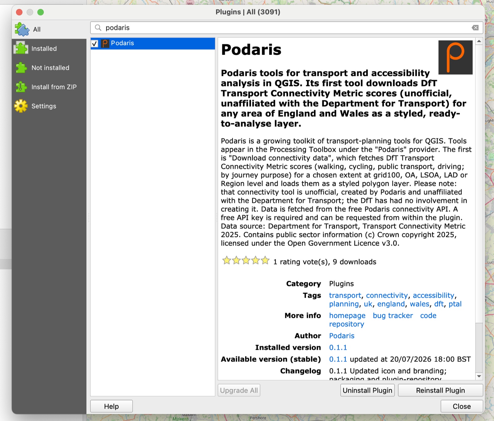
It needs QGIS 3.22 or newer, and nothing else. No Python packages to install, no dependencies to fetch. That last part matters, because installing packages from inside QGIS is exactly the thing that falls over on a locked-down work laptop. Everything the plugin needs is already in QGIS.
It installs into your own user profile, so no admin rights, and QGIS updates it in a click whenever a new version lands.
Getting a key
The data is free, but exports run on our servers, so we ask for an email address once.
Open Plugins -> Podaris -> DfT connectivity: API key…, enter your email, and click Email me a key. Paste the key that arrives into the box and hit Save. That's the last time you'll think about it. The key is stored in your QGIS settings and reused for every export.
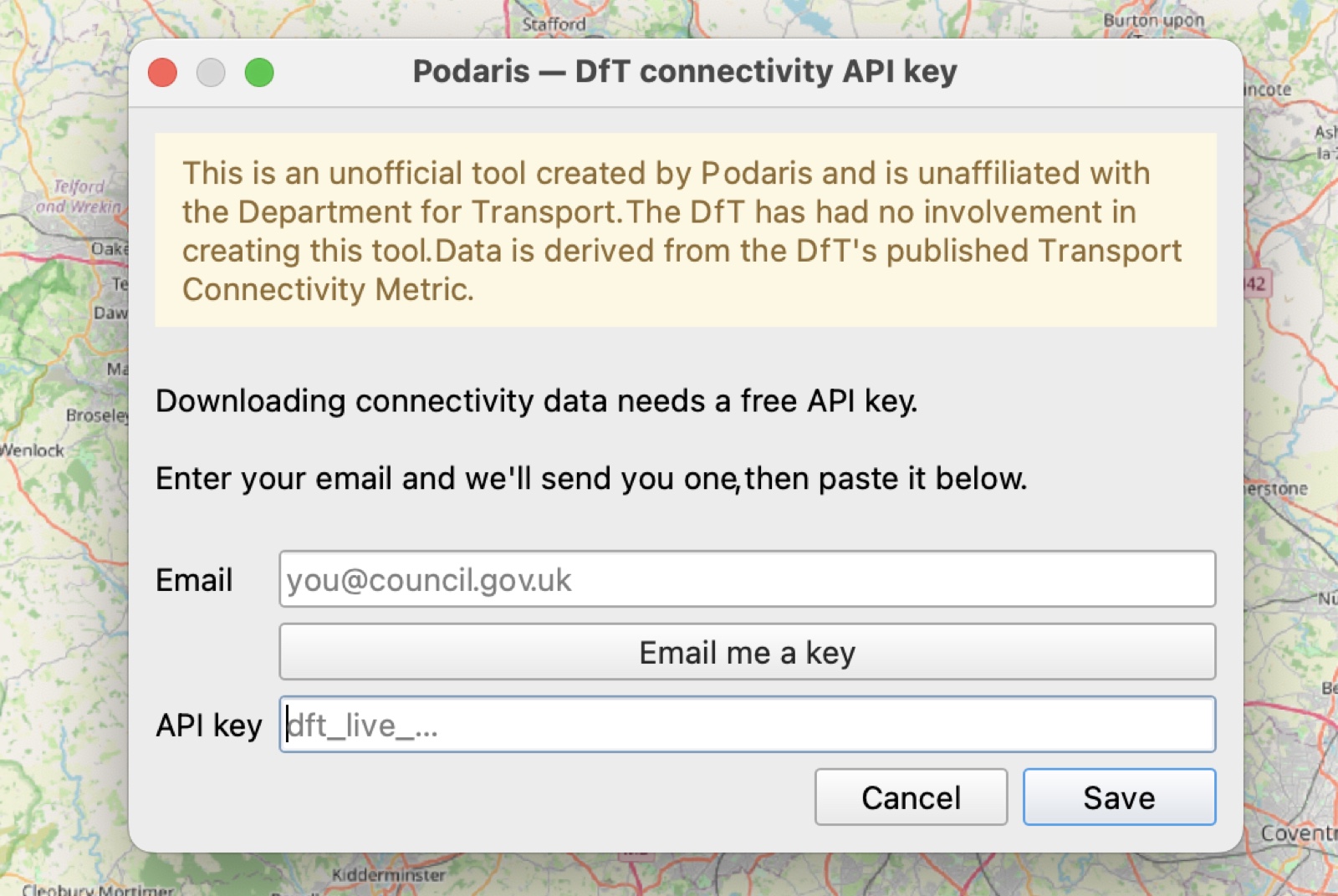
It's the same key as the public API, so if you already have one from scripting against the API, paste that in instead.
Pulling your first layer
Open the Processing Toolbox (Ctrl+Alt+T, or ⌘⌥T on a Mac), search for connectivity, and open Download connectivity data. You'll find it under the Podaris provider.
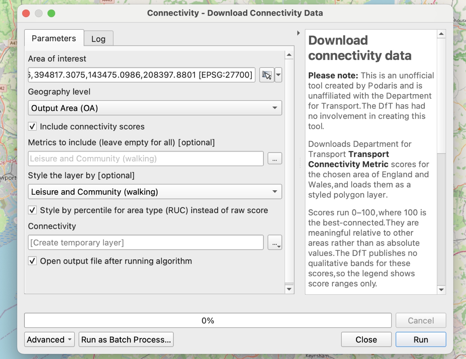
Area of interest. Click the … button and choose Use Current Map Canvas Extent to grab whatever you're looking at, or Draw on Map Canvas to rubber-band a study area.
Geography level. The same five levels the visualiser offers:
| Level | What you get |
|---|---|
| 100m grid | The finest resolution: every 100×100m cell |
| Output Area (OA) | The most detailed census geography |
| LSOA | Lower-layer Super Output Areas |
| Local Authority (LAD) | One row per district |
| Region | One row per region |
Metrics to include. Leave it empty for all 35 scores, or pick a subset. Overall is always added, so the layer can still be styled.
Style the layer by. Pick which score drives the colours. Overall by default, but you might want Healthcare (public transport) or Leisure and Community (walking). Every score still lands in the attribute table; this only chooses what you see.
Style by percentile for area type (RUC). For the small-area levels (100m grid, OA and LSOA) you can colour each area by where its score sits within its own area-type peer group, its 2011 Rural-Urban Classification, rather than by the raw 0 to 100 value. That's the same idea as the DfT's own Connectivity Matrix, which judges a score against similar types of place rather than the whole country. Raw scores are dominated by how urban somewhere is, so this is what makes a well-connected village stand out from other villages instead of vanishing under the cities. It rides along in the attribute table as a … percentile (RUC) column.
Click Run. The Log tab reports progress while the export builds on our side: the area it measured against the level's limit, the export queueing and completing, and the export job ID (worth quoting if you ever need to ask us about a run).
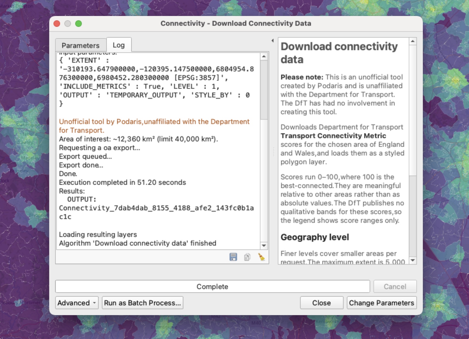
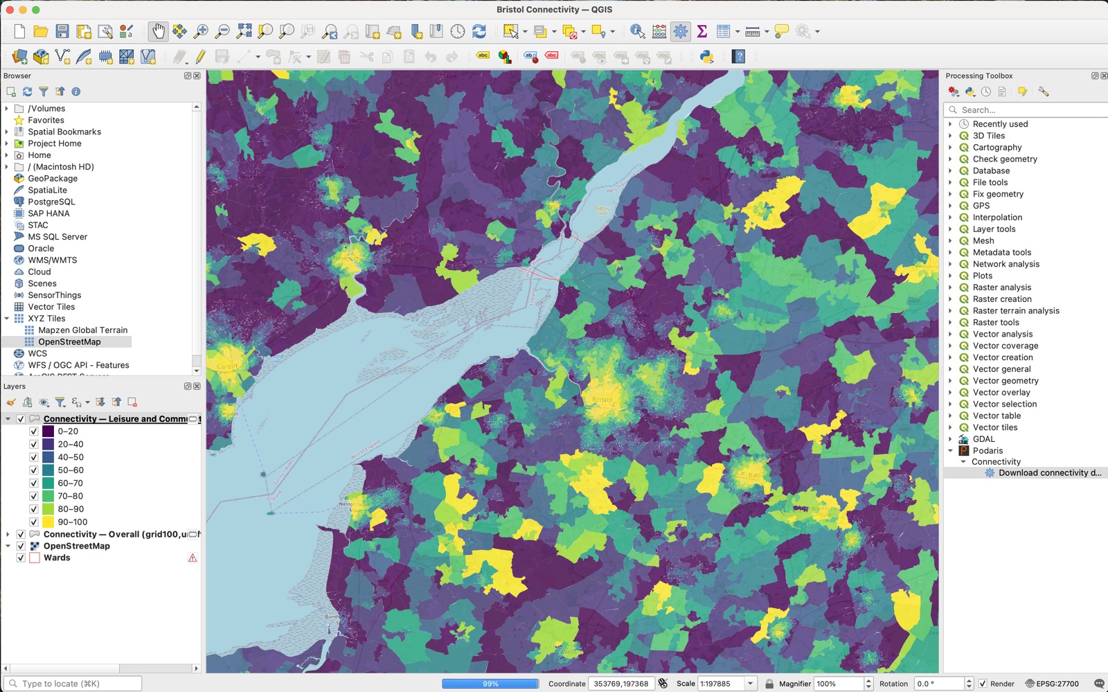
Then the styled layer loads into your project, ready to analyse. Here it's an Output Area layer across the Bristol–Severn region, coloured by the Leisure & Community (walking) score as an RUC percentile, so the bright cores are the areas best-connected for their area type, not just the biggest cities.
What you get
A polygon layer in EPSG:4326, one feature per area, with the boundary (or the 100m cell) as the geometry.
Every feature carries the 4 modes (walking, cycling, public transport, driving) across the 6 purposes (employment, education, healthcare, shopping, leisure & community, residential), plus the overall scores: properties like Healthcare (cycling), Employment (walking), and Overall. Alongside them sit level, level_code, and the geography codes that make sense at that level, so you can join straight to your own data.
The layer arrives styled with the same viridis ramp as the visualiser, binned into score ranges. Remember that the scores are meaningful relative to other areas, not as absolute judgements.
Area limits
Finer geographies cover less ground per request. A 100m grid export of a whole region would run to tens of millions of cells, so there are caps:
| Level | Maximum area |
|---|---|
| 100m grid | 5,000 km² |
| Output Area | 40,000 km² |
| LSOA | 90,000 km² |
| Local Authority | No limit |
| Region | No limit |
The plugin checks your extent against these before sending anything, so an area that's too large fails instantly with a message telling you how far over you are, rather than after a long wait. If you need a bigger 100m-grid area, export it in tiles or step down to Output Areas.
Troubleshooting tips
A few things you might hit:
- “No API key set." You skipped the key step, or saved an empty box. Open Plugins -> Podaris -> DfT connectivity: API key…
- “The chosen area is about X km², over the Y km² limit." Zoom in, or pick a coarser geography level. Nothing was sent.
- “The request was blocked before it reached the API." Usually a corporate proxy or firewall between you and the internet, rather than anything wrong with your key.
- “The export contained no features." The extent falls outside England and Wales, which is as far as the published data reaches.
A complement to the DfT's work
Please note: This is an unofficial tool created by Podaris and is unaffiliated with the Department for Transport. The DfT has had no involvement in creating this tool.
The Connectivity Metric is a genuinely useful piece of public infrastructure, and it gets more useful the closer it sits to the tools people actually work in. A planner shouldn't have to think about GeoJSON files, download links, or colour ramps to answer a question about healthcare access by bus. They should be able to type “connectivity” into the toolbox they already have open.
The data is © Crown copyright 2025, published by the Department for Transport under the Open Government Licence v3.0. The plugin just fetches it and colours it in.
From viewing to planning
Getting the official data into QGIS is where a lot of analysis starts. The harder questions come next: What happens to connectivity if we add this bus route, extend this rail line, or build this new hospital? The published metric is a static snapshot. It can tell you what connectivity is today, but not what your intervention would do to it.
Podaris:Insight implements the published DfT connectivity methodology from open data as a full analysis type, and where the published documentation leaves room for interpretation, we document the choices we made. That means you can go beyond the published data and:
- Model scenarios: compare baseline vs. proposed connectivity for a new route, scheme, or development;
- Change the assumptions: adjust time thresholds, mode weights, or destination categories;
- Bring your own data: plug in local jobs, healthcare, or education datasets, or even change the street network for a new development;
- Work anywhere: run connectivity analysis outside England and Wales, where the official metric doesn't reach.
The plugin brings the official picture into your GIS. Podaris lets you plan around it.