Adelaide changes the game. Unlike Darwin, Hobart, and Canberra, Adelaide is the first truely multi-modal city in this analysis series, and the results tell a compelling story about why integrated transport networks matter.
Missed previous cities? Checkout out:
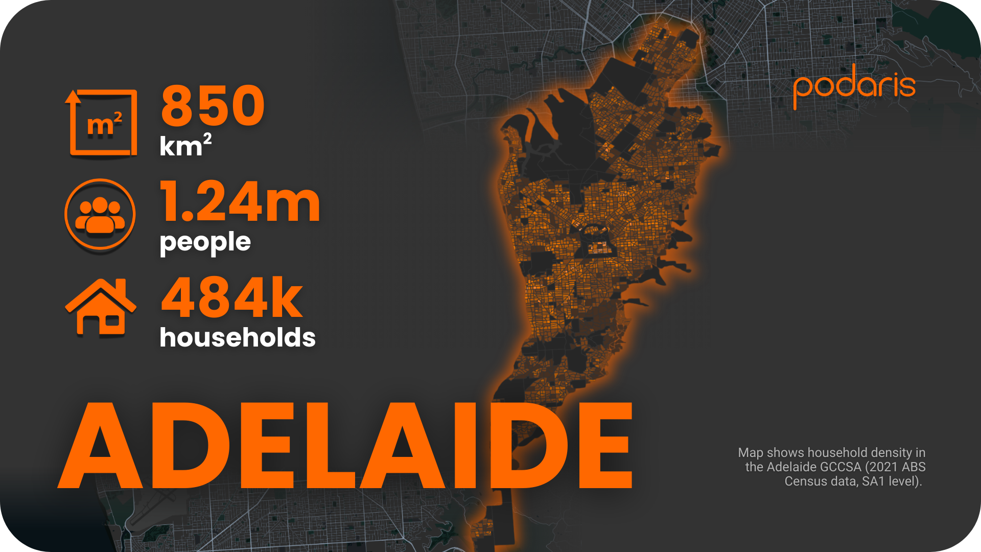
Introducing Adelaide
The Adelaide Greater Capital City Statistical Area covers around 850 sq. km, home to 1.24 million people and 484,000 households. With three public transport modes layered across the city, Adelaide provides a useful case for testing accessibility at scale—and for showing how Podaris can quickly model and analyse multi-modal systems.
Step 1: Building the network
Using Podaris:Plan, we imported Adelaide’s GTFS feeds for bus, tram, and rail. Podaris makes it straightforward to process large, multi-modal datasets—automatically optimising, filtering, and integrating them into a single network model.
For Adelaide, we also overlaid ABS 2021 household and population data at SA1 level, creating a demographic base to test accessibility against. With Podaris, custom datasets can also be imported, meaning this type of analysis can be tailored for any project context.
Step 2: Analysing accessibility
Adelaide was the first city in our series where the range of Podaris:Insight tools really came into play. For this case, we focused on two key metrics:
Stop catchments
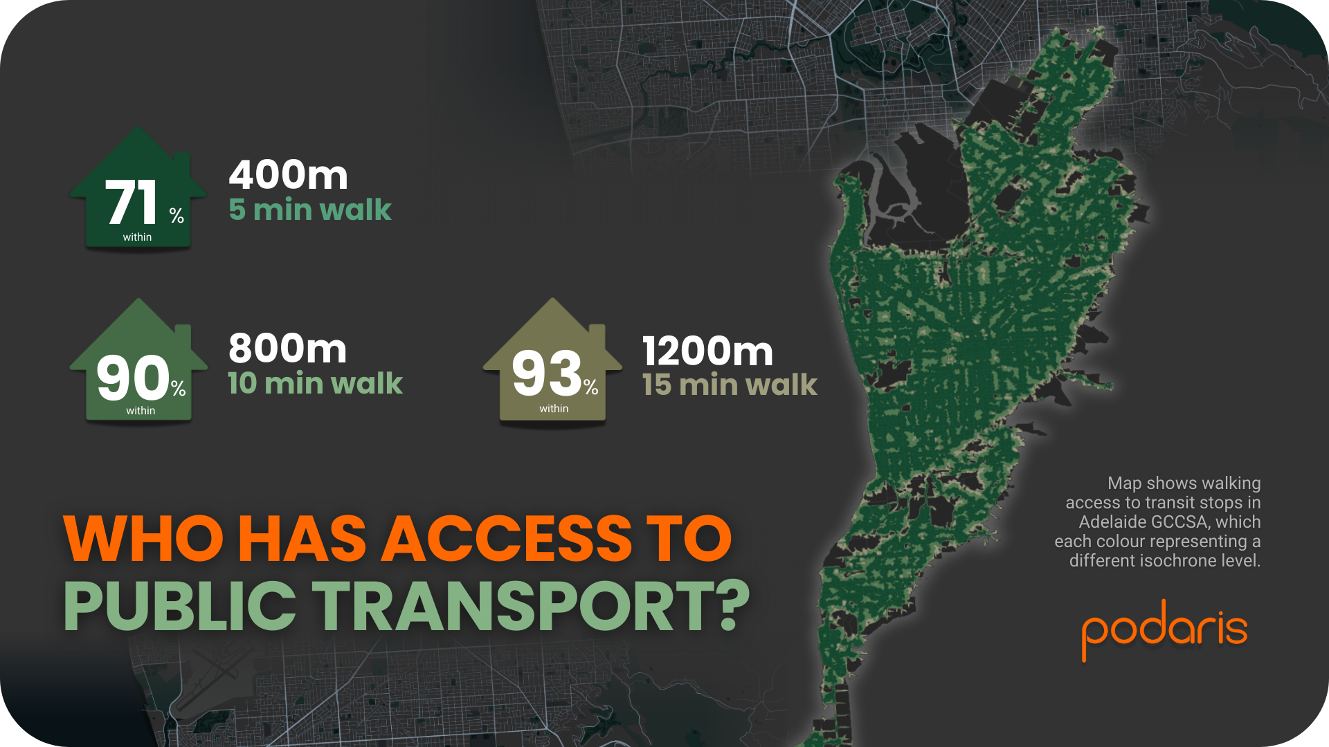
By running isochrone analysis, we measured how many households were within easy walking distance of a public transport stop (bus, tram, or rail). The results:
Three out of four Adelaide households live within a five-minute walk of public transport. By the time you reach a ten-minute walk, you've captured 90% of the city.
Compared with Darwin and Hobart, this shows a stronger reach across the city—likely a reflection of Adelaide’s multi-modal coverage. Stop catchments could be run for particular modes in isolation.
Public Transport Accessibility Levels (PTAL)
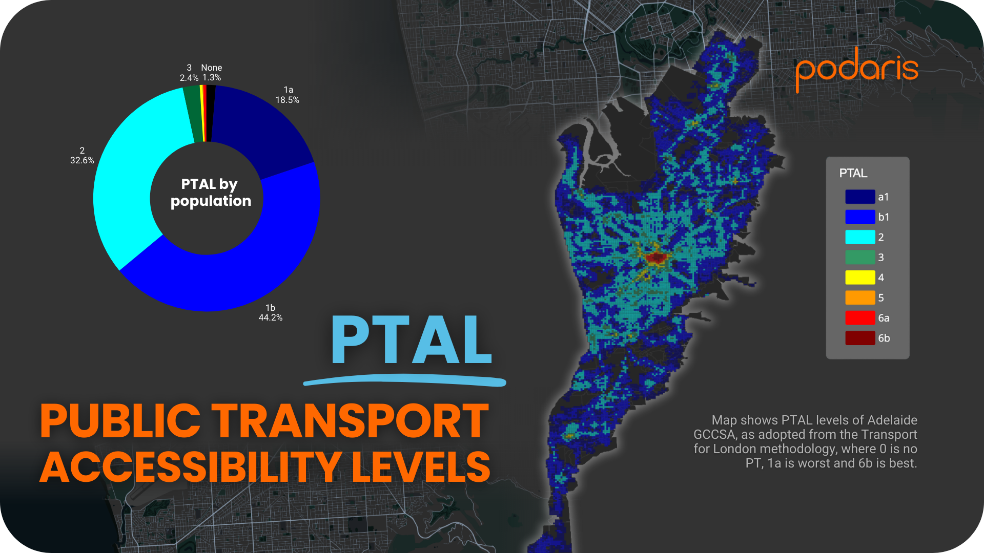
Using the Transport for London methodology, we ran average PTAL analysis during the morning peak (06:30–09:00). This gave us a detailed look at service accessibility and intensity:
- 18.5% in PTAL 1a
- 44% of the population sits in PTAL 1b
- 32.6% in PTAL 2
- Small but notable proportions in PTAL 3–6, including a tiny share (0.1%) reaching the top band (6b)
This is the first city in our scorecard with PTAL scores in the best category (6b) — showing the clear accessibility benefits of multi-modal provision.
What we learned
The Adelaide analysis highlights a few key takeaways:
- Multi-modal integration matters: Adding tram and rail significantly increases accessibility compared to bus-only cities.
- Podaris handles complexity with ease: Large, multi-modal GTFS feeds are processed in minutes, with corridor-level and citywide insights generated almost instantly.
- Clearer accessibility gradation: Unlike Darwin and Hobart, Adelaide shows a fuller spread of PTAL scores, which allows for more nuanced benchmarking.
As always, it’s worth noting PTAL’s limits: it measures how much service is nearby, but not where those services connect. Still, it remains a useful first-cut tool for identifying coverage and frequency strengths.
Final thoughts
Adelaide is a turning point in our Australian Transport Scorecard series—the first city where Podaris demonstrates its strength in modelling complex, multi-modal networks. With a single platform, planners can move from importing GTFS data, to visualising catchments, to producing detailed accessibility metrics—all in a fraction of the time traditional methods require.
Curious how your city's network measures up? We're working our way through Australia's capitals - Perth and Brisbane are next. Which metrics matter most to your city?
Want to run this analysis for your network? The same tools that powered this scorecard are available to transport planners worldwide.
Learn more at podaris.com