For part three of our Australian Transport Scorecard series, we move to the Nation’s Capital. Canberra is the first city in our analysis to feature both bus and light rail, offering a different perspective compared with Darwin and Hobart’s bus-majority networks.
Missed previous cities? Checkout out Darwin's analysis and Hobarts's analysis
Introducing Canberra
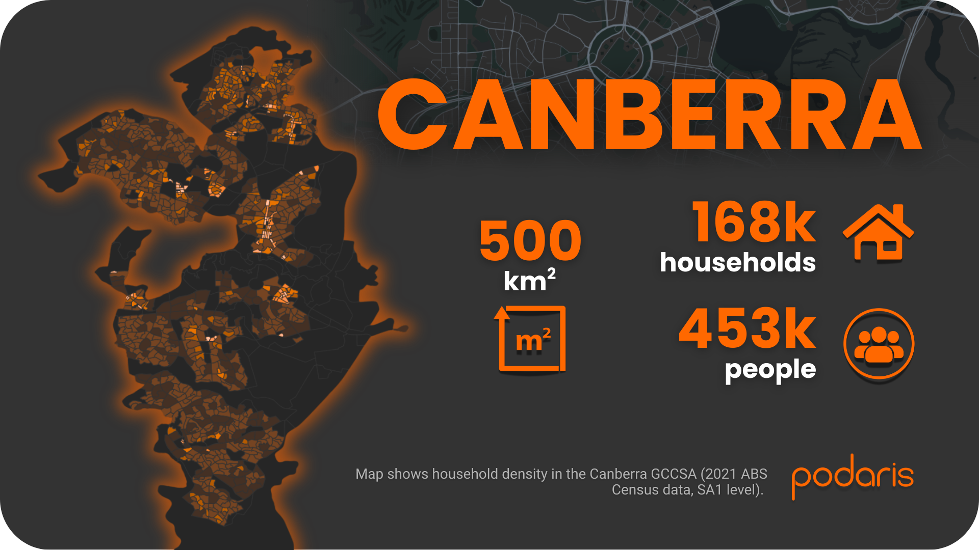
The Canberra Greater Capital City Statistical Area (ACT portion) covers around 500 sq. km, with 453,000 people and 168,000 households. The city’s planning history, built around town centres connected by arterial corridors, makes it an interesting case for accessibility Podaris analysis.
Step 1: Building the network
Using Podaris:Plan, we imported GTFS data for Canberra’s bus and light rail services. Podaris handles GTFS efficiently, even with multi-modal systems, and enables filtering, optimisation, and customisation of data to suit different planning needs.
We then overlaid ABS 2021 household and population data at SA1 level, creating a demographic baseline to measure accessibility against.
Step 2: Analysing accessibility
We applied two core Podaris:Insight tools to Canberra’s network:
Stop catchments
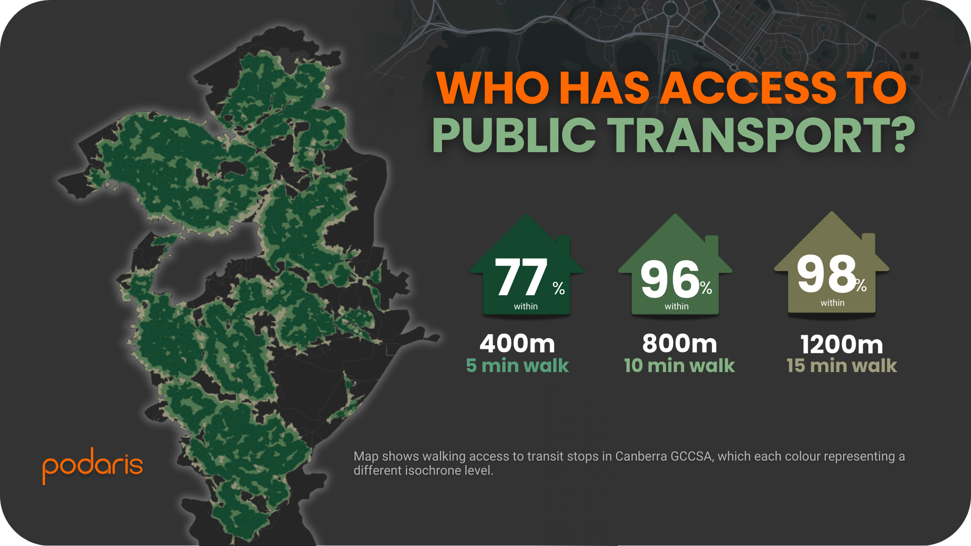
Isochrone analysis showed strong coverage compared to Darwin and Hobart:
- 77% of households within 400m (five minutes) of a stop or station
- 96% within 800m
- 98% within 1.2km
This is significantly higher than Darwin (61% within 400m) and Hobart (60%), showing how Canberra’s combination of buses and light rail provides broader coverage.
Public Transport Accessibility Levels (PTAL)
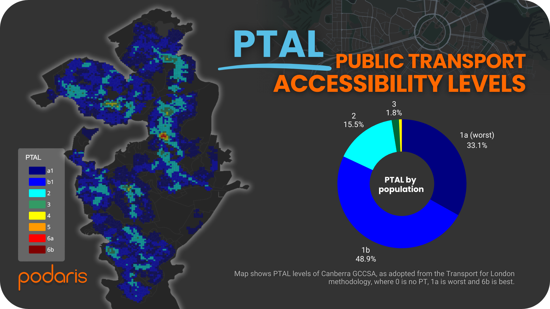
Using the London methodology, we analysed average PTAL scores (at a SA1 level) for the morning peak (06:30–09:00). The results:
- Nearly 80% of the population sits in PTAL bands 1a or 1b (low accessibility)
- 15% in PTAL 2
- A very small share (2.5% combined) in PTAL 3–5
- 3.3% of the population outside the network altogether
Compared with Darwin and Hobart, Canberra’s results are more mixed: better stop coverage, but still low intensity of services across much of the city.
What we learned
The Canberra case shows how Podaris can:
- Handle multi-modal integration (bus and light rail) seamlessly
- Combine demographics and network analysis to highlight accessibility strengths and gaps
- Support comparative benchmarking across cities
As with Darwin and Hobart, PTAL alone doesn’t tell the full story: it measures how much service exists nearby but not where those services connect. Still, the combination of stop catchments and PTAL offers powerful first-step insights.
Final thoughts
Canberra illustrates the value of adding even modest modal diversity into a network. While service intensity remains limited, household coverage is among the strongest we’ve seen so far in the series.
Together, Darwin, Hobart, and Canberra show how Podaris makes it simple to compare cities of similar size, quickly delivering insights that can guide planning discussions.
Learn more at podaris.com