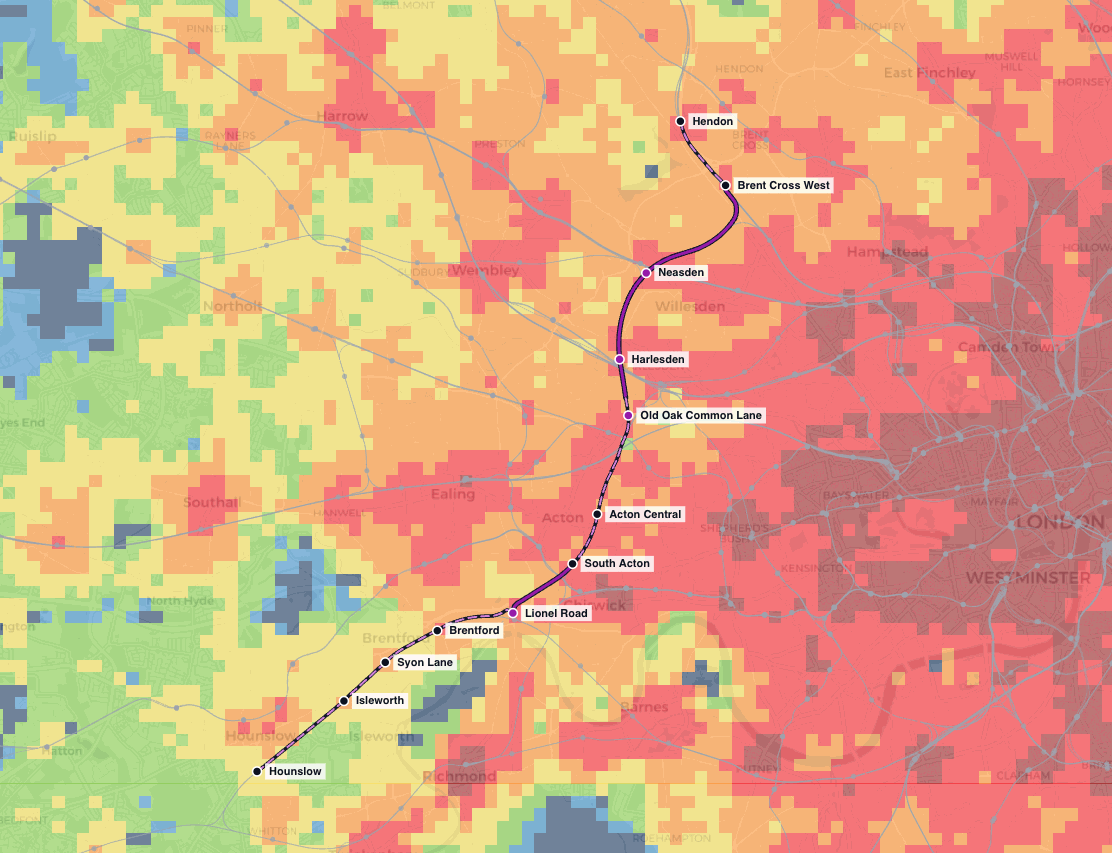
For decades, London has had one answer to the question “how well connected is this site?": PTAL. It is quick to calculate, granular, and universally understood by anyone who has ever put together a planning application. It is also, by design, a measure of how long it takes you to walk to a stop and wait for a service. It says nothing about where that service goes.
In July 2026, Transport for London published the Sustainable Access Measure (SAM) alongside the draft London Plan, together with a methodology summary report setting out how it is built. It is a new connectivity metric designed to sit next to PTAL rather than replace it, and it is meant to inform borough housing targets, the development density framework, car parking standards, and industrial land policy.
Credit where it is due: TfL published the methodology before the metric started making decisions, and put it out to consultation. That is not a given. When the DfT's Connectivity Metric was launched as the new national standard, the methodology arrived months after the promotion did, and we said so at the time. TfL has done this the right way round, and the consultation is a open invitation to scrutinise the work rather than a post-hoc formality.
So we took the invitation, and we studied the methodology, reimplementing the metric from the published specification, and compared our rebuild against TfL's own published bands, and then tested it with a real scheme: TfL's proposed West London Orbital. Through this we could see how much a new railway actually moves the number that now helps decide how many homes get built around it.
The draft London Plan consultation runs to 15 October 2026, and TfL has explicitly asked for feedback on SAM itself.
What is SAM?
TfL states the objective plainly:
Provide a granular, pan-London metric which reflects the ability of a typical Londoner living in a given location to meet their regular travel needs by sustainable, space-efficient modes alone.
SAM is calculated on the same 100m × 100m grid as PTAL, which means over 150,000 origin squares in Greater London, each with a score. It counts public transport and walking only. Driving is excluded because TfL wants to focus on sustainable and space-efficient modes, and cycling is excluded as a limitation due to uneven cycle infrastructure, as described in the Limitations section.
How It Works
SAM estimates how much of everyday London a typical resident of each grid square can actually reach. The underlying model is substantial, but the process breaks into four steps.
1. Define origins and destinations
- Every 100m × 100m grid square in Greater London is an origin. There are over 150,000 of them, and each gets a score.
- Destinations come from four datasets:
- Employment: LSOA job estimates, spread onto individual workplaces via Ordnance Survey AddressBase
- OS Points of Interest: the main dataset, of which around 200 sub-types relevant to personal travel were kept
- Get Information About Schools: primary, secondary, nursery and further education
- GiGL Open Space: parks and other green places to visit
Destinations outside the Greater London boundary count too. Only the origins stop at the boundary, because that's where the London Plan applies.
2. Measure three travel time catchments
Rather than one composite, SAM is built from three visibly distinct layers.
| Layer | Mode | Time | What's counted |
|---|---|---|---|
| City-wide public transport | Public transport | 60 minutes | Jobs |
| Other public transport | Public transport | 30 minutes | Weighted destination points |
| Walking | Walking | 10 minutes | Weighted destination points |
- The 60-minute jobs layer doubles as a proxy for everything Londoners travel furthest for: the specialist hospital, the world-class institution, the thing that only exists once in the city.
- The other public transport and walking layers share the same 11 categories of destinations, including green space, education, health, food shopping, etc., but use different weights (more on that below)
- The thresholds come from LTDS analysis of typical journey durations.
3. Weight each destination by how often Londoners go there
The destinations are not weighted by travel time: within the catchment, all count equally. Instead, each destination for the other public transport and walking layers is weighted by how often Londoners actually travel to that kind of place by that mode, using the London Travel Demand Survey. The same building is therefore worth different amounts in different layers. Below are a few examples:
| Journey purpose | Walk weight | Public transport weight |
|---|---|---|
| Food shopping | 2.36 | 1.22 |
| Green space | 2.07 | 0.31 |
| Education (under 11) | 0.55 | 1.59 |
| Health | 0.08 | 0.36 |
Which is intuitive once you see it. A park is something you walk to more often than take the bus, whereas you would more likely take public transport rather than walk to a hospital. All jobs (the 60-minute jobs layer) are weighted equally.
4. Standardise, weight and band
Each catchment is summed, then put on a common scale by counting standard deviations from the mean, because “1.9 million jobs” and “38 weighted destination points” are not otherwise addable. The three are then combined:
SAM = (0.43 × City-wide PT) + (0.16 × Other PT) + (0.41 × Walk)
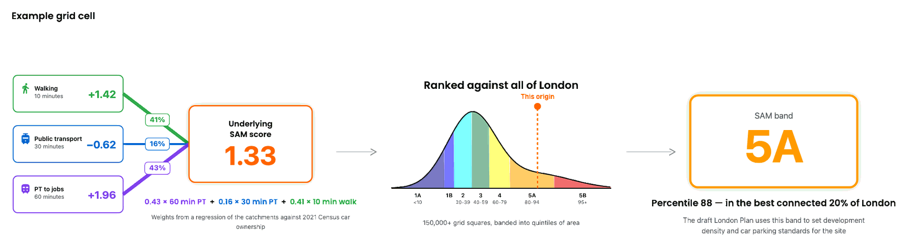
Those weights are interesting and the most unique part of the SAM methodology. They come from multi-linear regression modelling against 2021 Census car ownership across London's 26,000 output areas, controlling for income, household composition, tenure, ethnicity, recent arrivals, built form and borough effects. This means that instead of calibrating the weights based on actual trip rates, they're calibrated based on modelled importance, using car ownership as a proxy. The weights answer: once income and those other factors are controlled for, which of the three catchments best predicts an area having lower car ownership, and how does its strength compare with the other two?
TfL calls that an “outcome-first” process: measuring the outcome we want, whether that be car ownership or sustainable transport potential, rather than “inputs,” which are the destination purposes. The weights within each layer for different destination types come from an “input-first” approach, whereas the weights between layers are “outcome-first”.
Rebuilding SAM
Before testing anything, we needed to know that our version of SAM behaved like TfL's. So we rebuilt the metric within Podaris:Insight from the published specification and compared our output, cell by cell, against TfL's published bands.
| Check against TfL's published bands | Result |
|---|---|
| Cells in exactly the same band | 70% |
| Cells within one band | 99% |
| Mean band bias | +0.02 |
| Spearman correlation | 0.926 |
That is close enough to reason about real schemes with, and it is a reasonable independent check that the published methodology says what TfL's implementation does — which is the entire point of publishing a methodology.
It is not, however, an exact reproduction, and it cannot be. Three of SAM's inputs are not openly licensed, so we substituted:
| TfL input | Licence | What we used |
|---|---|---|
| OS Points of Interest | Closed | OpenStreetMap POIs mapped to the 11 categories |
| OS AddressBase (to distribute LSOA jobs) | Closed | OS Open UPRN / BRES at LSOA with area weighting |
| OS Multimodal Walk Network | Closed | OpenStreetMap walk network |
| Journey times (TfL internal models) | Internal | Rail Delivery Group timetables and open bus bus data |
| Get Information About Schools | Open | As published |
| GiGL Open Space | Open | As published |
The remaining 30% of cells that land a band away from TfL's are, as far as we can tell, mostly a consequence of those substitutions rather than of the method.
We ran everything below at a 250m grid rather than TfL's 100m, for runtime reasons across all of Greater London. That matters for one figure in particular: band boundaries are thin ribbons on the map, so a coarser grid will tend to understate the total area crossing a band.
What a SAM Band Actually Means
SAM's underlying scores form a smooth, long-tailed distribution with no natural breaks, except at the very top where central London pulls away. With no natural thresholds, TfL banded by quintiles of area, with the top and bottom quintiles each subdivided:
| Band | Percentile |
|---|---|
| 5B | 95+ |
| 5A | 80–94 |
| 4 | 60–79 |
| 3 | 40–59 |
| 2 | 20–39 |
| 1B | 10–19 |
| 1A | <10 |
5B captures the jump at the top of the distribution, and the draft London Plan's Optimisation Framework (Policy MBUL2) uses that 5A/5B split to inform development densities, a detail that matters in a moment. At the other end, 1A is the least-connected part of London's existing footprint.
One key takeaway is that a SAM band is a rank, not an absolute. SAM 4 doesn't mean “good connectivity”; it means “better connected than 60% of London”. The bands are a fixed 2026 baseline, so future transport schemes will shift the proportion of London in each band rather than redefining them.
The West London Orbital
Reading a methodology tells you how a number is built, not how much a real scheme moves it, and that turns out to be the question planners actually want to answer.
TfL note that SAM can be used “to identify where better public transport links, or a greater density of non-residential destinations, are needed to enable sustainable travel.” So we tested it.
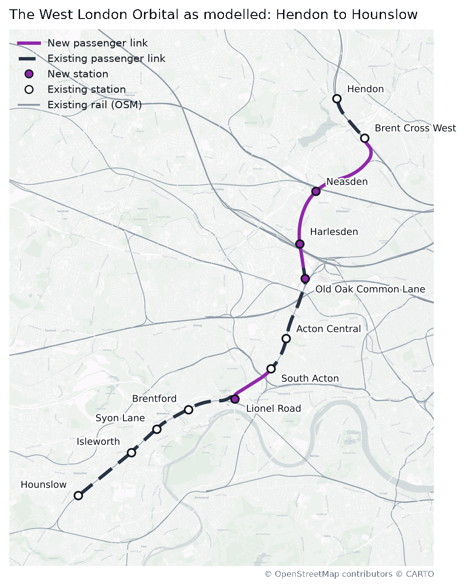
We ran the West London Orbital: TfL's proposed orbital line from Hendon to Hounslow using the freight-only Dudding Hill line, with four new stations at Neasden, Harlesden, Old Oak Common Lane and Lionel Road, at 8tph.
Using Podaris:Plan it was easily to plan an scheme like this minutes.
We ran our SAM analysis across all of Greater London and joined every grid square to 2021 Census population. The results were fascinating:
| Across Greater London | Area | People |
|---|---|---|
| SAM score moves at all | 366 km² | 2,282,800 |
| SAM score crosses a band | 5.9 km² | 28,200 |
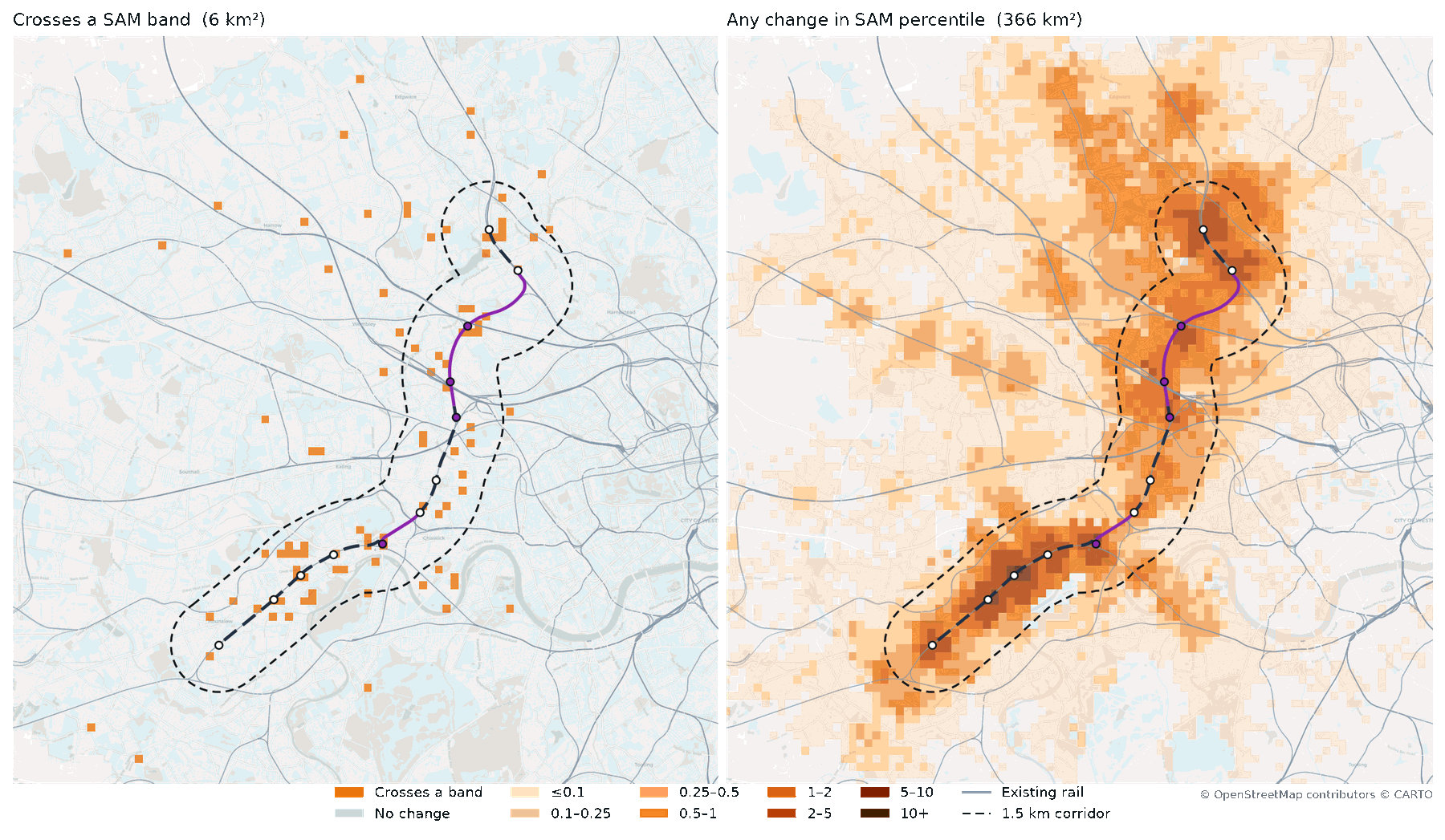
Roughly one Londoner in every 300 sees their SAM band move — which is what affects parking or density — but around one in four sees their SAM percentile move. Put the other way: 2.28 million people out of Greater London's 8.8 million are measurably better connected, and 28,200 of them are better connected in a way the planning system will act on.
Why is there not more of an impact?
Two structural features of SAM explain most of that, and neither is a flaw in the scheme.
The first is that a public transport scheme can only ever move 59% of SAM. The walk layer carries a weight of 0.41 and is completely untouched by a new railway: no new stations change how many shops are within a ten-minute walk of your front door. A rail scheme is competing for the remaining 0.59, and in practice almost all of the movement comes from the 0.43 city-wide jobs layer.
The second is that each band spans 10–20 percentile points, while the mean movement across all cells that move at all is 0.28 percentile points, with a maximum of 10.53. One new orbital line in an already dense rail network simply does not push many cells across a boundary that wide.
Where the band changes land

Breaking those band crossings down shows where they land, and it is not spread evenly. 4 → 5A is the biggest single mover, 2.69 km² of the 5.9 km² total and 15,700 of the 28,200 people. That is the consequential one: 5A is the threshold the draft London Plan's Optimisation Framework uses to inform development density, so nearly half of the scheme's band-level effect lands on the one boundary that changes what can be built.
The other end of the chart is more troubling. Only 0.12 km² climbs out of band 1B, and nobody lives on it. A new orbital railway in an area with a lot of rail already moves mostly the areas that were already reasonably well connected, because those are the ones sitting just below a boundary. For London's least connected ground, it does essentially nothing. If SAM bands are going to inform where growth is directed, that asymmetry is worth understanding before it is designed into policy: the scheme improves the measured position of the already-well-connected, and leaves the bottom decile exactly where it was.
Being able to test land use changes alongside public transport changes alongside active travel schemes is excatly what the Podaris platfom enables for metrics like SAM and the DfT's Connectivity Score.
Where the effect lands geographically
Perhaps more interesting, though, is not the size of the effect but its geography, and it is where SAM and PTAL part company completely by design.
| Score moves at all | Crosses a band | |
|---|---|---|
| SAM, within 1.5 km of the route | 62 km² · 442,000 people | 3.9 km² · 21,000 people |
| SAM, beyond 1.5 km | 304 km² · 1,840,700 people | 2.0 km² · 7,200 people |
| PTAL, within 1.5 km | 17 km² · 133,000 people | 6.0 km² · 38,100 people |
| PTAL, beyond 1.5 km | none | none |
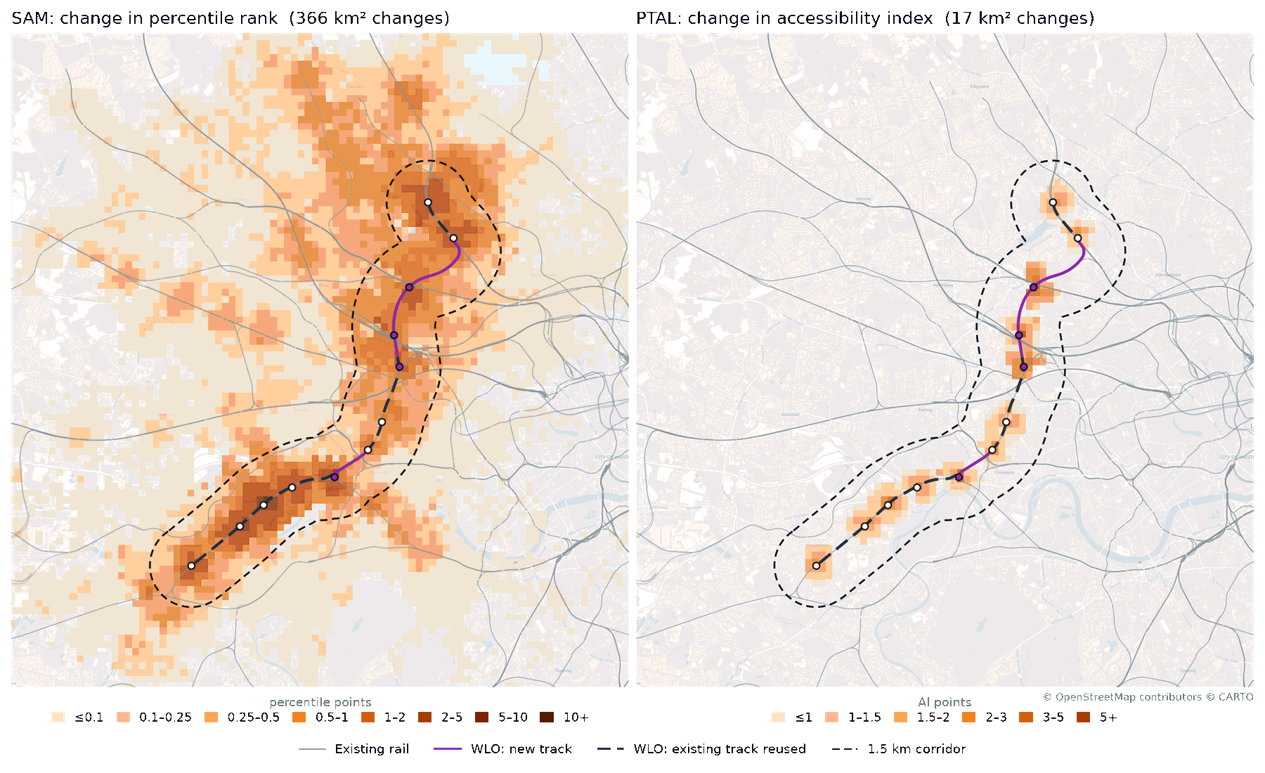
83% of the affected area and 81% of the affected people are outside the corridor, with measurable effects out to 20 km before they vanish. PTAL records nothing at all beyond walking distance of the new stations. Not a small amount: zero.
It is worth being straight about the other half of that table, because it cuts the other way. Close to the route, PTAL is the more sensitive of the two: 6.0 km² and 38,100 people cross a PTAL band, against 3.9 km² and 21,000 for SAM. That is not PTAL outperforming SAM; it is the trade-off working exactly as intended. PTAL concentrates all of its sensitivity in the walk catchment of a new stop, which makes it sharp locally and blind everywhere else. SAM spreads its sensitivity across the network, which makes it comprehensive and comparatively muted at any single point.
That follows directly from what each metric is. PTAL asks how much service is within 640 or 960 metres of you, so a new line is invisible a kilometre away no matter how useful it would be to your journey. SAM asks what you can reach, so anyone whose trip can route via the new line benefits, however far from it they live.
That's why we agree with TfL that SAM is the right metric for appraising a scheme like this, at a borough-wide scale rather than at a local development scale. An orbital's case rests on the journeys it makes possible across the network, and PTAL is structurally unable to see them: it has no mechanism for representing a benefit to someone who does not live beside a new station.
How SAM, PTAL, and the DfT Connectivity Metric Divide the Work
Under the current London Plan, PTAL informed borough housing targets, development densities and car parking provision. Under the draft Plan, SAM does all three. TfL's own words are that “SAM should directly inform the density of a site and how much car parking is permitted, as per the draft London Plan.”
So while it looks like PTAL is being retired, TfL says it isn't. Almost verbatim from the guidance document:
- SAM is a London-wide comparator. How well connected is this site compared to everywhere else in London, and how car-reliant might a neighbourhood be compared to all others? Use it to set the overall density of a site and how much parking is permitted. It can also be used to identify where better public transport links, or a greater density of non-residential destinations, are needed to enable sustainable travel.
- PTAL is a local comparator. How good is access to the network here compared to the rest of the local area? Use it to decide which part of a site takes the taller elements, and to test quickly how access shifts locally when you change the walk network or add a bus service.
Our West London Orbital numbers support that division precisely. SAM saw 1.84 million people outside the corridor whom PTAL could not see at all; PTAL saw more band movement inside the corridor than SAM did. Neither is a substitute for the other.
And why did TfL develop SAM when the DfT's Connectivity Metric is the new national connectivity metric standard? Because places are unique, with different trip rates and destination purposes, so a metric tuned to national average behaviour will systematically misread it.
Limitations
TfL lists a few known limitations of SAM, and we would add a couple:
- No cycling. Acknowledged and intended for a future version, but a notable gap in a metric whose entire premise is space-efficient modes.
- Walk quality and other accessibility considerations are invisible. A 10-minute walk along a dual carriageway scores the same as a 10-minute walk through a park. There is no incorporation of step-free access.
- No scenario testing as yet. Running SAM is slower and more resource-intensive than PTAL, and TfL publishes no tool to create and run new scenarios.
- The time of day isn't published. PTAL's guidance is explicit that it uses service frequencies between 08:15 and 09:15 on a weekday. The SAM methodology never states one. Our own runs use PTAL's window for consistency, but this should be in the published methodology, because a metric that sets parking standards should not be reproducible only to within a choice of timetable window.
- Three of the inputs are closed. OS Points of Interest, AddressBase and the OS Multimodal Walk Network are not openly licensed, and journey times come from TfL's internal models, which is why our rebuild required substitutions.
The last two are the ones that matter for scrutiny. A methodology note is a very good start, and it is more than the sector has been given before for other metrics. But a methodology note is not a reproducible model. Boroughs, developers and consultants whose applications turn on a SAM band need to be able to interrogate it, and right now they can get within about one band of it using open data and no further.
Have Your Say Before 15 October
The draft London Plan consultation is open until 15 October 2026, and TfL has explicitly asked for feedback on SAM. This is the window in which the questions above are still questions rather than settled policy.
Making SAM Work for You
Our West London Orbital analysis took an afternoon. We have built SAM into Podaris:Insight the same way we implemented the DfT Connectivity Metric, so the parts TfL has fixed in place become things you can examine and change:
- Catchment thresholds, point weights, and the weighting between layers
- Destination datasets, including your own
- The underlying street network, so you can add new links for your development site
- And most importantly, your own scenarios, so, that like we've shown here, you can plan a scheme and evaluate it in a day
If SAM is going to shape your site's density and parking, you should be able to see how it got there. Schedule a demo to talk through what it means for your sites.