When the Department for Transport launched its national Connectivity Metric in September 2025, it promised to transform how Britain plans transport infrastructure and approves development. But what happens when a new national standard contradicts a local metric that's already embedded in billions of pounds worth of planning decisions?
In Croydon town centre, a single address tells the story. On paper, its PTAL (Public Transport Access Level) score is 6b – the highest possible rating under Transport for London's established framework. That classification helped justify converting a single home at 51 Addiscombe Road into a 13-room guesthouse with zero parking, consistent with London Plan policy for highly accessible locations.
But when we applied the DfT's new Connectivity Metric to the same location: just a few hundred metres from East Croydon Station, one of London's busiest hubs, it scores closer to band 3. Had planners used the DfT Connectivity Metric instead, that development might have required parking spaces or other car trip-rate mitigations after all.
This isn't an edge case. It's a preview of the planning uncertainty now facing every local authority in England and Wales.
At Podaris, we've been trying to understand the metric. We've built a modern web app to visualise the public results released by the DfT, recreated the DfT Connectivity Metric within Podaris (currently in beta), and compared the new Connectivity Metric across directly against TfL's PTAL measure.
Key Findings
- The DfT Connectivity Metric better predicts real-world patterns: It correlates more strongly with 71% of over 500 demographic and environmental variables than PTAL, including commuting behaviour, air quality, and deprivation indices
- But the metrics disagree on hundreds of neighbourhoods: Over 800 London LSOAs (1.7%) show differences of three or more bands – enough to determine parking requirements, density limits, and scheme viability
- Both metrics capture different truths: PTAL measures access to transport infrastructure; the DfT Connectivity Metric measures access through transport to destinations. Neither is “wrong”, but their disagreement creates interesting questions for policymakers
- Transparency remains a critical problem: The DfT methodology was published months after launch, key data sources remain unspecified, and the calculation engine is closed-source
- Access restrictions undermine collaboration: The tool is available only to public sector bodies, preventing the consultancies and developers who play a critical role in UK transport planning from using it effectively
Background: Why This Comparison Matters
For years, London has relied on one accessibility yardstick: TfL's Public Transport Accessibility Level (PTAL). It's simple, transparent, and instantly recognisable to planners. A PTAL score can determine parking requirements, maximum densities, and the viability of car-free developments. It's woven into planning policy, legal precedent, and billions of pounds worth of development.
The DfT Connectivity Metric takes a fundamentally different approach. Instead of just measuring how close transport services are, it models how easily people can reach jobs, schools, healthcare, and other destinations across England and Wales. It considers travel times, destination attractiveness, and people's willingness to travel different distances. On paper, it's a more sophisticated measure of lived experience.
But sophistication brings complexity, and complexity without transparency creates problems.
How PTAL and the DfT Connectivity Metric Work
To understand where and why these metrics disagree, we need to understand what they actually measure.
| Feature | PTAL | DfT Connectivity Metric |
|---|---|---|
| What it measures | Proximity to public transport stops + service frequency | Access to jobs, services, and destinations via all modes |
| Core principle | How easy is it to reach a bus or train? | How many opportunities can you actually reach? |
| Geographic coverage | Greater London only (but as an easy open indicator, it can be quickly calculated for anywhere in the world) | England and Wales |
| Transport modes | Public transport only | Walking, cycling, driving, public transport |
| Destination types | Not considered (only infrastructure) | Jobs, schools, healthcare, shops, leisure (weighted by type) |
| Open methodology | Fully documented since 2010s | Published September 2025 (months after launch) |
| Publicly accessible | Free and open to all | Restricted to public sector bodies only |
| Can be reproduced | Yes, with public data | Difficult: missing data sources, detailed methodology, no source code |
| Best for | Infrastructure density assessment, quick development control checks | Holistic accessibility assessment, understanding lived experience |
PTAL's strength lies in its simplicity. It assigns each location a score from 0 (no service) to 6b (best service), based purely on how close you are to public transport stops and how frequently services run. It's a measure of potential mobility: how easy it is to get on a bus or train. Everyone in the sector knows what a “PTAL 6b” site means.
The DfT Connectivity Metric is more ambitious. It uses multimodal travel-time modelling with time-decay functions to evaluate access to employment, education, healthcare, shopping, and leisure destinations. Each destination type is weighted by its attractiveness and the population's willingness to travel there. The result is a 0-100 score (which we've normalised to PTAL's 0-6b scale for comparison) that aims to capture actual lived accessibility.
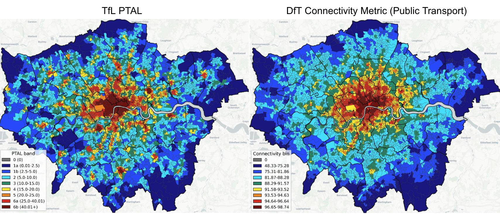
What the Maps Show: London-Wide Patterns
At first glance, both metrics look similar. Central London glows red, while the outer boroughs fade into blue. Both capture the fundamental truth that inner London is better connected than the periphery.
But once you compare them directly, sharp contrasts appear.
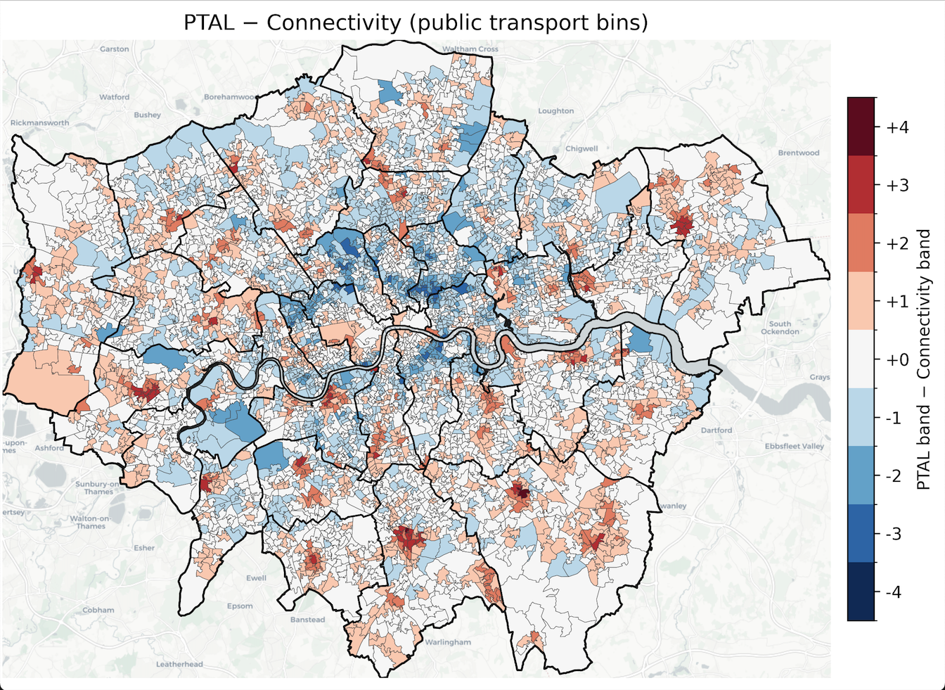
The difference map reveals two distinct patterns:
Pattern 1: Inner London Rail Gaps (DfT Connectivity Metric Scores Higher)
Neighbourhoods like Haggerston, Cambridge Heath, and Walworth rank significantly higher in the DfT Connectivity Metric. These areas lack dense Underground coverage, which limits their PTAL scores. But they have good Overground services and dense bus networks that provide strong access to local employment and services, exactly what the DfT Connectivity Metric captures.
This reveals the DfT Connectivity Metric's strength: it looks beyond infrastructure density to measure actual accessibility patterns. For neighbourhoods with good local connectivity but fewer “flagship” stations, the DfT Connectivity Metric approach tells a more complete story.
Pattern 2: Outer London Station Halos (PTAL Scores Higher)
Town centres at Croydon, Bromley, Romford, Sutton, and Clapham Junction show the opposite pattern. PTAL scores them high because of station density and service frequency, but the DfT Connectivity Metric rates them lower.
Why? Because most journeys from these locations travel significant distances to reach central London employment and services. You have excellent transport infrastructure, but you still face 30-60 minute journeys to access most opportunities. The DfT Connectivity Metric captures that lived experience; PTAL doesn't.
“In some neighbourhoods, the two metrics differ by three full bands, enough to determine whether a development requires parking, qualifies for increased density, or faces local opposition.”
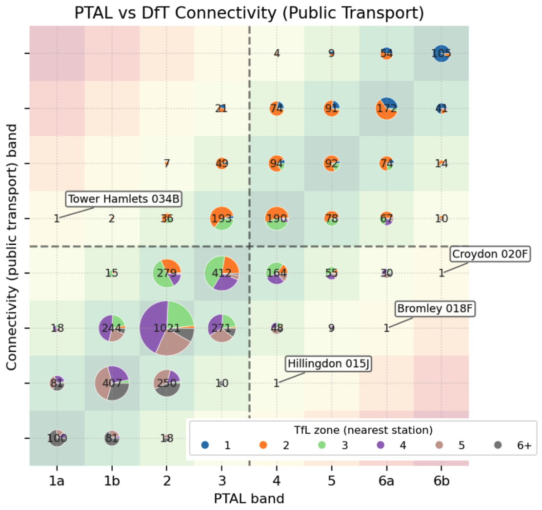
How Much Disagreement?
While the metrics broadly agree across most of London, over 800 neighbourhoods (1.7% of LSOAs) differ by three or more bands. This represents approximately 250,000 Londoners living in areas where planning policies based on PTAL might look very different if they were based on the DfT Connectivity Metric instead.
These aren't random edge cases scattered across the capital. They cluster in precisely the types of locations where planning decisions become contentious: outer London town centres with good rail links, inner London neighbourhoods undergoing regeneration, and areas along the boundary between well-connected and poorly-connected districts.
Case Study 1: Croydon Town Centre - When Metrics Determine Parking
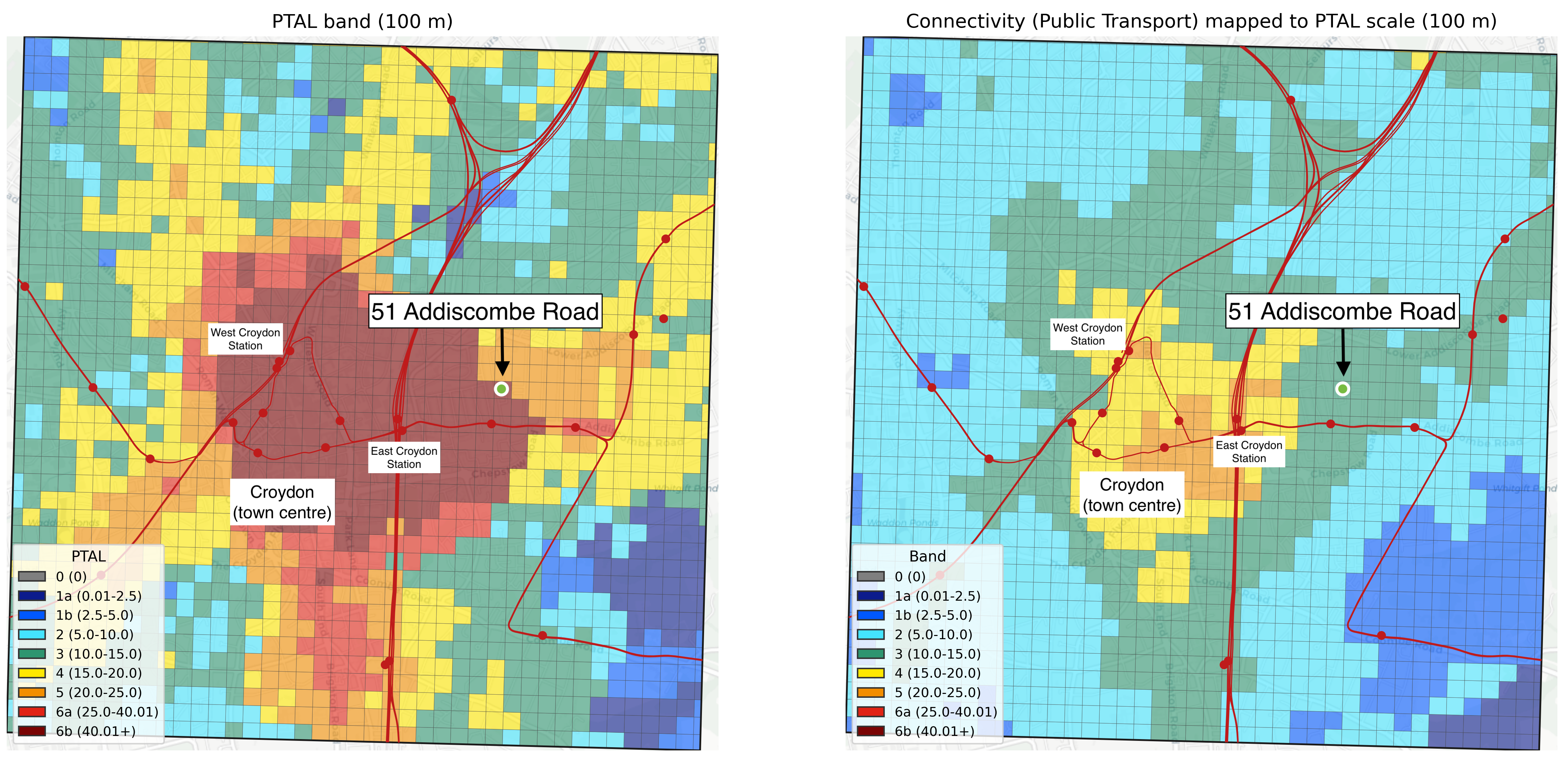
The Croydon example isn't just interesting, it's a window into the real-world consequences of competing accessibility metrics.
51 Addiscombe Road sits just a few hundred metres from East Croydon Station, one of London's busiest transport hubs. The station serves 27 million passengers annually, with:
- Fast services to Victoria, London Bridge, and Gatwick Airport
- Southern, Thameslink, and Southeastern rail services
- Tram connections across South London
- Dozens of bus routes
Under PTAL, the site scores 6b (the highest possible rating). That classification is embedded in Croydon's Local Plan and the London Plan. For planners reviewing a 2021 application to convert a single dwelling into a 13-room guesthouse, that PTAL 6b score justified zero parking provision. The scheme was approved on that basis.
But when we apply the DfT Connectivity Metric to the same location, it scores closer to band 3 on our normalised scale.* Both metrics are “correct” in their own terms:
- PTAL accurately captures that East Croydon offers exceptional transport infrastructure
- The DfT Connectivity Metric reveals that this infrastructure primarily serves long-distance commuters, not local connectivity to everyday services
The question isn't which metric is “right.” It's: which dimension of accessibility should determine whether a neighbourhood “needs” parking or mitigation measures?
This isn't just a Croydon problem. Across England, the DfT Connectivity Metric is being positioned as the “new national standard.” But it hasn't replaced existing local frameworks like PTAL; it's layered on top of them. When the two disagree, which takes precedence?
The answer isn't clear. And that uncertainty creates risk for:
- Developers who need to know whether sites are viable
- Local authorities who face legal challenges if they choose the “wrong” metric
- Communities who want development that reflects genuine accessibility
- The planning system as a whole, where consistency and predictability matter
Note: The most detailed DfT data publicly released is at Output Area level, which we interpolated to 100m grid cells for this case study comparison. The score at this precise location may differ in the full tool.
Case Study 2: Wandsworth - Two Sides of the Same Borough
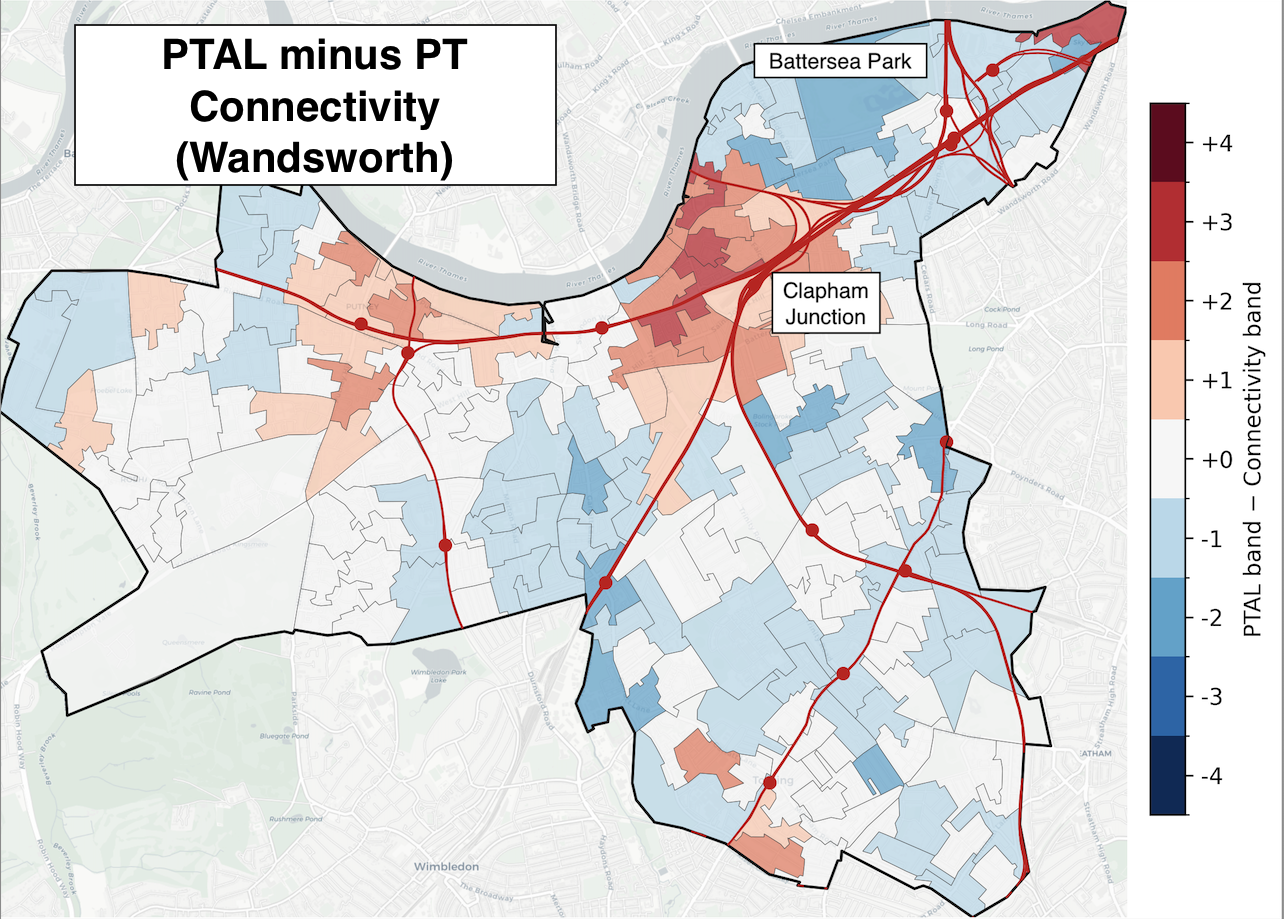
In Wandsworth, the contrast is spatial rather than creating planning dilemmas, but it illustrates why the metrics diverge.
Around Clapham Junction, PTAL shoots up thanks to the sheer number of rail lines serving this major interchange. But the DfT Connectivity Metric scores the same area lower. Why? Because despite excellent rail infrastructure, most destinations are still 20-40 minutes away. You're well-connected to the network, but the network still needs time to get you places.
Further north, around Battersea Park, the opposite pattern emerges. PTAL drops because there are fewer transport nodes in immediate proximity. But DfT connectivity improves because the area has good access to local amenities, employment in nearby Vauxhall and Westminster, and multiple bus routes that efficiently reach everyday destinations.
This reflects a fundamental difference in what the metrics measure: PTAL rewards proximity to transport infrastructure, while the DfT Connectivity Metric evaluates actual destination access. In outer London, you can have excellent rail links that still require 45-60 minute journeys to reach most opportunities. That's the difference between measuring the transport network and measuring what the network actually delivers.
Statistical Analysis: Which Metric Better Predicts London?
Maps and case studies tell compelling stories, but they're inherently selective. To understand which metric better captures the reality of London's accessibility, we need systematic comparison.
We compared both metrics against over 500 demographic, environmental, and socioeconomic variables drawn from:
- Census 2021 (population, employment, commuting, housing)
- Index of Multiple Deprivation (2019)
- Air quality data (NOx, PM2.5, 2024)
- Property prices (Land Registry, 2024)
- Crime statistics (data.police.uk, 2024-25)
- NHS GP registration data (2025)
- Energy consumption (DESNZ, 2010-2023)
For each variable, we fitted a simple linear regression and calculated R² values (a measure of how well each metric predicts real-world pattern - higher is better). The question: which metric explains more of London's characteristics?
R² measures how well a metric predicts real-world patterns. Values closer to 1.0 indicate stronger relationships. An R² of 0.70 means the metric explains 70% of the variation in that real-world feature. Higher R² means the metric better captures what's actually happening on the ground.
The Results: DfT Connectivity Metric Predicts Better
71% of features showed higher R² values for the DfT Connectivity Metric than for PTAL, including:
- 68% of Census indicators
- Particularly strong performance on features with higher overall correlation to accessibility
Put simply: the DfT Connectivity Metric better reflects London's underlying demographic, economic, and environmental characteristics.
Here are four examples that illustrate the pattern:
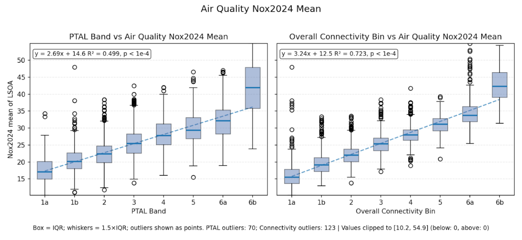
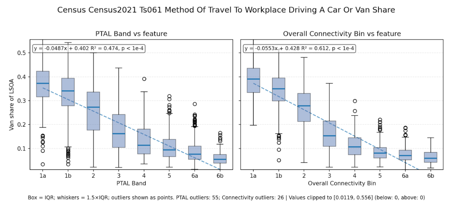
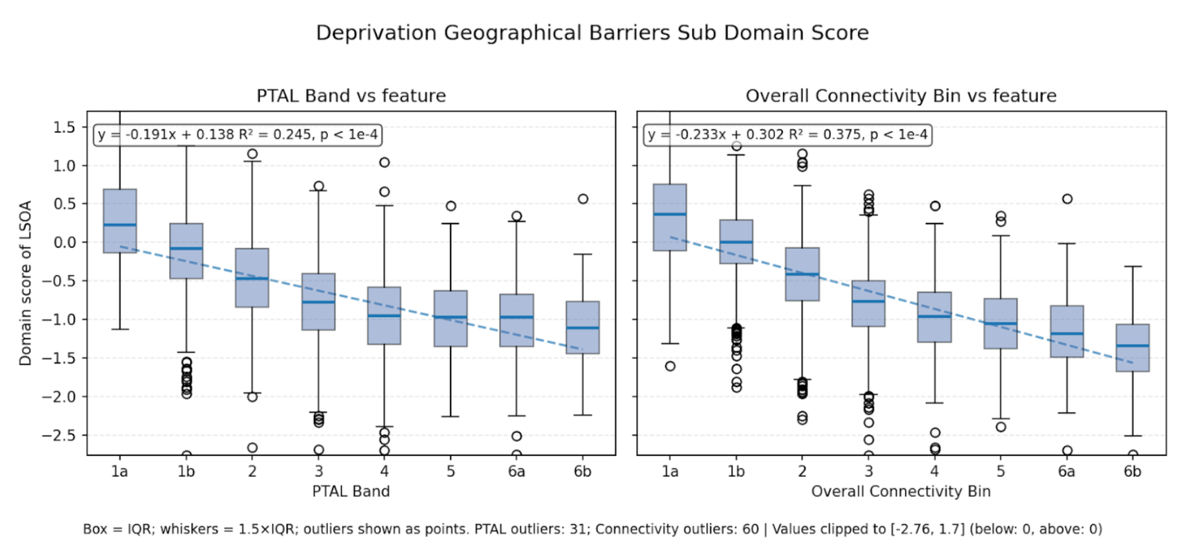
| Feature | Correlation | PTAL R² | DfT R² | What This Means |
|---|---|---|---|---|
| Air quality (NOx, 2024) | Positive: higher accessibility = higher NOx | 0.50 | 0.72 | High-accessibility areas tend to have more traffic pollution. The DfT Connectivity Metric captures this gradient more sharply, likely because it accounts for car accessibility. |
| Car/van commuting share | Negative: higher accessibility = fewer car commuters | 0.47 | 0.61 | Both metrics correlate with mode choice, but the DfT Connectivity Metric's multimodal approach better predicts who drives to work. |
| Deprivation: geographical barriers | Negative: better accessibility = fewer geographical barriers | 0.25 | 0.38 | Areas with poor transport face other barriers too (rivers, railways, major roads). The DfT Connectivity Metric picks this up more effectively. |
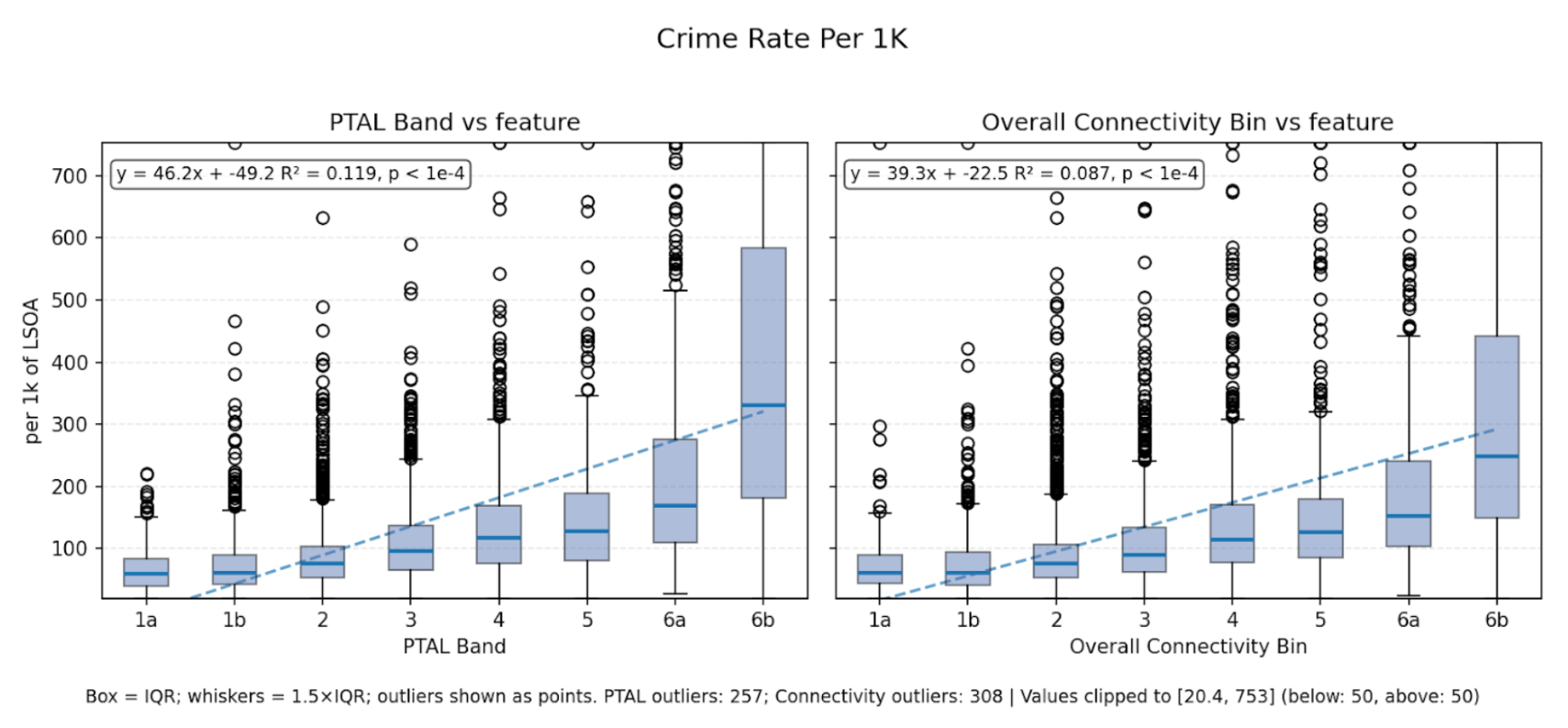
| Crime rate per 1k population | Positive (weakly) | 0.11 | 0.09 | One example where PTAL slightly outperforms, though both show weak correlation. Crime patterns have many drivers beyond accessibility, but perhaps increased footfall is captured through the infrastructure measurement PTAL provides. |
What This Tells Us
These correlations matter because they reveal what each metric actually captures:
- The DfT Connectivity Metric's stronger relationships with commuting patterns, air quality, and deprivation suggest it better reflects how Londoners actually experience connectivity in their daily lives
- PTAL remains useful for what it was designed to measure: the density and quality of public transport infrastructure
- Neither metric is perfect: both show weak correlation with some features (like crime), reminding us that accessibility is just one dimension of urban life
The statistical evidence supports what the maps suggested: the DfT Connectivity Metric provides a richer picture of lived accessibility.
The Transparency Problem: Why Black Boxes Are Bad for Transport Planning
The DfT Connectivity Metric's superior predictive power is useful. But statistical validity isn't enough for a tool that will influence billions of pounds of transport and development decisions. Transport planning needs to withstand public scrutiny, expert critique, and legal challenge. That requires transparency.
The methodology document was published in September 2025, months after the tool launched and after local authorities were already being encouraged to adopt it. This isn't how evidence-based policymaking should work. The published methdology leaves significant gaps for practitioners attempting to validate or extend the analysis. Key data sources remain unspecified, weighting parameters are incomplete, and the calculation engine is closed-source. More significantly, tool access is restricted to public bodies – meaning the consultancies, developers, and SMEs who undertake most UK transport planning cannot directly use it. This creates a two-tier evidence base where public authorities and their delivery partners work from incompatible analytical foundations.
These challenges aren't insurmountable. Modern transport planning benefits from diverse tools serving different purposes: government-provided baseline analysis, commercial platforms for scenario planning, and open-source frameworks for validation. The question is whether these tools can work together through shared standards and interoperability, or remain siloed.
Moving Forward Together
Rather than choosing between metrics or building in parallel, Podaris has integrated both PTAL and DfT Connectivity into a single platform that enables scenario comparison and transparency.
That's why we've taken three steps to advance this vision:
1. We've Built Both Metrics Into Podaris:Insight
Transport planners using Podaris can:
- View both PTAL and DfT Connectivity scores side-by-side for any location in England and Wales
- Understand where and why the metrics diverge
- Apply both frameworks to custom transport scenarios, bus routes, rail extensions, cycling schemes, demand-responsive transport
- Compare baseline vs scenario to understand how interventions affect connectivity under different definitions
The DfT Connectivity Metric provides excellent baseline analysis; Podaris enables the scenario planning and “what-if” modelling that baselines can't deliver alone.
2. We've Released a Free Public Explorer
Try our interactive connectivity visualiser →
3. We're Contributing to the Evidence Base
This analysis, weeks of work reconstructing the metric and processing millions of data points, advances sector understanding of the new Connectivity Metric.
Conclusion: The Future of UK Transport Analytics
TfL's PTAL and the DfT Connectivity Metric capture two different dimensions of accessibility:
- PTAL measures access to transport: how easily you can reach a stop or station
- The DfT Connectivity Metric measures access through transport: how easily you can reach the places that matter
Both perspectives have value. Our statistical analysis shows the DfT Connectivity Metric better predicts real-world patterns across most dimensions, but that advantage comes from additional computational needs and complexity that isn't fully transparent.
The question isn't which metric is superior. It's how we apply the correct metrics to best serve the public interest.
That requires:
- Transparency so metrics can be validated, critiqued, and improved
- Accessibility so all parts of the planning ecosystem can use the same evidence
- Interoperability so baseline analysis and scenario planning work together
- Collaboration between government departments, local authorities, universities, and commercial providers
Britain has world-leading expertise in transport analytics. We have innovative government departments, world-class universities, and cutting-edge SMEs. The question is whether we'll work together, or continue building in parallel, duplicating effort and creating incompatible systems.
Podaris is committed to the collaborative path. We'll continue:
- Making transport planning tools more accessible and transparent
- Contributing evidence to improve the sector's analytical capabilities
- Advocating for open standards and reproducible research
- Building tools that complement rather than compete with public provision
The connectivity metric debate isn't really about about a single metric. It's about whether UK transport planning has the transparent, collaborative, innovative ecosystem it needs to deliver better outcomes for everyone through place-based measures to support the National Planning Policy Framework.
We can get there. But only if we choose to.
Want to explore how Podaris can support your transport planning?
- Schedule a demo of Podaris:Insight →
- Explore our free connectivity visualiser →
- Read our write up of a similar multi-modal metric developed in the US →
Methodology Note
PTAL data: Obtained from TfL's open data platform, 100m grid resolution, latest available version as of October 2025.
DfT Connectivity data: OA-level data from DfT public release (September 2025), supplemented with interpolated 100m grid for detailed case study analysis. Interpolation performed using inverse distance weighting. OA-level data used for London-wide statistical comparisons.
Normalisation: DfT scores (0-100 scale) converted to PTAL bands (0-6b) using percentile matching to enable direct comparison. PTAL percentile thresholds applied to DfT score distribution.
Statistical analysis: Linear regression (OLS) with R² reported for each feature. Sample size: 4,835 LSOAs across Greater London. No outlier removal. All variables standardised before regression. Analysis conducted in Python using statsmodels and scikit-learn.
Demographic data sources: Census 2021 (ONS), Index of Multiple Deprivation 2019 (MHCLG), Air quality 2024 (DEFRA PCM), Land Registry price paid data 2024, NHS GP registration October 2025, Crime data 2024-25 (data.police.uk), Energy consumption 2010-2023 (DESNZ).
Limitations:
- DfT score interpolation to 100m grid may introduce minor inaccuracies at very local scales
- PTAL data represents 2024; DfT data represents Q4 2024
- Linear regression assumes linear relationships; some features may have non-linear dynamics
- Correlation does not imply causation
- Analysis covers Greater London only; patterns may differ in other urban areas
Reproducibility: Full analysis code and processed datasets available on request for academic and policy research purposes.
Data Sources, References, and Attributions
| Dataset | Source | Attribution |
|---|---|---|
| PTAL (LSOA, 100x100m) | TfL (ArcGIS online) | Contains public sector information licensed under the Open Government Licence v3.0. © Transport for London. |
| Connectivity metric (LSOA, OA) | Department for Transport | Contains public sector information licensed under the Open Government Licence v3.0. © Crown copyright, Department for Transport. |
| 2021 Census (LSOA level) | Nomis/Office for National Statistics | © Crown copyright, Office for National Statistics. Licensed under OGL v3.0. |
| Index of Multiple Deprivation (2019) | Ministry of Housing, Communities & Local Government | © Crown copyright, MHCLG, 2019. Licensed under OGL v3.0. |
| Electricity consumption (LSOA, 2010-2023) | Department for Energy Security and Net Zero | © Crown copyright, DESNZ. Licensed under OGL v3.0. |
| Home sales (2024) | HM Land Registry | Contains HM Land Registry data © Crown copyright and database right 2025. Licensed under OGL v3.0. |
| GP registrations (LSOA, October 2025) | NHS Digital | Contains NHS data © Crown copyright. Licensed under OGL v3.0. |
| Crime data (2024-2025) | data.police.uk | © Crown copyright, Home Office / Police forces of England and Wales. Licensed under OGL v3.0. |
| Air quality (1km raster, 2024) | DEFRA | © Crown copyright, DEFRA. Licensed under OGL v3.0. |
| Croydon Planning REF 21/03943/FUL | Croydon Council | © Croydon Council. Licensed under OGL v3.0. |
Academic References:
- Geurs, K.T., & Van Wee, B. (2004). Accessibility evaluation of land-use and transport strategies: review and research directions. Journal of Transport Geography, 12(2), 127-140.
- Papa, E., & Coppola, P. (2012). Accessibility and Transport Planning. European Transport \ Trasporti Europei, 52, 1-14.
- Levinson, D.M., & Wu, H. (2020). Towards a general theory of access. Journal of Transport and Land Use, 13(1), 129-158.
Published November 2025 by Podaris. Licensed under CC BY 4.0 for non-commercial use.