In our last blog post we looked at the social impact of transport accessibility and the consequences of poorly planned services on the individual, businesses, communities and the state.
In this article, we'll explore some of the reasons behind the current popularity of accessibility analysis and what makes a good metric.
Why has accessibility analysis become so popular?
While no one factor accounts for the current popularity of accessibility analysis, it's clear that technological developments have largely facilitated its adoption by planners.
Increases in computational power and decreases in computing costs have allowed complex accessibility analysis to be performed in minutes, rather than hours or days. With cloud-based software, planners can now access powerful analysis tools through their web browsers, regardless of the computing power of their devices. Collaborative planning tools can further accelerate projects by allowing multiple planners to perform different analyses on the same project in parallel.
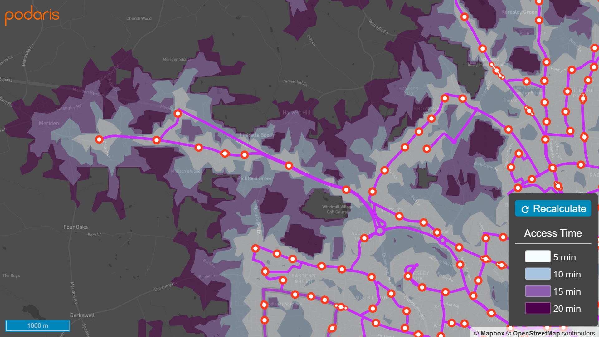
Bus stop walking accessibility visualised in Podaris
Near instantaneous results mean the ability to plan with greater agility and explore scenarios that might have been prohibitively time-consuming to construct in the past. Today's accessibility analysis tools offer faster results making them well suited to projects with a large number of planning cycles.
An abundance of high quality open datasets has also made it possible for anyone with a keen interest to perform high quality analysis using geospatial data from crowdsourced projects like OpenStreetMap (OSM). Despite being freely available to use and contribute to, OSM describes the quality of their data as “now often as good or better than what is commercially available…evidenced by increased government and corporate usage and contribution.”
As with transport provision, gaps in OSM's data still occur however, and are often found in places with the most vulnerable communities. For this reason, collaborative projects such as missingmaps.org exist to coordinate the efforts of volunteers who map areas not featured in OSM's data (in their case in places where disasters most often occur).
The strength of OSM is in its open and collaborative editing model, which much like Wikipedia embraces volunteerism and is made possible by the sheer number of contributors working to make the data complete and keep it up to date. But these sorts of projects have the potential to represent much more than just points on a map.
In the geospatial realm, the locations of key services such as schools are unlikely to change very often, if at all, but attributes such as OFSTED ratings are in continuous flux. Quality ratings such as these can help transport analysts create a richer picture of the impacts of equitable transport provision and understand the correlation, if any, between transport availability and the quality of nearby services.
Another factor behind the recent popularity of modern transport projects is the increasing number of stakeholders typically engaging with them. As a consequence, tools for rapid accessibility analysis have become invaluable in communicating the real world impact of transport decisions as easily comprehensible visualisations.
Finally, factors such as the stagnation of transport modelling solutions coupled with the need to rapidly plan for new transport modes, have all made accessibility analysis a key component in today's transport feasibility studies.
What makes a good metric?
With a wide variety of accessibility metrics out there, what factors make a good one? An inexhaustive list might look something like this:
-
It should allow different locations or geographies to be compared and contrasted to guide investment and land-use decisions
-
It should be able to benchmark different schemes or modes for use as part of an appraisal methodology
-
It should capture or approximate the actual travel demand and needs of the studied population
And finally, as good as your data, methods and metrics may be, they're only truly useful if they're understood by those to whom they aim to inform, or persuade. A good metric should therefore be scrutable by experts and non-experts alike, and the data be as important as the notion that is being conveyed.
To see how Podaris is helping planners around the world to better understand their networks with powerful tools for a wide variety of transport analyses, schedule a demo with us today!