Almost every active travel strategy published in Britain since about 2015 has contained a photograph of the Netherlands. Usually a station bike park, occasionally a canal, always with the implication that if we just built enough kilometres of cycleway we too could have a city where the school run happens on a cargo bike. Councils report their kilometres, national rankings count them, Active Travel England asks for them, and the number goes up every year, which is lovely.
The trouble is that a kilometre of cycle track along a dual carriageway and a kilometre threaded through a neighbourhood are not the same kilometre, and no league table can tell them apart. So, with street network editing now live in Podaris and two new analysis types in Podaris:Insight built to go with it, we decided to see how a place in the UK compared to the Netherlands. We drew a similarly sized study area in Utrecht and in Bristol (arguably Britain's perennial best-cycling-city-outside-London) and measured not how much cycle infrastructure each one has, but how much of each city it actually reaches.
Utrecht has 232km. Bristol has 112km, yet the share of each city within 200 metres of a cycle route is 36.9% and 36.3% respectively.
SPOILER Utrecht's network is a web of parallel and linking routes; Bristol's is a handful of corridors that happen to be very good.
NEW: Active travel analysis within Podaris:Insight
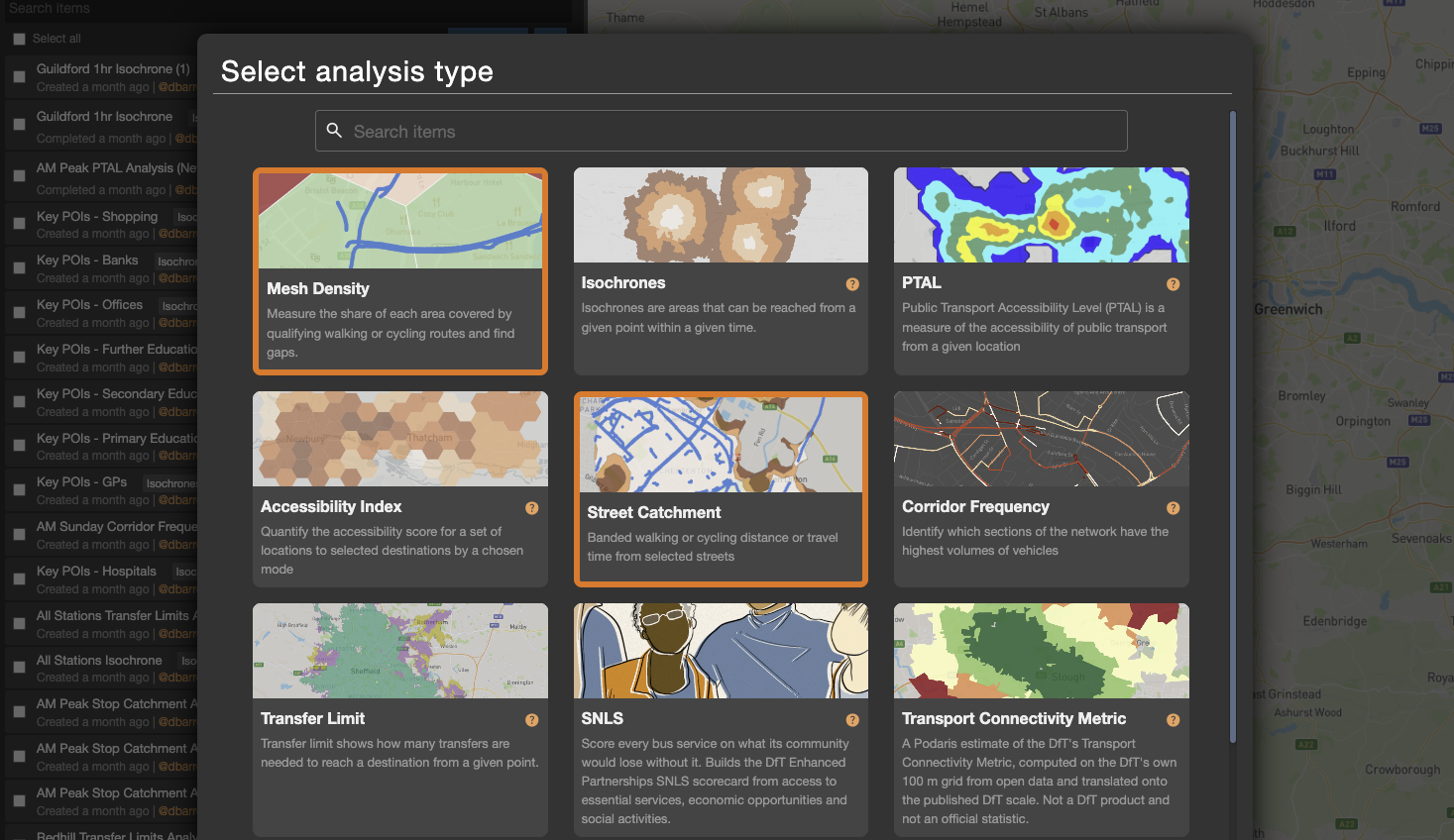
Podaris:Insight is our cloud-based analysis toolkit for multi-modal accessibility analysis. The tools inside enable users to build walk-time isochrones, conduct connectivity assessments and much more.
To accompany the launch of street editing, Insight now has two new street-specific analytical tools: Street Catchments and Mesh Density, and they exist because the street network in a Podaris project is now something you can draw, edit and analyse rather than something you import and tiptoe around.
- Street Catchments does what the name suggests: a walking or cycling isochrone generated from street segments rather than from points. Select every way with cycle provision and it tells you how far each part of the city is from the nearest one, and with a population dataset attached, how many people that is.
- Mesh Density divides the study area into a grid (we used 500m cells), and for each cell works out what proportion of its area lies within a set distance of the chosen network, and how many kilometres of that network it contains. If you have ever tried to answer LTN 1/20's question about mesh width for an entire authority area in QGIS on a Friday afternoon, this is the tool you wished you had.
Both run on nothing more than a street network, which Podaris will extract from OpenStreetMap for any area you draw or you can import your own data.
A tale of two cycle cities
Why these two? Partly because they come near the top of their national rankings. Partly because they are oddly alike: both shaped by water, both heaving with students, both convinced they are the real cultural capital and that the bigger city down the line is merely where the money lives. And partly, we admit, because several of us have cycled in both and have opinions.
A note on method: we drew the study areas by hand rather than using municipal boundaries, because Utrecht's takes in a great deal of polder and Bristol's gives up before the suburbs do, and we wanted to ensure an equal sized area to compare. “Cycle provision” meant any way tagged in OpenStreetMap as a cycleway plus any road with a cycle lane or track against it; a stricter, segregated-only definition is possible within Podaris, but would shrink both totals and, we suspect, widen the gap. Mesh Density ran at 500m cells with a 200m threshold; we tried 250m cells first, which were accurate, beautiful and completely unreadable at city scale.
Access to cycle infrastructure
Running a walking catchment from every segment with cycle provision, most of each study area turns out to be within a five-minute walk of a cycle route. In Bristol, with population data from the Podaris data library attached, that five-minute band contains around 235,000 people.
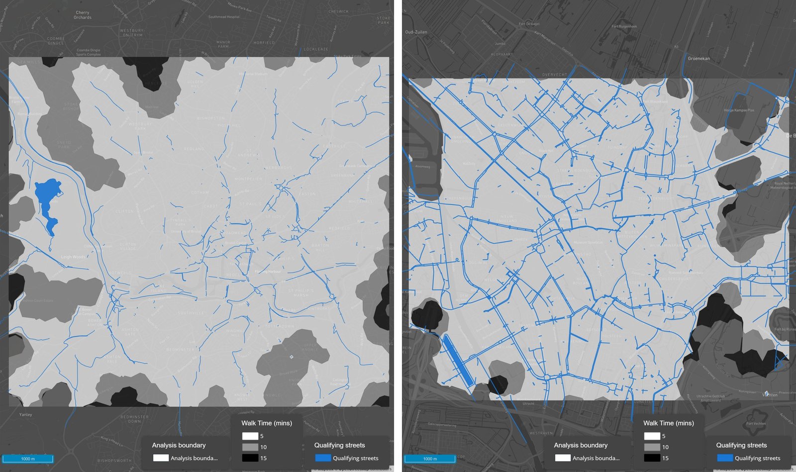
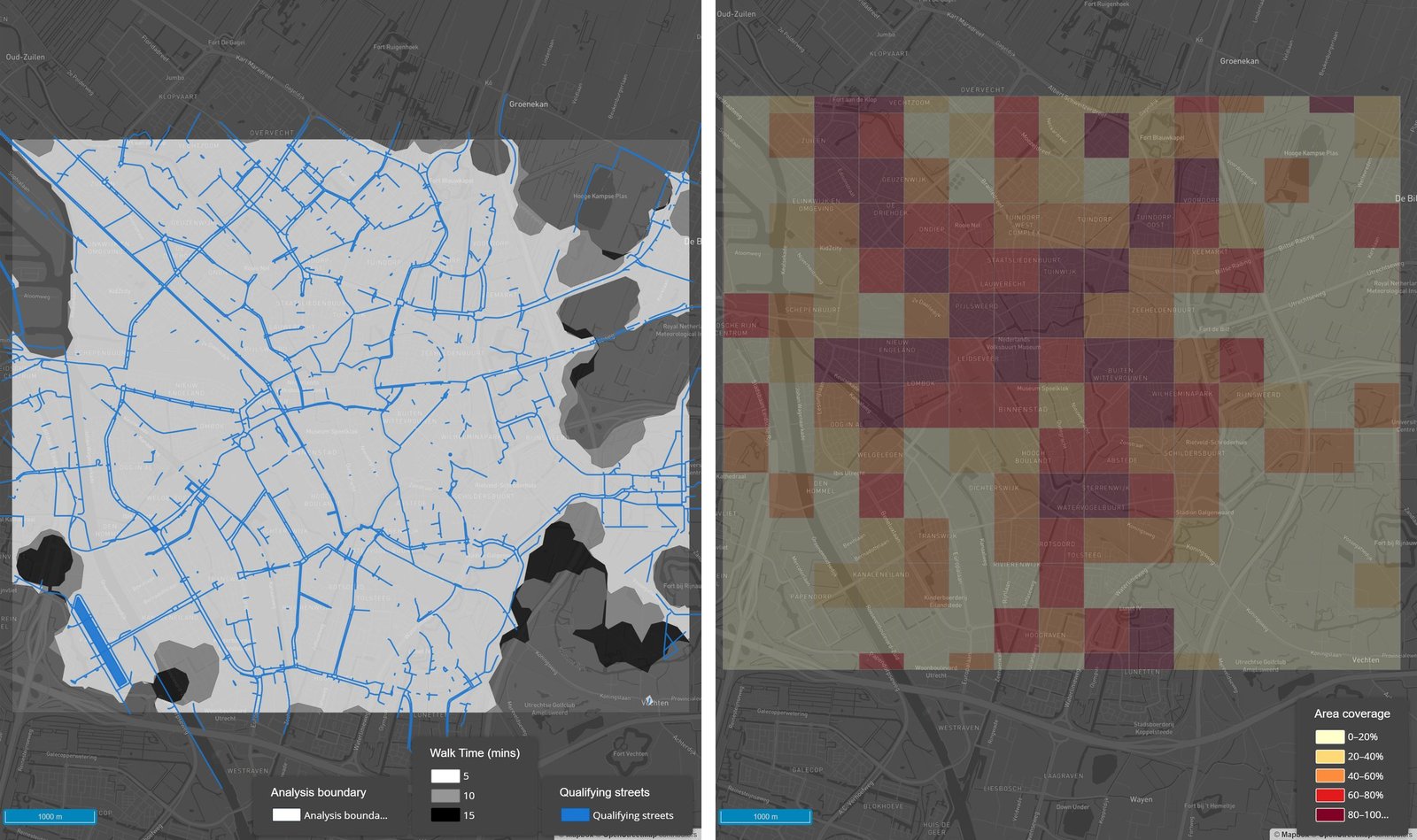
Street Catchments for Bristol (left) and Utrecht (right), calculated from all parts of the street network with cycle provision.
We used walking rather than cycling catchments on purpose. A cycling isochrone from a cycle route covers most of a city and tells you nothing; a walking one captures the first-mile problem, which is where inequalities between neighbourhoods live. (The mode is a dropdown in Podaris:Insight if your question is different.)
Despite one of these cycle networks being twice the length of the other, the catchment maps look very similar.
What cycle network density shows
Mesh Density is where the extra 120km finally shows up, and where it turns out to buy rather less than the league tables imply.
| Utrecht, NL | Bristol, UK | |
|---|---|---|
| Total length of cycle infrastructure | 232 km | 112 km |
| Area within 200m of cycle infrastructure | 36.9% | 36.3% |
| 500m cells with 80–100% coverage | 24 | 25 |
Twice the cycleway, the same coverage, and near enough the same number of cells in the top band.
The maps tell a different story. Bristol's best-covered cells cluster in the centre and along the main radials, like spokes with no rim. Utrecht's are spread out, with high-scoring cells well away from the centre in places like Schaakbuurt in Zuilen. Utrecht's network is a web of parallel and linking routes; Bristol's is a handful of corridors that happen to be very good.
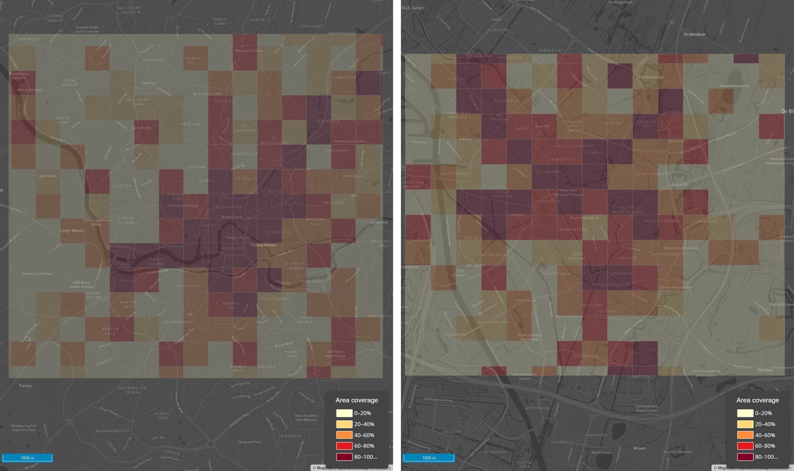
Mesh Density outputs for Bristol (left) and Utrecht (right), calculated from all parts of the street network with cycle provision.
So Utrecht's extra 120km is not buying reach. It is buying redundancy: a second and third route for most journeys, and a network that keeps working when a bridge is shut or a junction is being dug up. More importantly, it's about providing a true network that enables trips of all purposes, and maybe goes some way to explaining why Utrecht's cycle mode share is nearly 50% vs Bristol's ~8%.
What does this mean for Bristol? Probably that the next kilometre of cycle infrastructure will do more good joining the spokes to each other than extending any one of them further into the Mendips.
Building evidence for strategic investment in cycling
Length is a vanity metric, and the sooner LCWIPs stop leading with it the better.
In the UK, every local authority refreshing its Local Cycling and Walking Infrastructure Plan has to rank a long list of candidate schemes, and the quality of that evidence feeds straight into Active Travel England's capability ratings and, from there, into who gets funded. Street Catchments with population attached tells you how many residents each scheme brings within a given walk of the network. Mesh Density tells you whether the scheme adds coverage or merely adds kilometres.
In the EU the pressure is more direct. The 431 cities designated as urban nodes under the revised TEN-T Regulation, Utrecht among them, must adopt a Sustainable Urban Mobility Plan by the end of 2027, and their Member States must report a set of urban mobility indicators for each one. Access to mobility services is on that list, and cycle network coverage is most of what it means in practice.
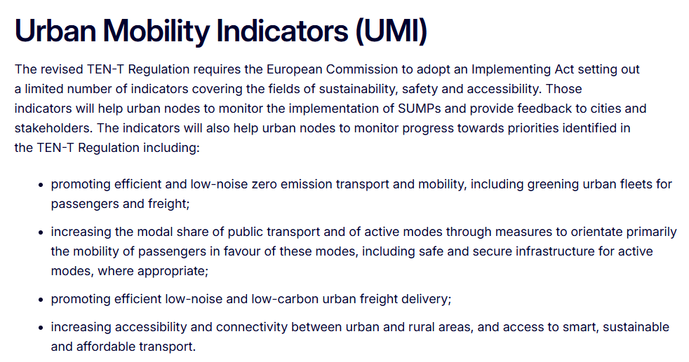
Source: European Commission, Sustainable Urban Mobility Planning and Monitoring, Access to Mobility Services indicator fiche.
Baseline, target, and the check afterwards: all three take minutes in Podaris. And because the network itself is now editable, you can run them on the scheme you are thinking of building, not just the existing network.
Try it on somewhere you're proud of
Both analysis types are live in Podaris:Insight now. The knowledge base articles for Mesh Density and Street Catchments will get you going, and all you need is a street network.
If you would like to put your own city through the same test, or find out where your next kilometre should go before you commit to building it, book a demo and we'll set it up with you. And if you think your city beats Utrecht on coverage, we would very much like to see the table.