A bus service can carry relatively few passengers and still be the link that makes everyday life possible: getting to college, reaching a hospital appointment, or doing the weekly shop without a car. Passenger numbers and operating costs tell us part of its story. Understanding what people would lose if it disappeared takes a closer look at the network around it.
That is the question behind our Socially Necessary Local Services (SNLS) analysis, now live in Podaris:Insight and already being used by local authorities. It measures the change in accessibility when a service is withdrawn, showing which communities are affected, what they can still reach, and where the alternatives fall short.
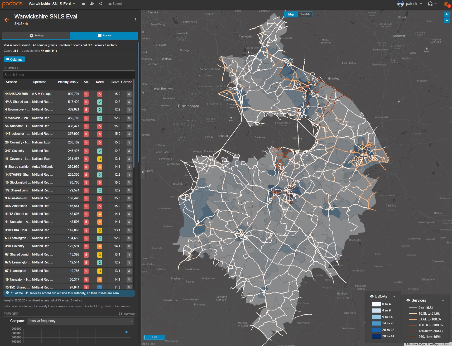
Service scores and the communities behind them: a Warwickshire worked example in Podaris. This is an illustrative analysis, not an adopted SNLS list.
We've designed it around the DfT's SNLS framework, with the flexibility to use the metrics, weightings and assumptions that make sense locally. For existing LTA customers, it is included in Podaris at no additional cost.
Where SNLS fits
The Bus Services Act 2025 requires local transport authorities in England operating Enhanced Partnerships (EPs) to identify socially necessary local services and include them in their EP plans. The DfT's statutory guidance sets 31 March 2027 as the deadline for updating those plans.
The definition centres on services that enable access to essential goods and services, economic opportunities, or social activities, where cancellation is likely to have a material adverse effect on passengers’ ability to access them. Listing a service means the authority and operator must follow a process to consider alternatives or mitigations before cancellation or significant variation. It does not guarantee that the service will continue unchanged.
The Enhanced Partnerships Manual offers a worked scorecard using journey purpose, socio-economic need, alternatives and patronage. Its methodology and threshold are illustrative: authorities can adapt them or use another approach. It also explicitly mentions Podaris:
“Transport Planning tools such as Podaris have an inbuilt route impact assessment tool and social value score that measures the impact of removing a service.”
— Department for Transport, Enhanced Partnerships Manual, p. 54
The next sentence explains that these tools can help automate scoring, provided the datasets used are documented. That is the role we've built the analysis to fulfil: doing the calculations and recording the evidence so an authority can explain its decisions.
Developed with CPCA and WSP
We developed the underlying social value methodology with Cambridgeshire & Peterborough Combined Authority (CPCA) and WSP. The work has helped CPCA plan more equitable network changes by making the consequences for communities part of the assessment, alongside passenger numbers and the cost of running services. CPCA has used the approach to review its contracted bus services, including its Tiger routes.
CPCA's September 2025 Transport Committee report describes the approach: measure the accessibility lost if a route were withdrawn, then weight that loss to reflect the importance of bus connectivity to different socio-demographic groups. It brings a social perspective to the operating-cost comparisons that form part of a network review, helping planners understand where a change would fall hardest on people with fewer alternatives.
That collaboration shaped the method now available in Podaris. The starting point was a real network and the decisions its planners needed to make; the current SNLS analysis builds on that work with configurable scorecards and evidence for the EP process.
Measure what changes when a service goes
The method has five parts. First we establish what residents can reach, then measure how that changes without each service, account for who is affected, and bring the results into a scorecard.
1. Build a baseline around the journeys people can make
The analysis starts from where people live across the authority. Destinations can extend beyond the authority boundary: a hospital or college in the next district still matters to local residents.
The baseline includes the wider public transport network. Other buses, rail, trams and ferries remain available where they are present in the project. Journeys use actual timetables, including waits and connections, with walking to, from and between stops routed on the street network.
2. Turn access to destinations into an accessibility score
Destinations are organised into three groups:
| Group | Examples |
|---|---|
| Essential services | GPs, hospitals, pharmacies, schools and further education |
| Economic opportunities | Employment areas, town centres, rail stations and interchanges |
| Social activities | Supermarkets, post offices, banks and other everyday destinations |
Authorities can adjust the relative importance of these groups and the destinations within them to reflect local priorities.
Travel time matters as well. A GP five minutes away contributes more than one that takes an hour to reach. The current default uses a smooth willingness-to-travel curve to reduce a destination's contribution as the journey gets longer, with a configurable maximum journey time of 75 minutes. An exponential alternative is also available.
The calculation also applies diminishing returns, following a similar principle to the DfT Connectivity Metric's methodology. Reaching a second hospital can make a meaningful difference; reaching a tenth nearby pharmacy may add much less.
Together, these choices distinguish useful access from a simple count of nearby facilities.
3. Remove a service and calculate what is lost
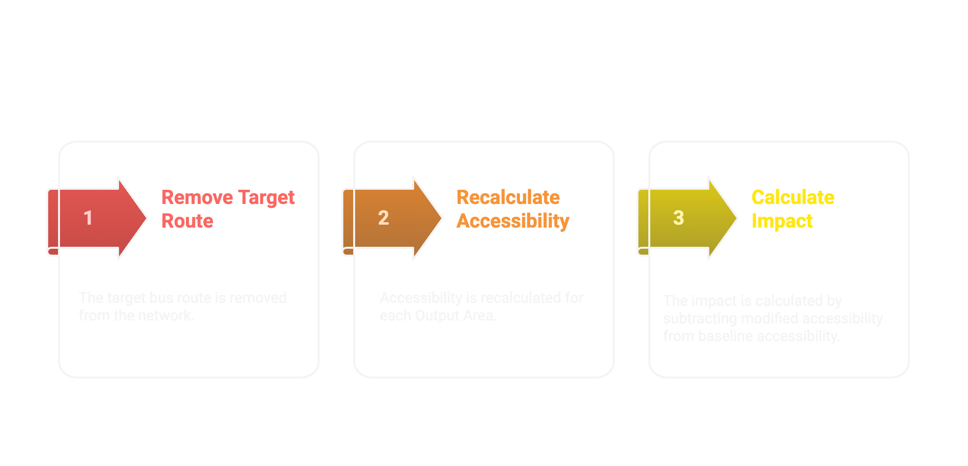
The analysis then removes each selected bus service in turn and recalculates those journeys. The difference is the accessibility lost through that withdrawal. Longer journeys reduce accessibility too, even when a destination remains reachable.
This captures effects beyond the route itself. A bus might be the first leg of a journey to a hospital, or the connection that makes a rail trip possible. Conversely, another service may preserve much of that access. Re-routing the network reveals both, rather than assuming that every destination near a route depends on it.
For a visual introduction to comparing access before and after a network change, our difference isochrones walkthrough shows the broader principle. Here, the comparison is repeated for each selected service and measures access to the destinations that matter locally.
Services sharing a corridor need particular care. Removing either one alone may show a modest loss because the other remains, even though losing both would be severe. Podaris identifies shared corridors and reports the group loss alongside the individual results, making that dependency visible.
4. Account for who loses access, and when
The impact is aggregated across the affected population, with a vulnerability multiplier built from factors such as deprivation, households without a car, disability and age. This gives greater weight to losses affecting communities that are more dependent on public transport. The individual weights can be adjusted locally, and the maps show where those impacts fall.
The calculation is repeated at sampled departure times across the selected days. All seven days are included by default, and day and time-period weights combine the results into a weekly measure, with daily and peak/off-peak breakdowns available. That makes it possible to examine weekend and off-peak needs alongside commuting, or test how different priorities change the result.
5. Bring the results into a scorecard
The accessibility-loss measure feeds the journey-purpose part of the scorecard, alongside measures of socio-economic need and remaining alternatives. Each metric is assigned a band from 1 to 5, then combined using the chosen weights. The raw loss and the combined score remain visible separately, so readers can see the evidence behind the ranking.
For example, the current three-metric defaults use relative weights of 30, 25 and 25. A service banded 5 for journey-purpose loss, 4 for need and 5 for alternatives would score 14.1 out of 15: the weighted average of those bands, multiplied by the three metrics used. Those weights are separate from the destination and demographic weights used to calculate the underlying loss.
By default, bands are relative to the services in that run. A band 5 means among the highest in that analysis, rather than high against a national benchmark. Fixed bands are available where consistent cut-offs are needed across runs.
From a network-wide result to a local conversation
In our Warwickshire worked example, Podaris brings the results into a service table and map. The table shows each service's accessibility loss alongside need, alternatives and its combined score. Selecting a service shows where its withdrawal would have the greatest effect.
The X17 between Coventry and Warwick illustrates why it helps to look below the headline score. The map lets us trace its contribution through Kenilworth and Warwick and see how the loss is distributed between neighbourhoods.
We can then change the time-period weights to explore a different question. In the peak-focused example below, the X17 ranks higher by accessibility loss. That shows how the result responds to the journeys being assessed; deciding how much weight those journeys should carry remains a local choice. A peak-focused run is useful for that comparison, alongside an assessment of needs across the rest of the week.
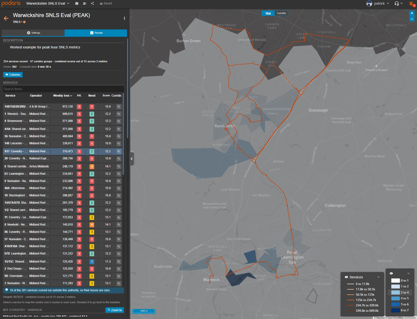
Selecting the X17 reveals the local pattern of accessibility loss under the peak-focused assumptions.
Evidence you can explain
The analysis produces an auditable scorecard, with the metrics used, their weights and the combined score. Service results and zone-level losses can be exported as CSVs, while an EP evidence pack brings the outputs and methodology record together for review with colleagues, operators or consultants.
The threshold is left unset until the authority supplies one. Once entered, a sensitivity check shows which services change status if the cut-off moves by 15% in either direction. Missing metrics are reported and the remaining weights rescaled: patronage, for example, needs operator data and is not inferred from accessibility. The score's maximum depends on the metrics included, so the manual's example threshold should not simply be copied into a different scorecard.
Those details matter when explaining why a service scored as it did. So do the underlying assumptions: the timetable version, walking distances, destination coverage beyond the authority boundary and any gaps in the data. A low score needs that context before it can support a decision.
This analysis measures the contribution of existing services. It does not, on its own, identify all the unmet needs in places that have little or no service today. Nor does a journey that is possible in the model establish that it is affordable, physically accessible or suitable for every passenger.
The resulting evidence supports the LTA's judgement. Passenger experience, stakeholder engagement, equality considerations and local knowledge still need to inform the decision about which services belong on the list and how changes should be managed.
Using it in your area
If your network and timetable are already in Podaris, much of the setup is in place. With a street network available, the Podaris data library supplies boundaries, population data and most destinations for a standard England analysis. We can help check the coverage, run an initial assessment and adapt the metrics, weights and assumptions to your area.
Your team can use it directly, or we can arrange access for consultants supporting your SNLS work so they can work in the same project. There is no additional charge for the analysis for existing LTA customers.
If you're working through your SNLS approach, get in touch. We'd be happy to look at your network together and help you turn the results into evidence you can use.