In late 2023, we launched the latest evolution of the Podaris platform, Podaris:Insight. Developed in response to the needs of our enterprise customers, Insight gives planners access to cutting edge accessibility analysis tools through a simplified interface designed to reduce the technical barriers to their implementation.
Insight bundles a wide variety of analysis types, from the common (travel time and access based isochrones) to the cutting edge (such as the recently devised Mobility Energy Productivity metric).
Users of Podaris:Plan, our cloud-based collaborative transport planning application, will be familiar with our isochrone analysis tools, which provide a range of options for visualising spatial accessibility as provided by your multi-modal transports networks. These are commonly used to explore catchment to existing or proposed transport services, and generate insights into the demographic impact of transport schemes. Podaris allows for both quick, indicative crow-flies isochrone analysis and street-based isochrone routing, which offers a more realistic picture of the limits of travel through a multimodal network.
While the setup of isochrones in Podaris is designed to be many steps faster and simpler than with traditional GIS tools, Podaris:Insight simplifies the process even further and brings the advantage of facilitating analysis of much larger regions than before.
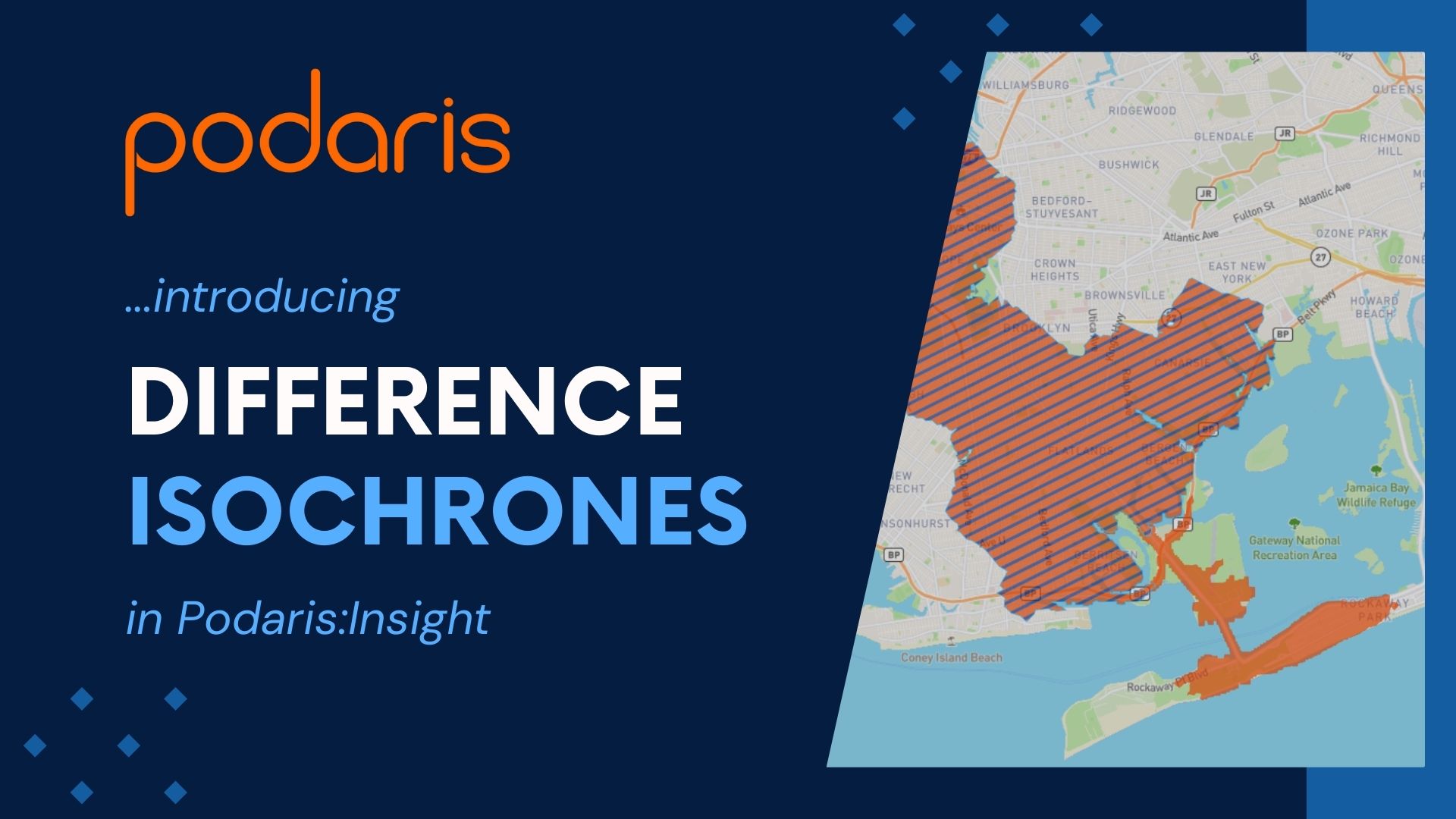
With Insight, we now have a method of comparing the difference in accessibility between two networks, with the new ‘Difference Isochrones’ tool.
Comparative accessibility analysis made simple
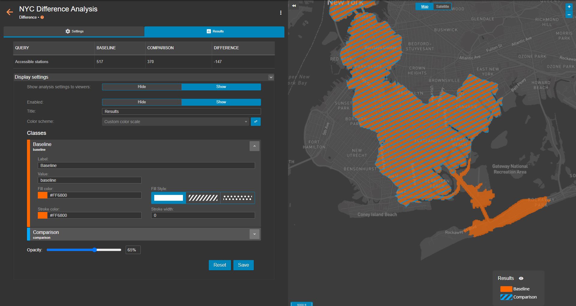
With this tool, Insight will generate an initial visualisation of all locations reachable from or to a given point, within a maximum duration (or journey time) using your baseline network. A subsequent analysis run, targeting a second network (a proposed extension to a transit system, for example), will then be performed. You can then visualise the difference in accessibility between our do-nothing and do-something scenarios.
As well as providing an at-a-glance visualisation of difference (depicted by two isochrones, one solid and one with a hatched or dotted fill - see below image), you are also presented with statistics such as the number of stations accessible across our baseline and comparison networks, and the difference between the former and the latter.
While our visualisation gives us a good view of accessibility in geospatial terms, it does not yet offer any insight into the real-world impact of proposed network changes. In order to answer demographic questions about the effect of network and service changes, you can leverage Podaris’ dataset functionality to calculate the number of residents who are given or denied access as a result of a modification to a network.
You can of course explore accessibility using demographic data to answer key questions. With a single analysis run, you can then quantify the access provided to residents with long term health conditions, those who own a private vehicle, or those who are in a particular age bracket, for example.
For multimodal transit systems, you can isolate particular days and times for analysis, as well as specifying a limit on the number of transit mode transfers. Outside of public transport, you can explore access to locations set as origins or destinations by car, cycling or walking.
For a complete overview of the analysis types included in Podaris:Insight, you can take a look back at our launch post here. We have also explored the Public Transport Accessibility Level (PTAL) metric, another analysis type included with Insight, in our recent blog post here.
Insight is available to all enterprise customers now. For a one-to-one tour of the complete Podaris platform, including its tools for GTFS editing, infrastructure and transit service planning, and stakeholder engagement, book a demo with us today.