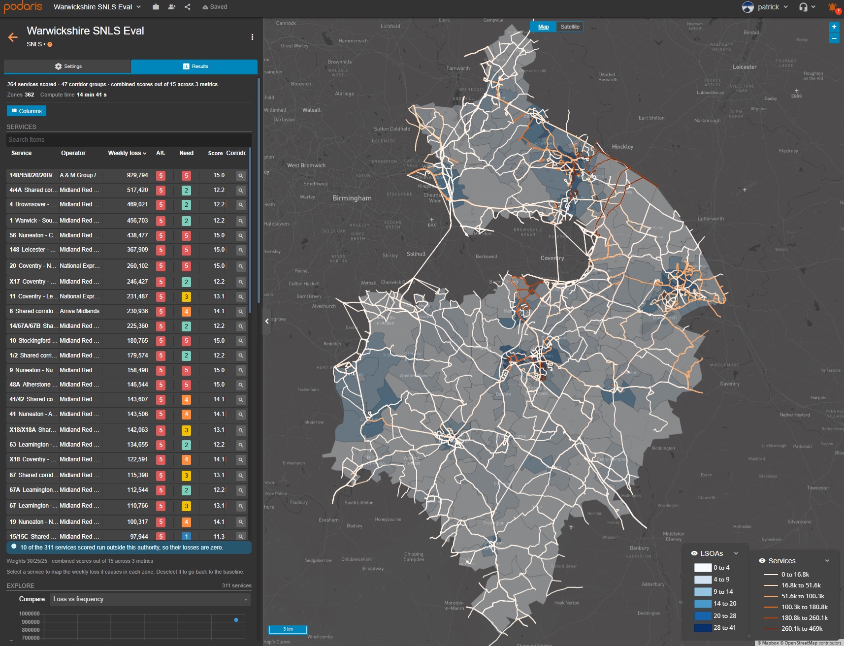
What would losing a bus service mean? Measuring SNLS in Podaris
Podaris measures the accessibility communities would lose if a bus service were withdrawn, helping authorities build evidence for socially necessary local services.…
Read More
Podaris measures the accessibility communities would lose if a bus service were withdrawn, helping authorities build evidence for socially necessary local services.…
Read More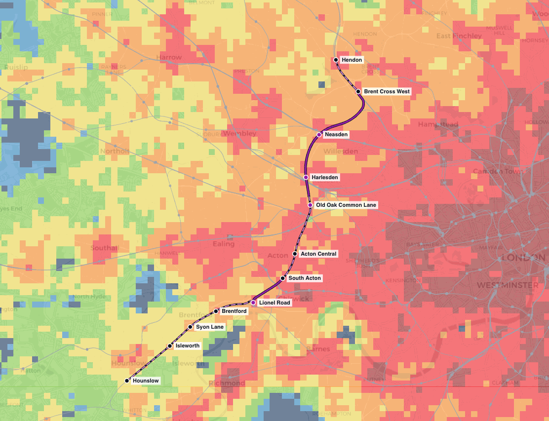
TfL's Sustainable Access Measure is the new connectivity metric behind the draft London Plan's housing targets, densities and parking standards. TfL published the methodology and opened it to consultation, so we rebuilt it, tested it on the West London Orbital, and are publishing what we found.…
Read More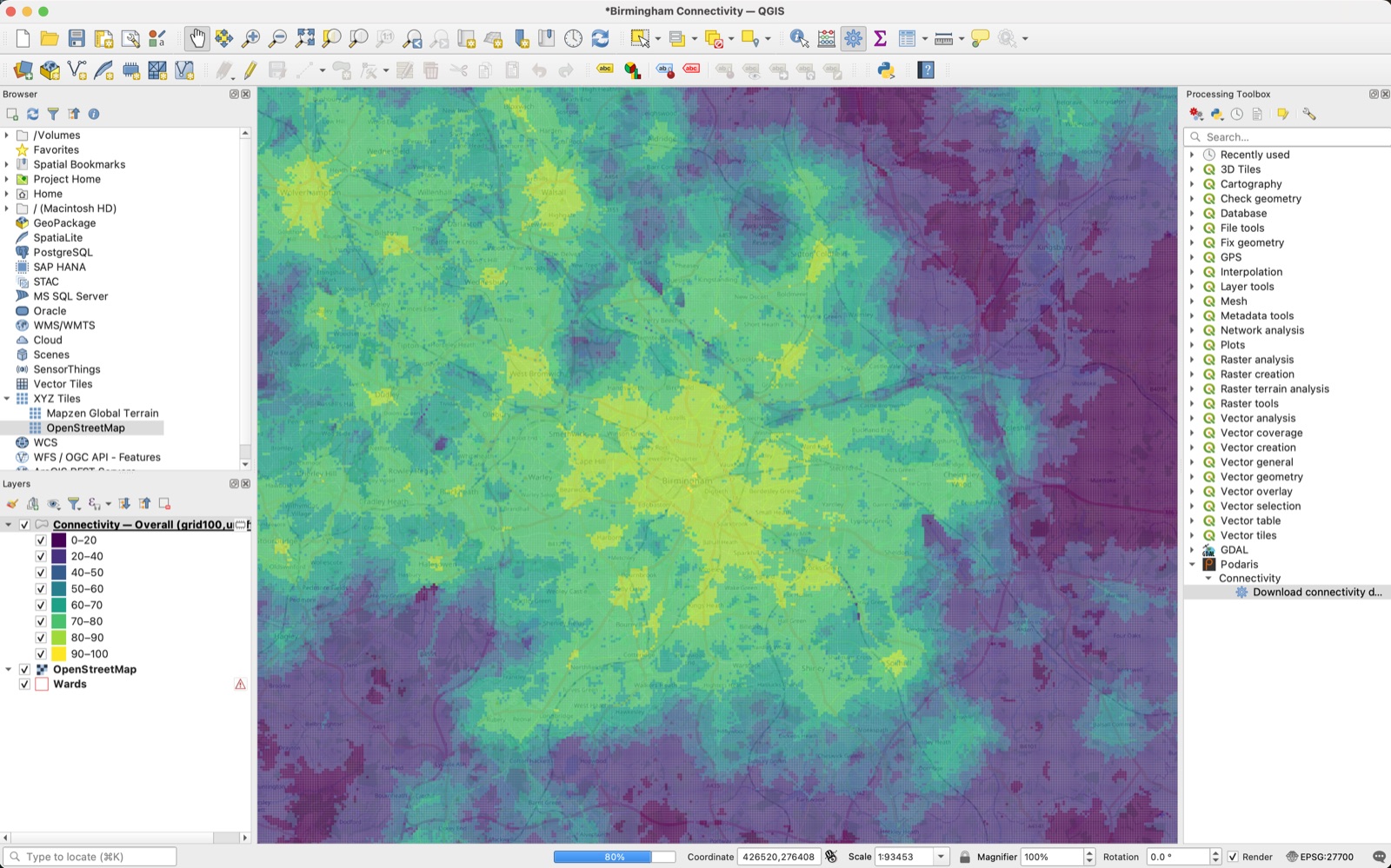
Connectivity data, straight into QGIS. Our free Podaris plugin, now in the official QGIS plugin repository, adds the DfT Connectivity Metric's published data to the Processing Toolbox, so you can pull a styled layer for any area of England and Wales without leaving your GIS.…
Read More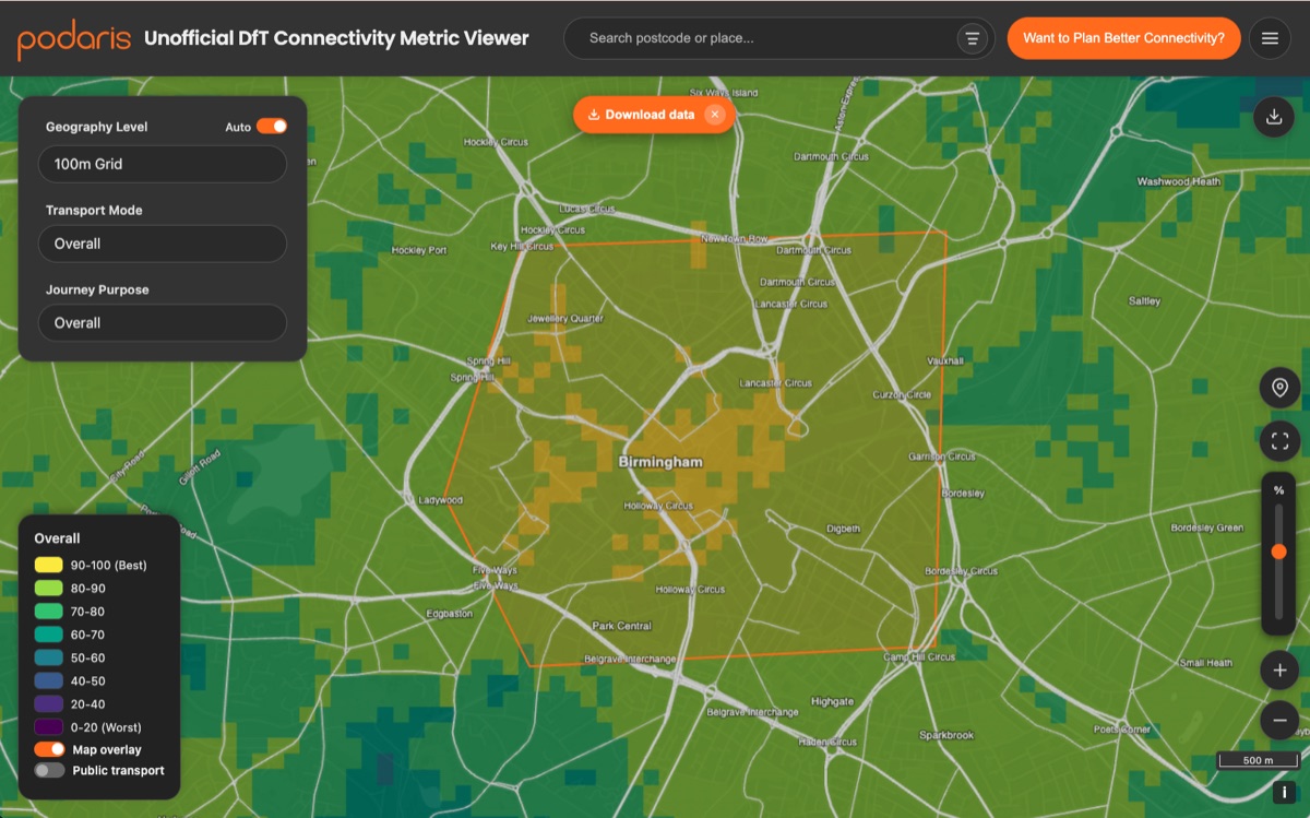
The official DfT tool lets you look at the new Connectivity Metric, but not download it. Our free, open visualiser now does. Here's how to export the data for OA, LSOA, local authority, region, or 100m grid in a few clicks.…
Read More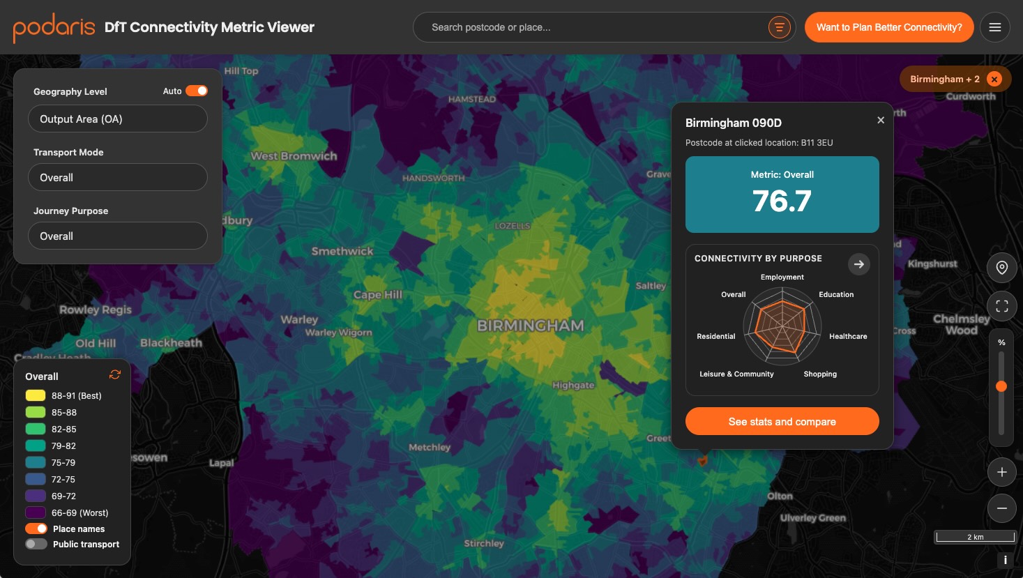
The DfT’s new Transport Connectivity Metric takes a bold step towards quantifying how well people can reach jobs, schools, and services — but how does it work, and what does it mean for planners?…
Read More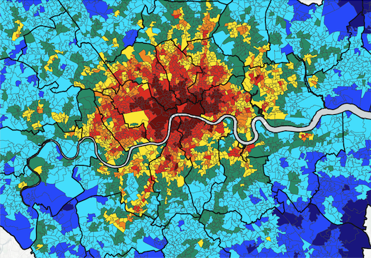
We compared London's PTAL against the DfT's new Connectivity Metric. The results expose planning risks, methodological gaps, and an urgent need for transparency in publicly-funded transport tools.…
Read More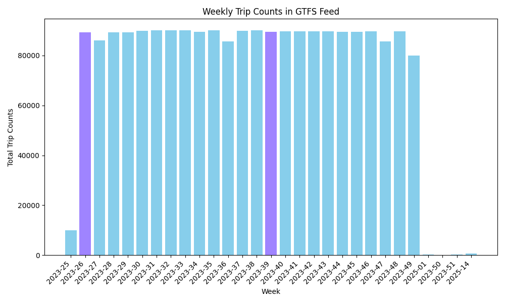
When working with a General Transit Feed Specification (GTFS) feed, understanding what constitutes an 'average week' is useful for gaining insights into the typical service patterns and usage trends.…
Read More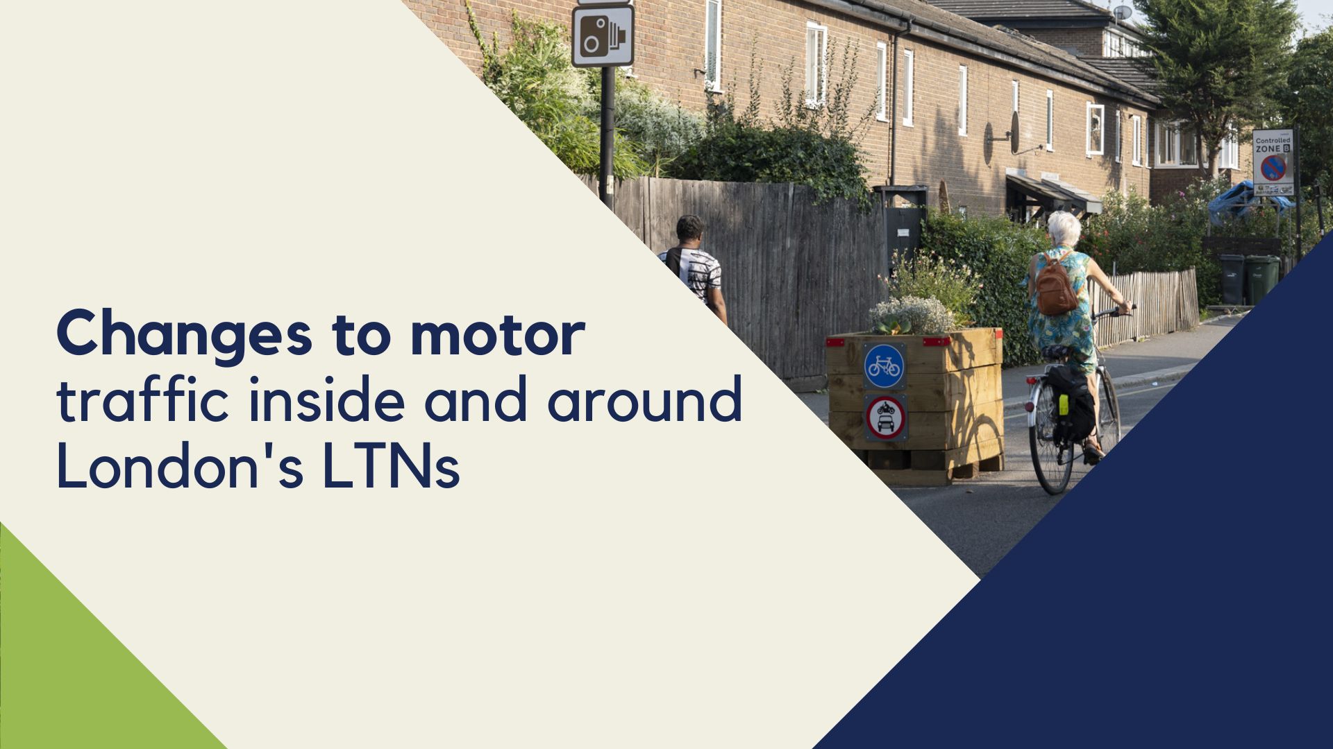
The University of Westminister and Possible explore the impact of LTNs…
Read More